Ligier is a French automotive manufacturer primarily specializing in microcars and formerly sports cars. Owned by the Drive Planet Group, the company was established in 1968 by racing driver Guy Ligier. With its headquarters in Abrest, France, the company operates largely within Europe. Over the years, Ligier has diversified its product range and has also forayed into the Formula 1 circuit in the past.
Meaning and history
Founded in 1968 by former rugby player and racing driver Guy Ligier, Ligier is a French company that initially focused on producing high-performance sports cars. The company transitioned into Formula 1 racing in 1976 and enjoyed some success until its exit in 1996. Ligier’s most notable achievements include earning nine Formula 1 Grand Prix wins and securing a significant presence in European endurance races like Le Mans. In the early 2000s, Ligier pivoted its focus to microcars, carving a niche in the market for compact, fuel-efficient vehicles. Owned by the Drive Planet Group, the company has its headquarters in Abrest, France. It largely operates within Europe, although its products have gained recognition worldwide. As of now, Ligier continues to innovate in the microcar segment, adapting to market demands and emerging trends in sustainable transportation.
What is Ligier?
Ligier is a French automotive manufacturer that was founded in 1968 by Guy Ligier. Originally involved in producing sports cars, the company later shifted its focus to microcars and even participated in Formula 1 racing. Headquartered in Abrest, France, Ligier currently specializes in compact and fuel-efficient microcars.
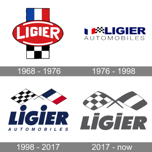
1968 – 1976
The oval red base carries the name of the brand. The latter is done using a bold, sans-serif font of a white color. The varying size of the characters created an illusion that the name was curved. This emblem was decorated by a vertical strip running behind it. The top was colored into national colors – the French logo, while the bottom portion featured a racing checkered flag. It was a perfect symbolism that told a lot about the company.
1976 – 1998
This logo looks very modern and stylish despite being created half a century ago. It consists of two lines. The upper line features a wavy line that has one half painted as a French flag and the other as a racing checkered flag, making reference to the original logo. Right next, it said “Ligier” in dark blue that matched the blue in the flag and used a bold, sans-serif font similar to Remora Corp W5 Bold and OPTIImprovNewWideNine font. The second line was not as tall and had “Automobiles” printed using a fine Nimbus Sans Extd Light or similar font and plenty of space between each character. The inscription was done in black, which placed an accent on the top line and at the same time referenced the black in the checkered pattern.
1998 – 2017
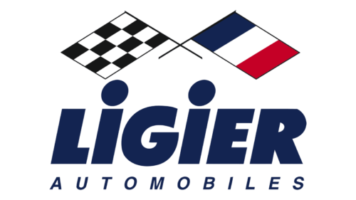
This logo has all the elements the brand was recognized by from the very beginning. The racing checkered flag and the flag of the country of origin were now crossed at the very top of the logo. Right underneath, the name was printed using a slightly different shade of blue than in the earlier version and now featured a font that looked like Regan Ultra Italic. The “Automobiles” inscription underneath was printed using a font that resembled Helvetica Thai Bold Italic and the same shade of blue as the top line. The fact that the company preserved the same color palette and simply rearranged the key elements of the previous logo made it look more reliable and, obviously, preserved its distinguishable brand image.
2017 – now
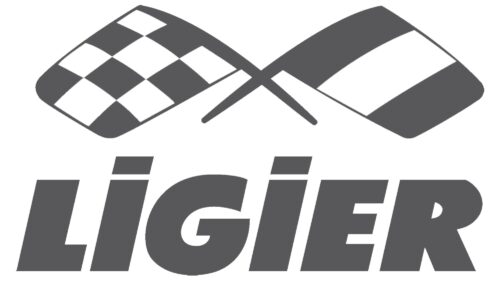
It looks like the company wanted to transform its logo to go in line with modern, more minimalistic logo designs. The logo was now done in a grey-and-white color palette, but it was instantly recognizable thanks to the use of the same font to print the name (without the second line). The two crossed flags featured the same pattern and now had rounded corners, which added a friendly touch and might have referenced the new direction – environmentally-friendly microcars.


