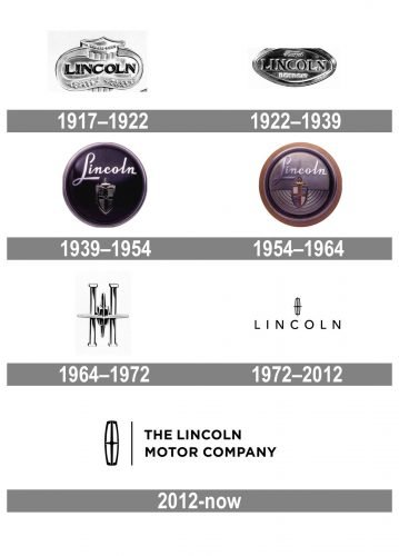
Lincoln is an American brand of high-end cars, created in 1917 and acquired by Ford Group in 1922. It is one of the most popular luxury-cars labels in the North America region, which exports its vehicles across the globe.
Meaning and history
Lincoln is a legendary brand and one of the main symbols of the American luxury automobile industry. It was created in 1917 by Henry Leland to build engines for aircraft and was reproduced into a car manufacturing company after its acquisition by Ford in the early 1920s.
The Lincoln visual identity has a rich history and a lot of versions of its meaning. Regardless of the original Lincoln logo idea, today it is a symbol of luxury, which is highly-recognizable across the world.
1917 – 1922
The first Lincoln logo was created in 1917 and featured a rounded-angled medallion with the bold wordmark on it. It was the only logo used by the brand while owned by Henry Leland.
1922 – 1939
After Lincoln became a part of Ford, its visual identity was redesigned by adding “Ford Detroit” lettering to the badge. The shape of the emblem was changed to a rhombus with rounded angles and a massive frame.
1939 – 1954
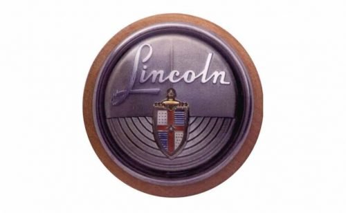
In 1939 the Lincoln logo changes its shape to a circle. The wordmark is now executed in cursive white lettering and the coat of arms becomes the only ornament of the brand’s visual identity for the next 15 years.
1954 – 1964
The redesign of 1954 brings bolder and more confident lines and a new color palette. The blue of the background is changed to silver, which makes the coat of arms looks brighter.
1964 – 1972
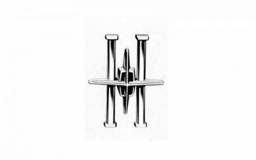
The first version of the today-famous Lincoln Star was created in 1964. The brand wanted a big change. And a framed four-pointed star seemed to be a perfect option to reflect the luxury and finesse of the Lincoln cars.
The Star from the 1960s featured Art-Deco shape and was a sleek and chic emblem.
1972 – 2012
The wordmark is added to the brand’s visual identity and the emblem is being refined. The “Lincoln” lettering is executed in all capital letters of a sans-serif font with simple strict lines and a lot of space.
The emblem becomes more geometric and modern, the shape is clear and confident and looks great both in monochrome and in silver when placed on the cars.
The logo remains almost untouched for 40 years and becomes a true strong symbol of a powerful American brand.
2012 – Today
The iconic Lincoln logo was redesigned in 2012. The wordmark was made more elegant and balanced due to the use of bolder and shorter lines.
As for the star emblem, it is now fully enclosed in a frame, the star lines are shortened, which makes the logo look more graphical and modern.
The Lincoln four-pointed Star is a symbol of the brand’s worldwide influence and expertise in quality and design. It is a great reflection of the luxury segment and the prestige of the famous brand. Minimalist, laconic yet meaningful.


