Land Rover is a British manufacturing company, focused on premium cars. It was founded in 1948 and got a Royal Warrant in 1951. Land Rover is a truly legendary brand, which is owned by Jaguar Land Rover Group.
Meaning and history
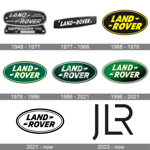
Land Rover is a company with a unique signature in everything. Its 4WD cars have instantly recognizable designs, as well as its iconic logo, which was created in 1986 and was only slightly modified since then.
The company values its heritage and traditions, providing its customers with the best quality and technical characteristics of cars.
1948 – 19??
The first Land Rover logo featured a dark gray, almost black, oval with a silver outline and italicized lettering. The signature “Z” connection between the words “Land” and “Rover” is still in use today.
The brand’s name was not the only text of the original Land Rover logo. There was also mentioned “Solihull Warwickshire” and “England” to celebrate the brand’s origin.
The Land Rover logo from 1948 was a reflection of the brand’s car universality, reliability, and functionality.
19?? – 1968
The emblem introduced in 1948 was significantly simplified. In fact, it now has only “Land–Rover” printed in all uppercase letters of a white color on a black background. The base is rectangular with thin white framing and is placed on a slight diagonal. Such a positioning gave the relatively basic log dynamics and reflected the fact that Land Rover automobiles are not afraid of hills and challenges.
1968 – 1978
In 1968 the brand switches color palette of the logo to black and silver and removes all the extra lettering from it.
Now the Land Rover logo is composed of a more round emblem with a sole “Land Rover” wordmark on it and a signature zigzag connection, which was split into two parts.
The typeface of the wordmark became bolder and stronger, the brand’s name now stands out and evokes a sense of confidence and power.
1978 – 1986
The company switches to a green color palette, which makes a great contrast with gold lettering. The style and spacing of the wordmark remain the same, as well as the overall logo design.
1986 – 2021
The logo we know today was born in 1986 and only slightly refined during the years. It is composed of an emerald green oval with a white outline and a wordmark.
The simple and strong lettering is executed in a font from Gill Sans Family, which is simple yet reflects the brand’s functionality and quality.
1996 – 2021
This emblem looks more like the 1978 version as it has the lettering done in light beige color. Although the green color got much brighter, they preserved the gradient introduced ten years earlier. The border has also been changed. The new brand identity is full of life and looks more natural, which is what Land Rover is all about.
2021 – now
The updated logo looks a lot more modern and bold as the company changed the color palette to black and white. The border now has fewer lines – a thicker black on the outside and a thinner one on the inside, which are separated by a white line. The inscription was not changed drastically. The letters were redrawn ever so slightly and the black shadow was no longer applicable.
2023 – now ( JLR Logo )

Jaguar Land Rover’s full facelift gained momentum as the company revealed a new logo for its new official name – JLR. The new, simple motif matches the minimalist style of JLR’s products and dealerships and is said to embody the company’s “elegance, modernity, and cutting-edge essence”. This is the first time that the company has officially received a single logo, rather than using the separate Jaguar and Land Rover brands.
The Emblem
The combination of green and white colors symbolize nature, energy and movement, eternal progress of the brand.
There is a funny legend, that the oval shape of the Land Rover logo was inspired by the tin of fish, which the designer saw during his lunch. There are also two versions of what the signature “Z”-connection stands for: the difficult roads, which are easy to take on the brand’s cars, or just a graphical representation of the company’s motto “Above and Beyond”.
Whether it is true or not, the simplicity and elegance of the Land Rover logo make the brand’s visual identity timeless and quality-centric.


