Lada is the name of a Russian automobile marquee, established at the beginning of the 1970s by AutoVAZ. Today the brand, specialized in the production of affordable cars and commercial vehicles, is owned by Renault Group and distributes its products all over Eastern Europe and some Asian countries.
Meaning and history
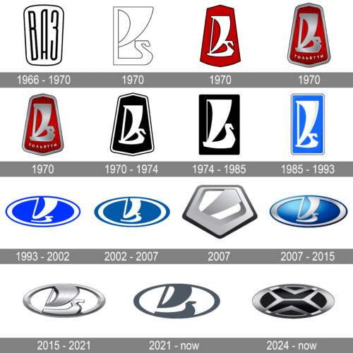
The history of the Lada logo started in the 1960s, with the badge, created for AutoVAZ, which has never been used. The prototype was laying on the shelf for almost five years until the first official logo was accepted and introduced in 1970.
1966 – 1970
The first, trial version of the logo was designed by a Russian artist, Vladimir Antipin. It was an inscription in Cyrillic, places inside a trapezoid badge with rounded angles. There was a strong resemblance to the iconic Fiat logo in this design, so probably it was one of the reasons it has never been used.
1970
The fourth image depicts a logo that is simple yet bold, featuring a stark contrast between black and white. The monochromatic use of black and white adds to the logo’s versatility and timeless quality while also allowing for strong visual impact and readability. This logo be seen as a symbol of elegance, precision, and modernity, reflecting a brand that values innovation and sleek design.
1970
The image showcases a logo that is bold and striking, with a clear contrast of colors and a distinct geometric shape. The emblem features a shield-like figure, predominantly red, with a white border. The use of red symbolizes energy, passion, and power, while the white line may suggest purity and clarity of purpose. The overall design of the logo conveys a sense of tradition and strength, indicative of a brand with a rich heritage and a robust character.
1970
In this logo, the design is anchored by a shield-like badge, evocative of strength and protection. Within this badge is a stylized graphic that combines elements that may resemble a sail and the prow of a ship, set against a backdrop of a striking red color. The shield is topped with a metallic flourish that resembles a ribbon, adding to the logo’s dimensionality and visual interest. Below the central graphic, the name “ТОЛЬЯТТИ” is inscribed in a contrasting white color, acknowledging the brand’s heritage and location. The overall design conveys a sense of pride and durability, likely aimed at a market that values tradition and resilience.
1970
The logo is similar to the previous one, maintaining the shield shape and central graphic but opting for a darker, more muted color scheme. The red is less saturated and set against a gradient black background, which may suggest a more upscale and premium brand image. The metallic elements, such as the ribbon-like flourish, are rendered with a glossy effect, indicative of a high-quality finish. The inclusion of the same inscription at the bottom of the badge keeps the connection to the brand’s roots, while the overall darker tones of the logo suggest a sense of sophistication and elegance.
1970 – 1974
The first official Lada logo was introduced in 1970 and depicted a stylized image of a sailing boat, which looked like the one the northern people such as Varyags and Vikings used. The name of the marque, Lada, is a Russian name for this boat.
The symbol in white was placed on a black background enclosed in a pentagon white and black frame with the “Tolyatti” (the name of the city the brand was established, “Тольятти” in Russian) inscription along its bottom part.
When the first thirty cars of Lada were released, there was a typo on their badges and instead of the Russian letter “Я” ( “Ya” in “Tolyatti”), the Latin “R” was put.
Later in the same year, the lettering was removed from the logo, and it was just a white sailboat on a black background.
1974 – 1985
In 1974 the shape of the badge was simplified to a strict vertically placed rectangle, and the framing was removed. It was a very minimalist and laconic emblem, which looked strong and confident on any placement.
1985 – 1993
The color palette of the emblem was switched to blue, white, and gray in 1986, but that was not the only change of this redesign. All lines and contours were elongated. The badge became narrower and higher, started looking elegant. The white Lada boasted delicate gray accents on its sail and looked bright on a sleek blue background. The gray accents were balanced by a gray outline of the rectangular emblem with rounded angles.
1993 – 2002
In 1993 the logo was completely changed by another Russian artist, Vladislav Pashko. He changed the vertical rectangle to a horizontal oval, redrawing the boat in a more abstract way with smooth wide lines. The color palette was kept, yet the blue shade became brighter.
2002 – 2007
In 2002 the electric blue shade was replaced by a calm tone, and it gave a more professional and trustworthy look to the badge, evoking a sense of confidence and reliability.
Later a three-dimensional badge was created. Keeping the style and colors, some light gray gradient was added to the composition. The metallic shade was matte, and it added a luxurious touch.
2007
This logo is an exercise in geometric minimalism, featuring a diamond-shaped figure that is both hollow and solid. The design plays with the concepts of space and form, using shades of gray to create an illusion of depth. The simplicity of the design, with its clean lines and absence of additional decoration, speaks to a brand that prioritizes clarity, precision, and modernity. The monochromatic color palette reinforces the logo’s contemporary appeal, while the metallic gradient adds a touch of sophistication.
2007 – 2015
The logo presents an oval shape with a stylized representation that could be interpreted as a sail or a flag in motion, conveying a sense of advancement and progress. The figure is rendered in a metallic silver that gracefully curves against a rich blue background, which may symbolize depth and stability. The entire emblem is encased within a silver border, enhancing its refined and modern aesthetic. The use of gradient within the elements gives the logo a three-dimensional feel, suggesting a dynamic and evolving brand that values innovation and forward momentum.
2015 – 2021
The redesign of 2015 brought some significant changes to the Lada visual identity. The blue color was removed from the emblem, and the sailboat was redrawn, becoming wider, bolder, and more square. It was the first time when the logo was created by a foreign artist, Steve Martin.
2021 – now
In the logo presents a modern and sophisticated look, with a monochromatic color scheme that blends shades of dark and light gray. This creates a sense of harmony and continuity. The use of gradient shades gives the logo a three-dimensional appearance, suggesting depth and substance. The minimalistic approach to the design, with its clean lines and absence of additional embellishments, implies a focus on simplicity, functionality, and the essence of the brand’s identity.
2024 – now
The logo is characterized by a modern and minimalist design that captures attention with its metallic luster and sleek lines. It’s an oval emblem, with its interior divided into a symmetrical pattern of stylized triangles and parallelograms that appear to interlock. The color palette is a gradient of silver and gray to black, creating a 3D effect that suggests sophistication and contemporary elegance. This metallic sheen and the angular design be associated with precision, engineering, and the automotive industry. It exudes a feeling of dynamic movement and forward-thinking, possibly reflecting the brand’s focus on innovation and progress.


