Automobiles under the LaSalle brand were made and sold by General Motors’ Cadillac division. The cars were released from 1927 to 1940. The concept behind the brand was developed by Alfred P. Sloan, who was the Chairman of the Board in General Motors back then. Despite these automobiles being made by Cadillac, their price was lower and they didn’t have the brand of the manufacturer written anywhere.
Meaning and history
You can come across at least three forms of the LaSalle logo: the monogram, the emblem, and the full wordmark. Each was executed in a dramatically different style and had a different palette.
Monogram
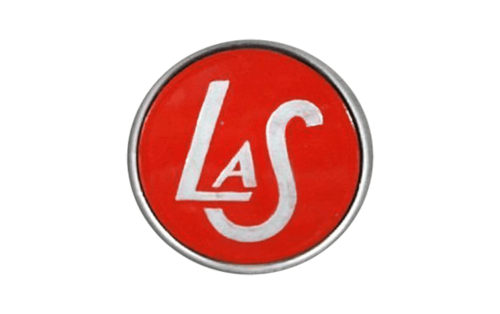
Probably the most popular version was the one where the lettering “LaS” was placed inside a red circle.
All the glyphs had different sizes. The “A” was the smallest, although it had the shape of the capital letter. The “L” was by far larger, while the “S” was the largest glyph. There was some variation in the thickness of the lines in the “A” and “L,” while the “S” had the same thickness throughout its body. The overall effect was pretty stylish and elegant.
The letters were positioned in an artistic way. The “A” was “standing” on the horizontal bar of the “L.” The “S” was moved lower, below the level of the “L,” and then was moved to the left. As a result, the lower end of the “S” was right below the horizontal part of the “L.” Due to this, the monogram became compact and could be squeezed into a smaller circle without sacrificing its legibility.
What is LaSalle
LaSalle automobiles fit somewhere in between Buick and Cadillac. They were introduced by Cadillac, which was the division of General Motors. In its luxury provision, LaSalle was sold for 14 years.
The letters were silver as was the border of the circle. The filling was red, which made the badge visible even at smaller sizes.
Also, you can come across other renditions of the monogram. For instance, models released in late 1920s-early 1930s featured a metal badge without red filling. Here, the glyphs had a very intricate shape, more like a signature. The ends of the letters were intertwined. Some of the examples of this monogram can be seen on LaSalle Series 303 Coupe (1927) and the 1930 Sedan.
Emblem
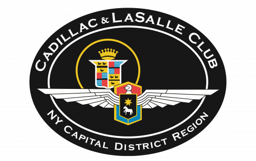
The emblem featured more details. Although it wasn’t as intricate as the crests of medieval knights, it seemed to have been inspired by something of the sort. The elements alluding to the medieval theme are the shield and the head of a knight in full armor.
The highlight of the LaSalle logo is undoubtedly the creature in its very center. We don’t dare call it either a horse or a dog, but it has something similar to both the animals. The head is more like the horse’s head, while the body resembles the dog’s body – at least we have never seen a single horse with such a tail. It may easily be a mythical creature, too.
The star above contributes to the enigmatic impression the animal leaves. You can also see a universal symbol of speed, a pair of wings. Luckily, they don’t belong to the creature, as in this case, its classification would have presented even more of a problem.
Wordmark
The scripted wordmark was widely used in print advertising. Here, the name of the brand was set in a refined script imitating a handwritten word. You can also see it on cars themselves. For instance, the 1936 Roadster had the wordmark written on its wheels. The 1940 Series 52 Special Sedan had it written over the front grill.
Colors and font
The emblem and scripted wordmark were silver and black or white and black. The monogram was either silver and red or just silver. None of the versions of the LaSalle logo used a ready-made typeface.


