

Most of the logos seem quite obvious to us, but only because we see them quite often superficially. But hidden meanings are the most interesting ones. Because they can give you more information about the brand.
Amazon
![]()
This logo is a relatively recent invention of the company with great ambitions. Originally a small bookstore, today it is the largest online trading platform where you can find everything in the literal sense, from “A” to “I”, that is, pardon, “Z”. This is the emphasis in the logo. However, the curved arrow also performs the function of “smile”, because customers are satisfied with the choice and service.
FedEx
![]()
Accuracy and speed are the basis of the brand’s mission. Accuracy and clarity – in clear lines, separation.
Project X Construction
![]()
Just a text with a stylized letter “X”? But the secret is the same as with the previous logo – the same arrow is hidden in it.
1Here There
![]()
Reflections are a very productive topic for the logo. Here it is easy to read both “basic” and “reflected” text. By the way, there is one more secret between the “main” and the “reflected” letter R – the arrow. And this too – about direction, speed and clarity.
Continental
![]()
In the logo of the manufacturer of automotive rubber is the actual wheel. You can see it by looking at the combination of the first two letters of the logo.
Baskin Robbins
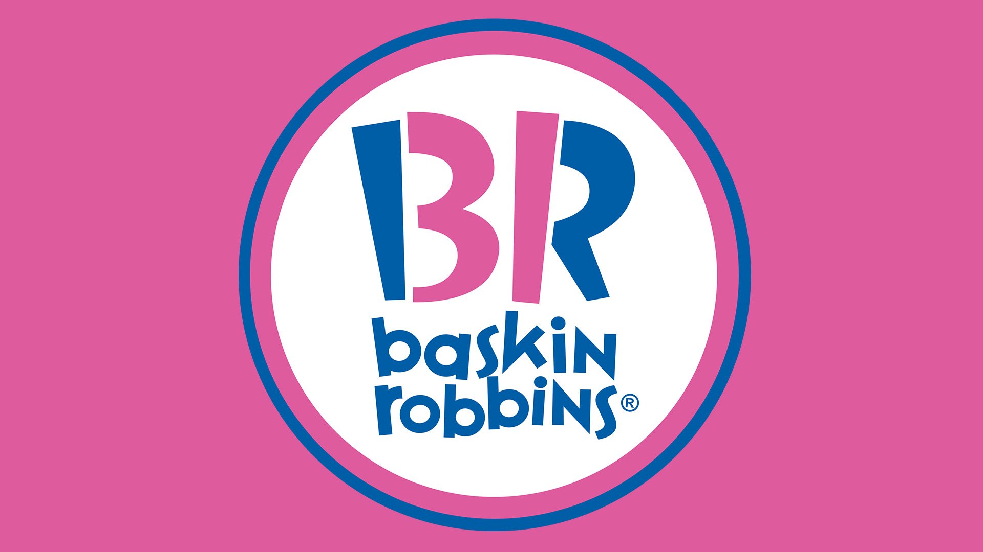
The logo mentions the number of original flavors of ice cream Baskin Robbins, that is, 31. Note that the pink elements in the logo are not at all part of the letters, but quite clearly the figures shown
Toblerone
![]()
Producer of chocolate hides in his logo bear on the background of the mountain – a reference to the Swiss city of Burn, in the arms of which the bear occupies the most honorable place.
Sony Vaio
![]()
The brand of the manufacturer of electronics, in particular, laptops, combined in its logo and the sign of the analog (wave) signal, and the sign of the digital signal (figures 1 and 0).
Eighty-20
![]()
Logo created by people who are familiar with the binary system of calculus. The logo of the consulting agency hides the numbers “80” and “20” written in binary code. Remember? Matrix: 80% of effort yields 20% of the result.
Eight
![]()
The logo is not Greek at all, and not even Arabic. Just at the base of each letter is the number “8”.
Carrefour
![]()
In the two-color picture, an additional letter is hidden. In fact, the title “C”. And not in the colors of the logo, but on the contrary – in the empty space between them.
Roxy
![]()
A lovely heart for lovely ladies – that is how the logo of Roxy can be described. The company specializes in accessories and clothes for women who are engaged in active sports. But, if you look closely, the logo is a mirrored and doubled logo of the parent company, Quiksilver. And that’s true – for charming girls and elegant ladies everything should be at the highest level, doubly.
Unilever
![]()
The only company that managed to fit the icons of commodity groups and environmental principles of the company in their logo. So, among the presented badges there is a bird (pleasure from life, freedom from everyday troubles), percussion arrows (ecological compatibility), heart (love, care), shirt (caring detergents), etc.
Northwest Airlines
![]()
Since the very name “NorthWest” means the north-west, both the capital letters of these directions, and … the compass with the indicated corresponding direction are simultaneously ciphered in the logo. Yes, yes, this little triangle pointing to the northwest of the logo.
Milwaukee Brewers
![]()
The logo of the baseball team contains a glove with a caught ball, and two letters – “M” and “B”.
Hartford Whalers. The first thing that catches your eye is the tail of a blue whale. And, having looked closely, it is easy to see letters – green “W” in the base, and “Н”, hidden in “empty places” between elements.
Tostitos
![]()
Chips and sauce – that’s what can unite people, as the creators of the logo believe. there are two people in the center, separated (or united?) With a cup of red sauce and a potato.
Formula 1
![]()
The most laconic logo, and the most famous of those whose bowels contain hidden additional meanings. This image is also called the “Unit that does not exist.”
Elefont
![]()
Just “E”? Look closely – this is a twisted elephant trunk!
Sun Microsystems
![]()
An amazing design is an ambigram in which you can read “Sun” four times. However, why four times? It should be eight times at least!
NBC
![]()
The US National Broadcasting Corporation has chosen not a flower as its logo, but rather a peacock. Six large feathers (they are the same – 6 main divisions), and the empty place in the center is actually a hidden head. And then to say, to track, “where the head is” (in the Russian language the wording “how the legs grow” is usually used) is not easy in the media sphere.
GreenLabs
![]()
Ordinary tree? No, this is the brain of a person that can be used to solve any, even the most difficult, problems while maintaining the ecological balance on the planet.
Twins
![]()
The main “hidden message” of this logo is the inverted digit “2”, which, as it turns out, can easily replace the letter “N”.
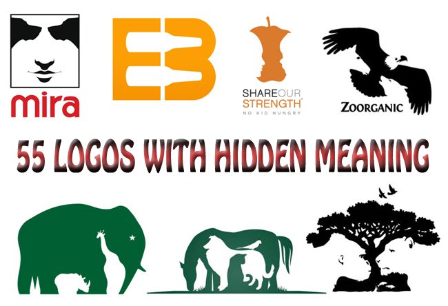
Mira
![]()
Is it a human face, or two dogs nose to nose? Indeed, reflections – this is a very, very productive topic for the creators of logos.
Black Cat
![]()
Initially, the logo looks like a 90-degree turn text. However, paying a little attention to it, gives us an insight to understanding that the letters “C” in both cases are not at all what they seem at first glance. And the fact that we do not see the whole cat, since it’s black.
Hide
![]()
A logo in which creators also played with positives / negatives in the photographic sense of these concepts. The letter “D”, contrary to the initial impression, is not at all small here – it is just a different color.
Helping Hands for Pets
![]()
Combining only two contrasting colors allowed the designers to “fit” into one another a horse, a dog with a bird on its back and a cat. However, this is not about the “death”, but about the helping domestic animals.
Kolner Zoo (Cologne Zoo)
![]()
One of the few world zoos that decided to create their own logo, and even such a bright one. The first, of course, is the elephant. Afterwards you can see a giraffe and a rhinoceros. But only looking closely, we can see also the spiers of the famous pearl of architecture – the Cologne Cathedral.
Pittsburgh Zoo and Aquarium
![]()
The world tree – a baobab or sequoia – with birds flying up above is actually only the first semantic layer of the image. Look closely: there are also two profiles, a gorilla and a leopard. Only here without any territorial binding, unlike the previous logo.
Bones
![]()
Brutality and aggression – that’s what emotionally responds to this logo. And, looking more closely, we notice that literally pieces of “meat” are torn from each letter. Already to the bone.
Two Wolves
![]()
Just a figure? Of course, everything is not so obvious. Indeed, these are the two wolves circling opposite each other.
Cats
![]()
It is clear that the brand specializes in creating products for women (because who else loves cats that much?). And the form of the cat undoubtedly resembles a shoe.
AMAZING
![]()
Logo, which is literally “imprisoned” under the play of words. In fact, it’s a puzzle, where in the place of Maz(e) is painted the same labyrinth (this is how Maze is translated).
A.G. Low Construction
![]()
Here, too, is a labyrinth. That is, not a labyrinth, of course, but an apartment plan, because the company is engaged in the construction of housing. Only in reality this is not a plan or a labyrinth, but rather stylized letters, in which the name of the company AG (at the top) Low (at the bottom) is easily read
Countercurrent
![]()
Where is the opposition, if the logo has four white arrows pointing in the same direction? The secret is that the image is not 4, but 5 arrows. And it is the fifth hidden from the superficial glance and carries in itself the basic semantic load.
Shit Talking
![]()
Logo on the verge of a foul. Hint of swearing, a hint of a toilet inside the “quotes”. In general, provocative and shocking, banter and sarcasm. But at the same time – with the ability to defend against possible charges, because “there is nothing like that” in the logo.
Galant Shoes
![]()
At first glance, a simple system of a monochrome logo on closer examination is much more complicated. There is a capital letter “G”, and a crescent, and a lady’s slipper.
My Fonts
![]()
Surface observation will show the presence of a simple font element. However, take a look – the first two letters actually make up the palm.
Old Drunk
![]()
A funny (or drunk) little man, of course, makes you smile. But he is only the background for a full glass.
Raven
![]()
Three white crows are a perfectly harmonious composition for the logo, right? Especially when we realize that there are actually four of them. And the one that you do not notice at first glance is the most successful one. After all, the logo is owned by a financial company.
Lion Bird
![]()
Judging by the name, the image is a lion. But at the same time – and a bird. For the lion is the king of beasts (and the company pretends to this title), and the bird is able to rise to unprecedented heights (again, like a company).
Zoorganic
![]()
The logo on which the eagle flipped its wings. But under his wing is hidden the image of the howling wolf. And also – horses.
Strength
![]()
A bite. Of course, it’s not like Apple, but, after looking closely, you can see two human profiles.
Oak Bros
![]()
Figure sheet, occupying the entire space of the logo. But there are three human busts in it, as if three people are looking at you from above, from entering the parallel world, which resemble a leaf to you.
Hidden Cork
![]()
The glass, created with the help of two stylized letters – “stacked on the back” h and C. After all, the main thing is not to spill the delicious contents.
Safehands
![]()
The Shadow Theater is the perfect backbone of the logo. Yes, it is a dollar sign in a white circle. Yes, it’s the letter “S”, the capital letter of the brand name. But also these are the two hands that form this image. For success can only be achieved through joint efforts.
Hands up
![]()
Just one small circle, added to the font – and now in the text appeared a little man with his hands up in the air.
Mother
![]()
The secret of the logo is the uneven letter “M” at the beginning of the word. Take a closer look – these are small and big person holding their hands.
The Installers
![]()
The manufacturer of building structures opaquely hints at their activities. After all, the “I” in the central part of the logo is the swinging doors. Of course, into a happy future.
British Telecom
![]()
Dancing man? In reality, everything is more complicated. The logo depicts two people (precisely for the creation of such an effect – two colors), one of which is raised to the ear symbolizes the hearing, the second – the trumpeter in the pipe – the transfer of information. Of course, this is the company’s logo.
Embrace Beer
![]()
And a little more about beverages. The image contains the letters “E” and “B” (initials of the company), and – two horizontally laid bottles. Bottles of beer of course, since it’s a beer company.
I Hate You
![]()
A direct example of how an image may conflict is the text encoded inside it. It’s not the heart that is in the center of the logo, but the letters “Hate” laid out in a special way. And now the logo has acquired a diametrically opposite meaning.
Epirate
![]()
The classic pirate flag received a new reading. Now instead of the skull – the letter “e” (one-eyed pirate is still a pretty powerful image), instead of bones – crossed swords. In general, like time like pirates.
Truce
![]()
Write a brand twice, with contrasting colors? Yes, of course, there are plenty of such samples. But only Truce guessed that the second spelling could be upside down. And so, of course it emphasizes the main font, shades it. It turns out both voluminously and creatively.
ELECTRIC
![]()
“Just” font name of the brand. Almost. Only here through the whole logo stretches the cord, which passes in the letter “E” into the socket. Universal logo for the creator of a variety of electricians.
Of course, logos with hidden meanings are much greater. But, you see, the search for additional meanings allows the client to at least partially take the initiative into their own hands. And the information component in such branded images is much more important. And even before reading the brand name, we can already imagine who we are dealing with.


