

![]() Roxy Logo PNG
Roxy Logo PNG
The Roxy logo reflects the fact that it is the women’s version of the Quiksilver brand. From the one hand, there is a clear link with Quiksilver, from the other hand, the logotype has a noticeable feminine touch.
Meaning and history
![]()
The history of the Roxy brand started in 1990. The line suffered badly from the surf industry crash in 1991, so it was very likely that it would actually disappear altogether. However, as soon as in 1992 the line was revived by Bob McKnight and Danny Kwock. There are two explanations for the choice of the name for the brand. Firstly, the word “Roxy” brought to mind a punk band or club. In addition to this, both Alan Green (Quicksilver founder) and the company’s CEO Bob McKnight had daughters called Roxy.
What is Roxy?
Roxy is a women’s clothing line by Quiksilver, which was founded in 1990. The brand presents clothing designed for active lifestyles and extreme sports. The first collection of the brand was a line of clothing for swimming and surfing. Today Roxy has a wide range of sports activities covered and has its clothes distributed all over the globe.
![]()
Quiksilver symbol
To understand the Roxy logo, it is necessary to discuss the logotype used by its sister brand, Quiksilver. The Quiksilver logo includes two parts: a cresting wave and a snow-capped mountain. The inspiration behind this image came from the traditional Japanese technique called woodblock printing. The logo resembles a rather well-known woodcut depicting a typhoon wave and the Mount Fuji.
The high mountain is used as a symbol of excellence and authenticity. Also, the wave represents surfing, while the mountain represents snowboarding, the two activities where Quiksilver products are often used.
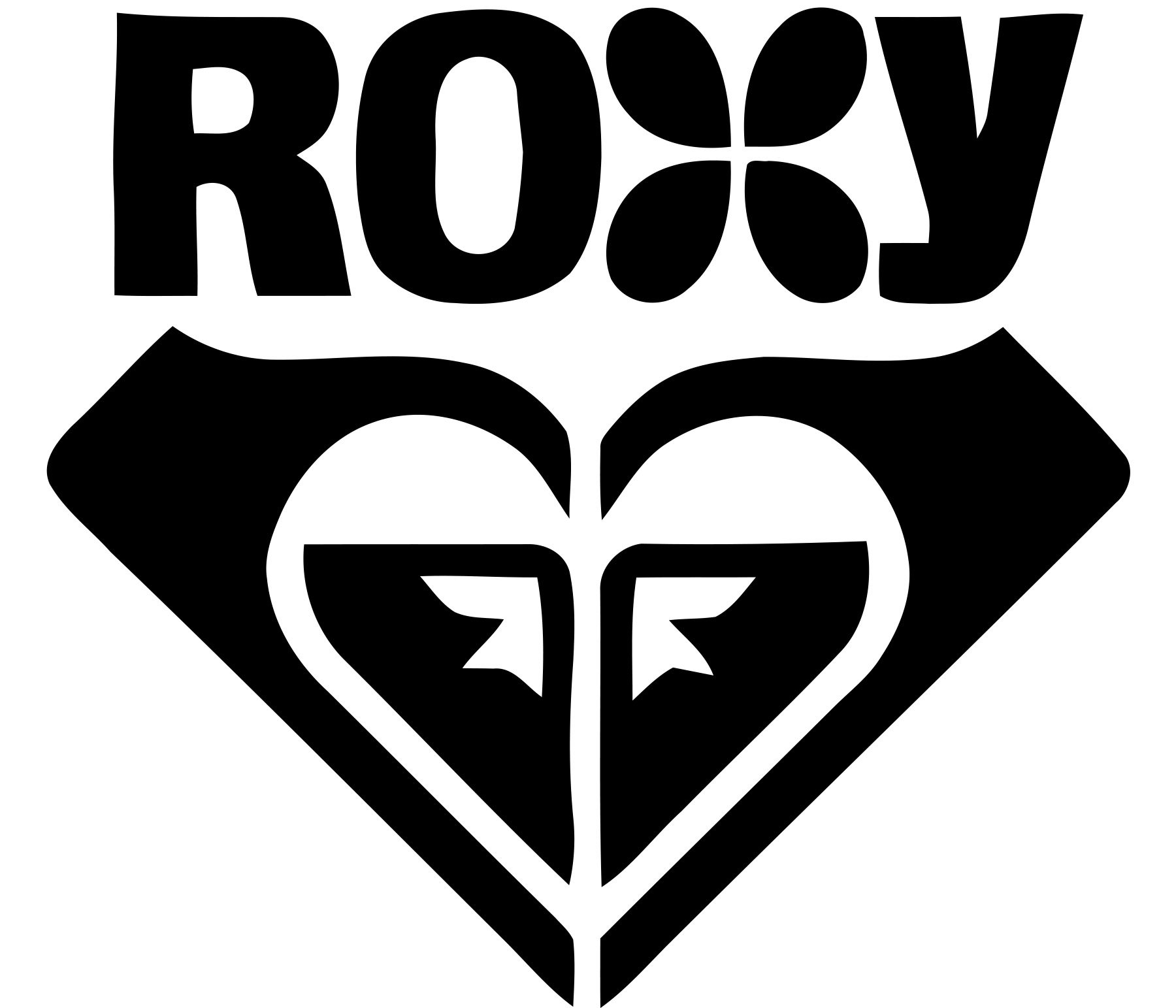
Emblem
At first glance the Roxy logo may look like just a stylized depiction of a heart. However, if you take a closer look, you will notice that it is not that simple. The heart is created by two copies of the Quiksilver emblem (one standard, the other one reflected), positioned next to each other. The unusual approach manages to make a link with Roxy’s parent brand and at the same time create a unique and romantic image appealing to women.
Font
![]()
The typeface used for the Roxy logo is soft and simple. The letters are lowercased and italicized. The wordmark does not look unique, yet it has a distinctive feature: the distance between the characters is somewhat longer than usual. Alternative version of the logo features an all-cap sans-serif font, which is not italicized.
Color
![]()
The emblem is given in the magenta color, creating a bright, girlish mood. Next to it, the grey wordmark may look not so noticeable, yet it is stylish and elegant. Alternatively, the logo may be given in black and white. There is also a version of the logo where the blue emblem is given against the white background.


