“31” has long been a sacred number for Baskin Robbins. While older logos explicitly showcased it, the current one has it hidden in a way that many people don’t even notice it. What does “31” mean and how can you notice it on the current logo? Read on to find out.
Meaning and history
The history of Baskin-Robbins traces its roots to 1945 when Burt Baskin opened his Burton’s Ice Cream Shop in Glendale, California. A year later, his brother-in-law Irv Robbins founded another ice cream parlor, this time in Pasadena. Two more years later, the brothers-in-law joined forces. Although they closely collaborated, each of them still worked under his own brand during the following several years.
What is Baskin-Robbins?
Baskin-Robbins is the name of the world’s most popular brand of ice cream, which was established in the United stayed in 1945, and today has more than seven thousand locations across the globe.
1953 – 1980
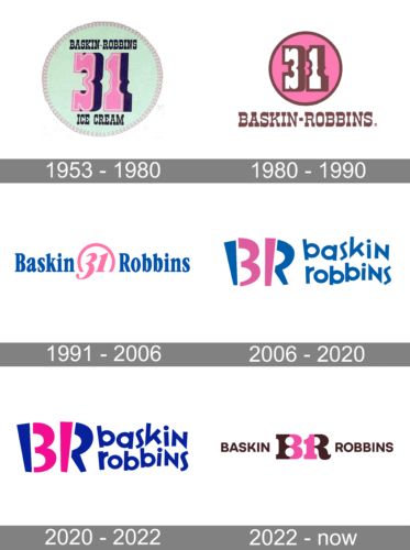
It was only in 1953 that they opted for uniform brand identity – the advice received from the local advertising firm Carson-Roberts, which later became part of Ogilvy & Mather. The agency also created the slogan “31 flavors,” which is supposed to represent a flavor each day, and the earliest Baskin Robbins logo. The logo consisted of a light minty green round background with stitching around the border. The pink number “31” took the main place in the logo. “Baskin-Robins” was printed above it and “Ice Cream” below. Both inscriptions used the same font and had a very dark blue color, just like the shadow behind the number. The logo had a very welcoming and friendly appearance.
1980 – 1990
The pink color is associated with something happy, sweet, and playful. Thus, it is not surprising that the company chose it as the main color for the round base. The latter now held only the number “31” which was done in white and had a brown shadow and outline. The name was placed underneath, while the “Ice Cream” part was removed altogether. The company used the same font that featured high-contrast strokes. The use of the same font, number, and round element made the logo very recognizable.
1991 – 2006
 The second emblem, which was adopted in 1991, preserved the number “31” as its core but merged it more effectively with the wordmark by placing the words “Baskin” and “Robbins” to the left and to the right from the number respectively. Also, the color scheme now included only two colors, pink and blue.
2006 – 2020
The new logo was introduced as part of an entire brand refresh. While a flavor for each day of the month used to be an impressive offer in the 1950s, it can hardly surprise anyone today. Interestingly enough, the company has introduced over 1,000 flavors since 1945. And yet, the ice cream chain decided to preserve the iconic number as part of its identity.
So, the authors of the logo still placed the figures “3” and “1” at the center of the emblem, but made them less prominent – in fact, you can hardly notice them unless you know where to look. Just pay attention at the pink parts of the letters “B” and “R” and you’ll see “31.” The wordmark in lowercase letters can be seen below.
2020 – 2022
The 2020 version is just marginally different from the predecessor. Namely, they made the color scheme more saturated and slightly darker.
2022 – Today
 The redesign of 2022 is a tribute to the original Baskin Robbins logo, created in 1947. The chocolate and pink color palette of the initial badge was slightly deepened and strengthened, and the style was modernized, but you still can see the resemblance between the two emblems. The rethought badge of the band today features a bold and elegant “BR” monogram in brown, with the internal parts colored pink and looking like the “31”. On the sides of the monogram the full logotype is set in brown capitals of a modern yet simple sans-serif typeface, “Baskin” on the left, and “Robbins” — on the right.
Font
 The Baskin Robbins new logo features a type bearing a striking resemblance to the commercial font called Variex Regular. The unusual zig-zag letters create a playful and happy mood.
Colors
 Pink has been an essential part of the brand identity ever since the Baskin Robbins logo history started in 1953. While blue was added in 1991, the current logo brought about slightly different shades.
What is the meaning of the Baskin Robbins logo?
The Basking Robins logo is pretty obvious and direct. It is composed of a stylized “BR” abbreviation in brown, with pink elements on the letters, forming the “31” number, which represents the variety of Baskin Robins flavors, 31 — one for each day of a month. The full name of the brand is written on the sides of the monogram, in solid brown capitals of a clean sans-serif font.
Why is the Baskin Robbins logo pink and blue?
The warm and bright color palette of Baskin Robins’s visual identity is composed of brown and pink, friendly and “tasty” shades. Pink was on the logo of the brand since the very beginning, and initially was placed there to represent a cherry, but now Baskin Robins has more than just a cherry taste to offer to its customers, and one of the most popular is the chocolate flavor, which is represented by the second shade of the BR color palette, dark brown.
Why is there a 31 in the Baskin Robbins logo?
The number “31” is very important and symbolic for the brand, as it first appeared on the Baskin Robbins badge at the beginning of the 1959s. It was placed there by the creators of the logo, Carson-Roberts Advertising agency, which made it to symbolize the number of ice-cream flavors in the Baskin Robbins portfolio. Since then the number of Rama’s yes has increased, but the “31” remained untouched.
What are the 31 flavors at Baskin Robbins?
The assortment of the Baskin Robbins ice-creams includes much more than 32 flavors, but this number has been a part of the company’s marketing strategies since the beginning of the 1950s when the brand really offered just 31 flavors to its customers.
What does the Baskin Robbins Logo symbolize?
The main meaning behind the Baskin Robbins badge is taste and joy. The simple elements in the logo enhance the mood and sense of warmth due to the used color palette and thick lines, which evoke a very cozy feeling and promise intense flavors and enjoyment. As for the “31” element of the logo, it stands for the variety of ice-cream flavors, which you can change every day — 31 flavors for 31 days of a month.
Did Baskin-Robbins change the logo?
The logo of the Baskin Robbins ice cream brand was changed several times throughout the years, with the latest redesign taking place in 2022. Although, all of the versions featured the “31” number and the name of the company as two main elements. Another thing, that also has always been a part of the badge is the pink color, which represents love, warmth, and sweetness.
Who created the Baskin-Robbins logo?
The original version of the Baskin Robbins logo, along with the iconic idea of the “31” number inscribed into the badge, was created at the end of the 1940s by the American Carson-Roberts design bureau. The company has not only designed the logo for the brand but has also made up the whole advertising concept and marketing strategy for the company.
How did Baskin-Robbins get its logo?
The original badge of the Baskin Robbins brand was created in 1947 by the American marketing agency Carson-Roberts. It was the idea of the designers to hide the number “31” in the stylized abbreviation with the two letters of the company’s name. The number was placed on the badge as a symbol for the rich flavors assortment, which was supposed to mean “one flavor for one day of a month”.
Why did Baskin-Robbins change the logo?
The logo redesign of 2022, held by the Baskin Robbins brand, was meant to represent the growth of the company, and its ability to change in line with modern trends and tendencies. The redesign of the badge has kept the main elements of the concept but introduced them in a refined refreshed way, r electing a powerful company.


