

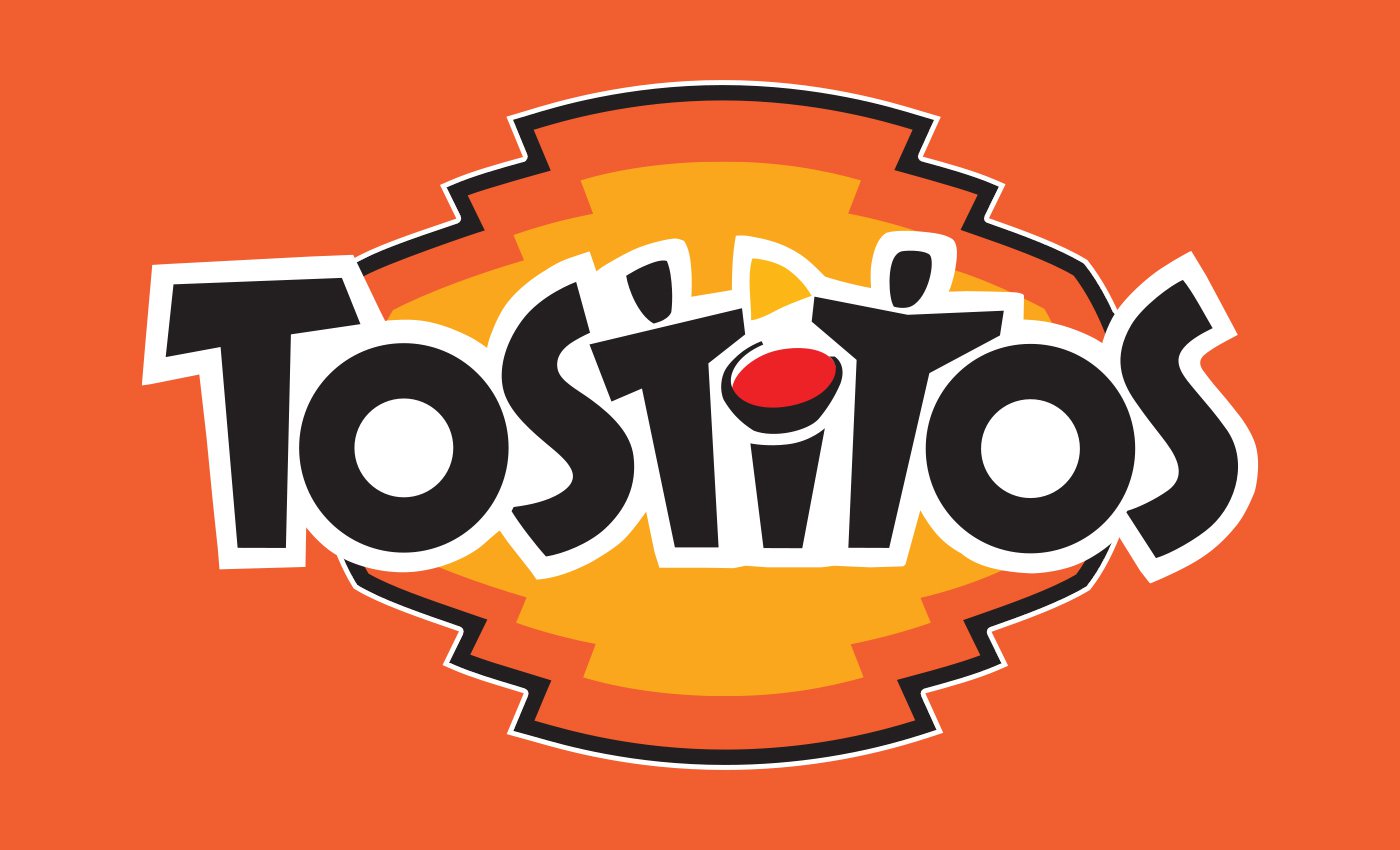
![]() Tostitos Logo PNG
Tostitos Logo PNG
Since its debut in 1979, the Tostitos logo has gone the way from a rather generic wordmark to an inviting emblem with a secret symbolism.
Meaning and history
![]()
The Tostitos visual identity hasn’t changed much since the date of its introduction. All the redesigns of its logo were more refinements and modifications, as the style and character were set in the very beginning.
1979 — 1985
![]()
The original Tostitos logo was created in 1979 and stayed with the brand for almost six years. It was a simple yet bold and memorable black inscription in a title case with the dot above the “I” in red. The wordmark was executed in a custom font with extra thick lines and thin sharp serifs.
1985 — 2003
![]()
The logo, introduced in 1985, featured a new typeface, though the color palette and composition remained the same — black lettering with a red dot. The new font was sans-serif and had both letters “S” slightly enlarged and stretched vertically.
2003 — 2012
![]()
In 2003 the wordmark got the inclination and was placed in a yellow and orange figure background. The red dot above the “I” was now complemented by a yellow triangle, so the icon started looking like the chips and the sauce. There were also small black accents added above two letters “T” in the middle of the word, looking like two people eating the chips.
The black inscription in a sleek and modern sans-serif was outlined in white and looked stylish and progressive, and the renewed color palette made the whole logo bright and recognizable.
2012 — Today
![]()
The redesign of 2012 simplified the Tostitos logo, though kept the “two men with chips and sauce” theme as the main one. The black inscription was set in one straight line, with all the letters slightly inclined to different sides. The first “T” and the last “S” of the wordmark are enlarged, creating a kind of frame for the composition.
The “I” with a red oval and yellow triangle got its contours refined and became a bit shorter and smoother. The stylized letters “T” have their bars a bit diagonal, so that it looks like people are stretching their hands to get the chips.
The 2003 symbol
This wordmark was a breakthrough. It was the first time that the logo acquired hidden symbolism. The “t’s” in the middle resembled people sharing a tortilla chip, while the dot above the “i” was a bowl of salsa. Behind the wordmark, a mouth-watering chip with an orange crust was placed.
The 2012 emblem
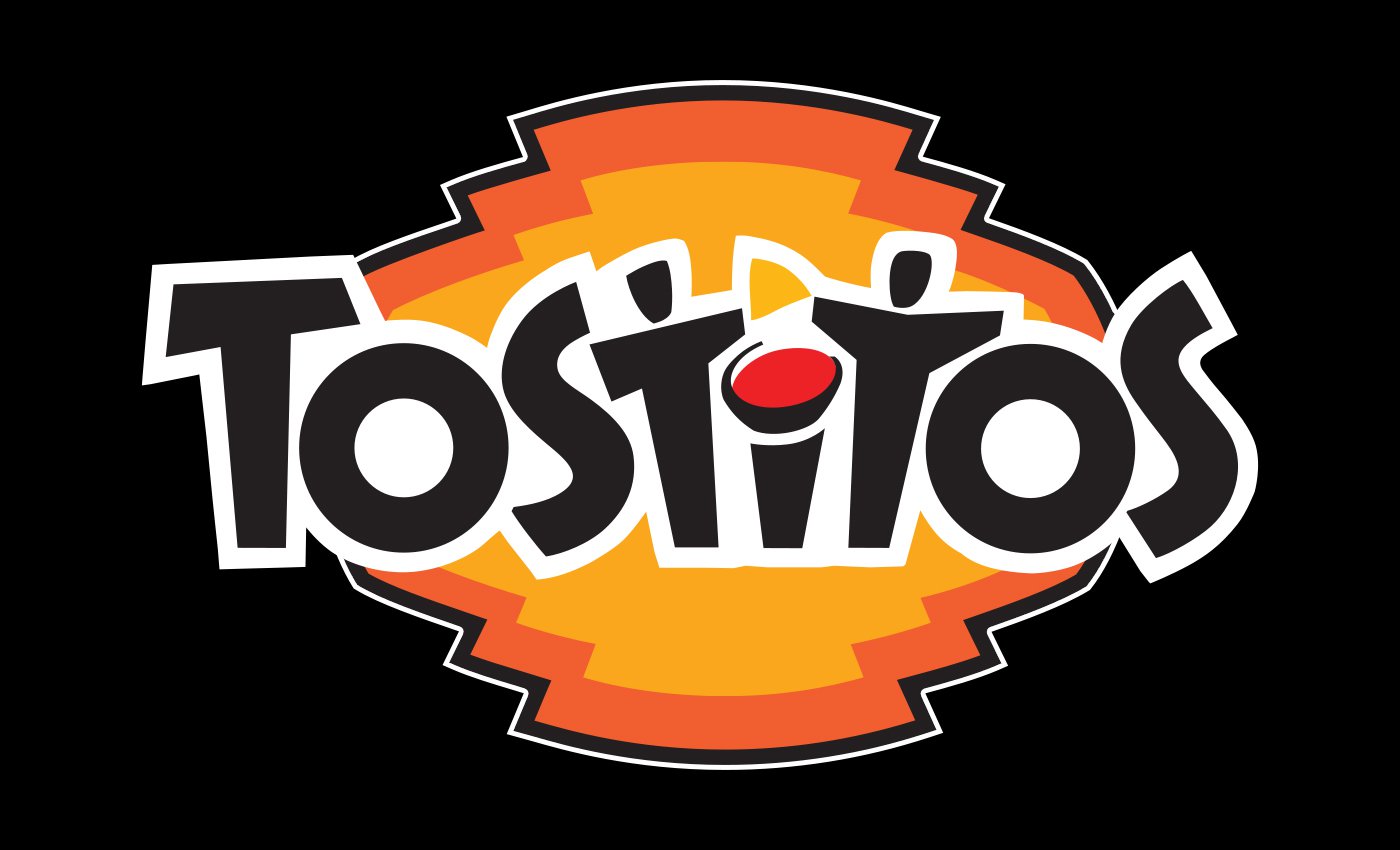
At the end of the fall 2012, Tostitos products in new packaging started to appear, where an updated logo could be seen. The highlight of the previous emblem, the people with a tortilla chip between them, is still present in the current version, although in a slightly updated design. Now, they form a mirror reflection of one another. The chip between them has shifted slightly, while the “i” has been simplified. As a result, the two sides of the central part of the logo are symmetrical to one another. Moreover, one more hidden meaning has emerged here, in addition to the one mentioned above. Now, this part of the logo resembles a cute smiling muzzle of a raccoon. The dots above the “t’s” are the raccoon’s eyes, while the circle above the “i” is the nose.
In spite of the new hidden meaning, the logo looks cleaner than its predecessor. The orange-and-yellow chip behind the wordmark disappeared, while the design of each letter has been modified.
Font
![]()
In addition to the unique look, the custom type featured in the Tostitos logo has a hidden symbolism. For instance, the horizontal bar above the first “T” has an upward direction and, as the result of it, a more optimistic feel.
Color
![]()
The main colors are black, red, and yellow, while white serves as the background.
What does the Tostitos logo symbolize?
Tostitos, a popular brand of chips and salsa sauce, has some funny images hidden in the design. The letters “T” in the Tostitos logo represent two people enjoying chips (yellow triangle) and salsa (red circle) at a high bar table. This design reflects the fun of parties where Tostitos snacks are often used. Apart from that, the bold black characters symbolize professionalism and stability of the brand and its confidence on the market.
What does the Tostitos logo represent?
Apart from the bold name of the brand, the Tostitos logo also represents the brand’s main products — chips and salsas. Inside the Tostitos logo, you can also find the main purpose of the brand, which is to make the friends and families gatherings warmer and happier. It is shown by the two “T’s” that look like people holding tortilla chips together, ready to dip them into a bowl of salsa, represented by a red dot above the “I”.
How did Tostitos get its name?
As Tostitos brand was introduced about a decade after its twin brother, Doritos, the Frito-Lay company decided to name it as close to Doritos as possible, to create positive associations for the customers. Plus, the Tostitos name evoke an image of something crispy and tasty.
How was the Tostitos logo created?
The original Tostitos logo, introduced in 1979, was pretty far in its concept from the iconic badge the whole world knows today. It was a simple black lettering with the red dot above the “I”, and nothing else. Only in 2003 the two “T”s turned into two persons, and a yellow triangle appeared above the red dot, making it look logical and showing it as a tortilla chips and red salsa. Since then, the badge was redesigned just once, in 2012.
What is Tostitos slogan?
The bright “get together” visual identity of the Tostitos brand is complemented by the slogan, which supports the initial idea of the logo. It is “Bring The Party”, a very friendly and light motto, which creates the right atmosphere and shows the brand’s purpose better than anything else.
What is the meaning of the Tostitos logo?
In the confident black lettering on the Tostitos badge you can find two schematic people — the two letters “T” — standing near the bar table (the “I”) with a red circle of a salsa bowl above it and a yellow triangle of a tortilla chips. This is how the brand shows its range of products, which includes chips and sauces, and the idea of bringing people together.
How old is the Tostitos brand?
The Tostitos brand was introduced by the American Frito-Lay company in 1979, as a friendly competitor to its brother brand Doritos, which was created in the 1960s, and by the time of the Tostitos birth has already became extremely popular not only in the United States, but internationally.


