

![]() FedEx Logo PNG
FedEx Logo PNG
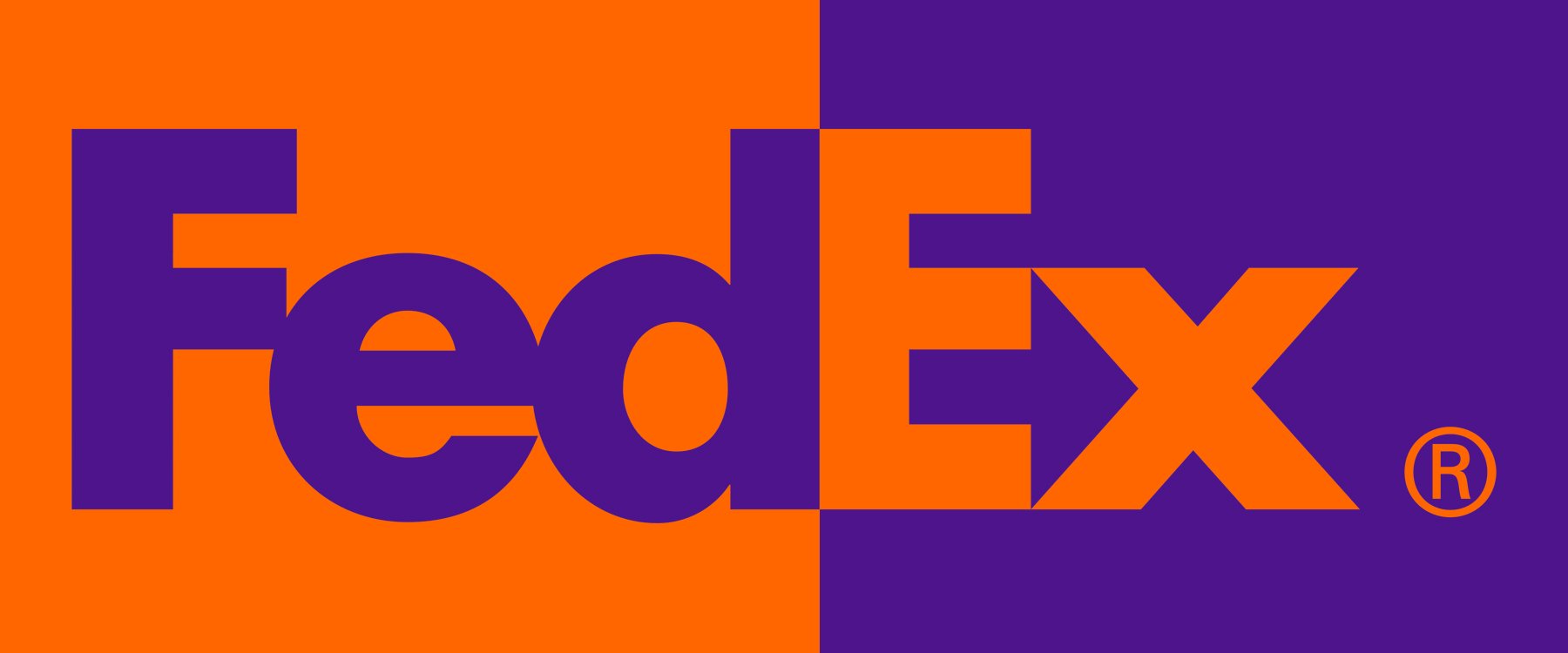
The FedEx logo has been known as one of the most commercially successful examples of the use of negative space. Due to the white arrow that can be noticed between the letters “E” and “X”, the logo has received more than 40 design awards. Also, it was mentioned in the top-10 best emblems by Rolling Stone magazine.
What is the symbol of the FedEx corporation?
The symbol of FedEx is its iconic title case logotype in orange and purple, which is considered to be one of the greatest logos ever created. The main thing about the badge of the company is a white arrow, pointing to the right, formed by the negative space between the letters “E” and “X”, showing the essence of the company and evoking a sense of motion.
Meaning and history
![]()
The logo of the US delivery services company FedEx is best known for the white arrow “hidden” between the “E” and “X.” Due to this simple element, it started a new era in design.
1973 – 1994
![]()
The earliest FedEx logo reflected the company’s original name, Federal Express. The main reason why Fred Smith, the founder, chose this name was that he wanted to get the Federal Reserve Bank as a customer. Also, he supposed that the word “federal” could give some weight to the company emphasizing patriotism and the desire to contribute to the country’s economy.
The logo was a rectangle broken down into two fields by a diagonal line. The top field was purple, while the lower field was orange.
Along the line, the name of the brand could be seen, with the word “Federal” in white over the purple background and the word “Express” in orange over the white background. We should add that there was some playing around with the palette: you could come across a version where a rather dark and muted shade of purple was paired with an active orange or a version where purple was very bright and almost blue, while the word “Express” was close to burgundy.
1991 – 1994
![]()
With the purchase of the Flying Tigers network, Federal Express turned into the largest full-service, all-cargo airline delivering to over twenty countries.
The new status made it crystal clear the company needed a brand identity update. One of its parts was the new, shorter name, while the new FedEx logo was another essential part.
Between the original logo and the iconic “white arrow” wordmark, the company went through a three-year period of using a transitional version combining the elements of both of them. On the one hand, it already featured the shortened name and didn’t have the rectangle, which made it similar to the “white arrow” version. On the other hand, the designers stuck to the orange-plus-purple palette and the rounded type similar to the original emblem. What’s even more important, there was no white arrow yet.
The diagonal theme disappeared leaving nothing but the name of the company on the white surface. While this logo wasn’t very impressive, it could be regarded as a transitional one. It made it easier for the customers to recognize the following logo and created a link between the new logo and the brand they were already familiar with.
1994 – Today
![]()
The legendary “white arrow” logo was created by Lindon Leader. Back then, he worked in the Landor Associates brand consultancy as the senior design director. Leader’s preference for clean, neat designs was greatly influenced by the 1980s catalogs of Smith & Hawken, one of the most popular garden lifestyle brands of its time.
On the one hand, many clients liked his minimalist designs including not less than 30% whitespace. On the other hand, when Leader showed his work to clients, he often heard one and the same question: “Isn’t there a way we can make the white space work?”
When trying to resolve this problem, Leader came across the logo Northwest Orient Airlines used. Here, you could see two letters, “N” and “W,” combined into a single glyph with the help of negative space.
We should add, though, that the “aha” moment leading to the creation of the successful FedEx logo was prepared by lots of hours of hard work and experimenting. According to FedEx, three design teams were working on the new visual brand identity, while the number of versions was more than two hundred.
Who designed the FedEx logo?
One of the most iconic logo designs in history, the FedEx insignia, was created by Landor Associated design bureau in 1994, the world’s leading company in branding. Landor Associates was established in 1941 and has created several truly unique and legendary visual identity concepts for various brands.
Many of them featured arrows as a symbol of movement and progress, and of course, the symbol of what FedEx does. However, none of the arrows was formed by the negative space, like in the Leader’s version. When Leader introduced his design, the majority of the company’s senior executives and designers working on the task did not notice the hidden arrow. Among those who did notice it was Fred Smith, the CEO, and the global brand manager.
To squeeze the arrow, Leader had to use two fonts, Univers 67 and Futura Bold. The palette combined the colors from the original logos.
Today, lots of logos use negative space. Back then, it was a revolutionary approach, due to which the FedEx logo has won over 40 awards worldwide.
Current emblem
The second version of the emblem was presented in April, 1994. It was created by Lindon Leader, the senior design director of the brand consultancy Landor Associates.
![]()
As a designer, Lindon admired negative space and its incredible possibilities. His love for things clear and elegant was closely connected with his interest in the Smith & Hawken catalogs of the 1980s. Presenting his simple, clean designs with 30-40% whitespace, he often had to face criticism from his clients. “Can’t we make use of the space?” they would ask.
![]()
One of the logos he admired was Northwest Orient Airlines. Here, in addition to the clearly visible “N” it was also possible to notice a “W”, which was created due to the successful use of negative space. In addition to it, the picture could be interpreted as a compass with a little negative tick, pointing northwest. Lindon decided to use the same approach in the design of the FedEx logo.
What is the hidden symbol in the FedEx logo?
The laconic and modest FedEx logo, based on the sans-serif lettering in two colors, purple and red, has a truly unique hidden element in its design. The negative space between the “E” and “X” forms a white arrow pointing to the right, as a reflection of the company’s purpose and essence and a symbol of movement and progress.
How was the symbol created?
At the time, the company was still called Federal Express, but the CEO, Fred Smith, agreed to change the name of the brand. There were two or three teams working on the logo, over 200 versions were created. Quite a few of them comprised arrows, but none were hidden.
![]()
Interestingly enough, most designers as well as FedEx’s senior executives did not even notice the hidden arrow, while Fred Smith and the global brand manager were among the few people who did spot it.
Font
![]()
The typeface is a customized mix of the two fonts: Univers 67 and Futura Bold. Lindon Leader recalls that in the 1990s these were his favorite typefaces. He experimented a lot with both, changing the distance between the letters, using uppercase and lowercase letters.
![]()
At one point, he noticed a negative arrow appearing between the “E” and the “X”. Lindon tried a lot of modifications of both the fonts, but could not create a version in which the arrow looked the way it should. At last, he decided to mix the two fonts. So, he used the “X” from Univers 67 and blended it with the stroke of Futura Bold. As a result of the following modifications, a completely new letterform was created.
Color
![]()
Bright and eye-catching in themselves, the combinations of colors used in different versions of the logo identify the part of the company the logo belongs to. For instance, if the letters “Ex” are orange, then the logo refers to FedEx express, a green “Ex” refers to FedEx Ground, while a red “Ex” refers to FedEx Freight. The other two operating units use a blue “Ex” (Office) and a yellow “Ex” (Trade Networks).
What is the meaning behind the FedEx logo?
The iconic FedEx logo stands for the high quality of the company’s services, specifically, the speed and accuracy of delivery, which is depicted in the white arrow, formed in the negative space between the letters “E” and “X”. The badge also represents energy and confidence with the help of the shape of the characters and the color palette.
What is the hidden symbol in the FedEx logo?
There is no secret anymore that the FedEx logo is not as simple as it might seem. The stable geometric sans-serif lettering from the badge of the company contains a hidden symbol — a white arrow pointing to the right, placed in the negative space between the “E” and “X”, the two letters, standing for the “Express”.
What do FedEx colors mean?
The color palette of the FedEx visual identity is composed of purple and orange, where purple stands for stability and professionalism, and orange is the color of energy, motion, and speed. Hence, the combination of shades in the FedEx badge represents the company as a reliable and professional one, and its delivery services as fast and accurate.
What type of logo is the FedEx logo?
The FedEx logo is the wordmark, but considering it has a hidden graphical element in the lettering, we can also refer to the FedEx badge as a combination type of the logo, which means it has both the wordmark and graphics in it.


