

![]() xHamster Logo PNG
xHamster Logo PNG
With more than 10 million users, xHamster is known as one of the most popular websites on the Internet. It was established in 2007 and used the same logo for almost a decade. The xHamster logo update, which took place in 2016, resulted in a simpler, yet more emotionally charged look. The logo uses an animal, similar to the Playboy and Puma logos.
Meaning and history
![]()
xHamster was inaugurated into the digital world by a group of entrepreneurs in 2007, marking the start of an enterprise that would grow to become one of the most recognizable names in its sector. From its inception, the company aimed to offer a platform that differentiated itself through a user-centric approach, focusing on accessibility and a wide range of content.
Throughout its journey, xHamster has been likened to a chameleon, much like the iconic Lacoste logo, for its ability to adapt and evolve within the ever-changing digital landscape. Its achievements include significant strides in content personalization and user engagement, setting industry standards that many strive to emulate. The company has also shown a commitment to wildlife conservation, subtly aligning with the values represented by the WWF panda logo, by engaging in various awareness campaigns and philanthropic efforts.
Moreover, just as Bacardi, with its bat emblem, has become synonymous with innovation in the beverage industry, xHamster has pioneered developments in its sector, leading to significant achievements. These include advanced user interface designs, privacy protection measures, and community engagement strategies that have set industry standards.
Today, xHamster occupies a prominent position in the adult entertainment industry, boasting a vast library of content and a global user base. Its commitment to innovation, user safety, and content diversity continues to define its current standing, making it a pivotal player in the digital content arena.
Quite a few people have been wondering why a website would have chosen a hamster for a mascot. According to a company representative, there were several reasons for this.
To begin with, they were looking for an animal that would be “funny, friendly, and catchy.” As a result of some preliminary work, they chose three animals: a mole, a fox, and a frog. The fox mascot, like Mozilla Firefox, seemed to have a fair chance of success due to the clear association with the word “foxy.” And yet, eventually, the team opted for a hamster.
For one, this option didn’t seem as obvious as a fox. According to the company spokesperson, these animals are “hilarious and adorable,” “cute, fluffy.” He also mentioned such characteristics of hamsters as their passion for collecting and sexual energy. To end up, they are the creatures that are exceptionally pleasant to touch.
2007 – 2016
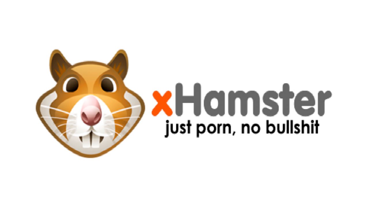
The original xHamster logo, like the current one, consisted of two elements: a hamster’s muzzle (on the left) and the name of the website (on the right). The muzzle featured several shades of yellow and brown, as well as white and black nuances. The first letter of the wordmark was red, while all the other letters were black.
2016 – now
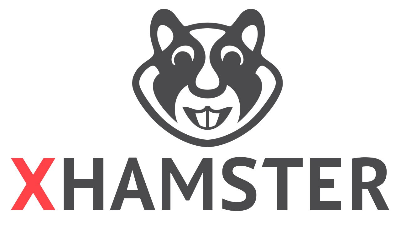
The most obvious thing is that the palette has become by far simpler – nothing but black, white, and red has been left. The muzzle and its expression have been modified, too. While the teeth used to be rather prominent on the original logo, they stand out even more on the updated one. The eyes and corners of the mouth are drawn in a way that the creature appears to be smiling. On the whole, the current hamster has a tricky face. In comparison with it, the muzzle of the previous hamster had a rather blank expression.
What about the typographic part of the logo? The wordmark has become much better legible. For one, all the letters have been capitalized. Also, the type itself has grown simpler.
According to Alexander Hawkins, the company’s Chief Marketing Officer, the new logo is “simple but sexy.” He doesn’t cite any other reasons for the update than just the desire “to become even better.”
Font
![]()
The original type appears a bit friendlier due to its plump and rounded glyphs. The current one looks more angular in its shape and neutral from the emotional point of view. It doesn’t seem as inviting as its predecessor. One of the reasons for the update could have been that the design team was trying to make the wordmark better legible. Also, it’s possible that the angular shapes better fit modern beauty standards.
Colors
While the original palette was rather realistic, the current xHamster logo provides better contrast. When the hamster is given in black and white, it looks more like a logo than just a drawing. The company’s design team, however, didn’t dare to change the color scheme completely, so they left the red “X” as it was to create a visual link between the old and new logos.


