

![]() Monster Jam Logo PNG
Monster Jam Logo PNG
Monster Truck is a giant on wheels, capable of crushing a van and doing somersaults in the air at a height of 10 feet. The Monster Jam competition includes off-road Monster Truck racing, jumping over obstacles made from the bodies of old cars, and acrobatic stunts. Driving on the rear wheels through the rows of already crushed cars and jumping with a 360-degree flip is particularly beloved by the public. These cars don’t have real doors and visibility isn’t that great. The elevated driver’s seat makes it difficult to see directly below it. Therefore, for safety reasons, there are radio operators on the show who can turn off the Monster Truck engine if something goes wrong. Other precautions include drivers being required to wear two fireproof suits, a helmet, seat belts, and neck protection.
Meaning and History
![]()
From humble beginnings to a global phenomenon showcased in over 30 countries, the story behind Monster Jam is almost as incredible as the stunts performed during the competition. The first Bigfoot appeared in 1979, when Bob Chandler presented his original monster truck, known as the “Bigfoot”, to the general public. In 1981, he made a video of his Bigfoot crushing old cars. The footage was seen by a racing promoter who came up with the idea of showing a Monster Truck destroying old cars for the entertainment of the crowd. In 1983, Ford made a decent investment as a sponsorship of the BigFoot project. Soon rules appeared and full-fledged Monster Truck races began to be held, a kind of drag racing with obstacles. It was not until 2001 that these were called Monster Jam.
What is Monster Jam?
More than 4 million people attend Monster Jam events in North America, Canada, and Europe every year. Winners in Monster Truck competitions are determined by scores in various activities. Games like this are incredibly addictive, and it’s not just about sheer speed.
1991 – 1992
![]()
The emblem created for the first competition looked futuristic thanks to a very interesting choice of font. There was no rhyme or reason for the placement of the letters or the way they were printed. The main thing that united all the letters was the spikes at the ends of the strokes. The golden metallic color enhanced the striking effect of the inscription placed on a blue billboard. The logo told the viewer to expect the unexpected.
1993 – 1997
![]()
The new logo was created when SRO/Pace acquired the show and gave it a new name. The inscription was just as bold and also printed in two lines. The letters were now placed in one line and spaced very closely. The powerful and strong look was boosted with the use of thick strokes. Other elements, such as a lightning bolt that was coming from the “M” and underlining the word “Monster” and the metallic color of the letters, reminded of the previous version. This logo was a perfect representation of the speed and strength of the Monster Trucks.
1998 – 2003
![]()
The new name, given to the events by its new owner SFX Entertainment, was a great representation of what the competition and the trucks were all about. “Motor Madness” was printed using a sans-serif bold font and split between two lines. An extra large initial “M” done in red with a thick black outline was placed above the inscription.
2001 – 2002
![]()
This logo looked very much like the previous version with a large letter “M” and golden background. The “Motor Madness” was replaced by “Monster Jam”. This name change happened after SFX Entertainment was acquired by Clear Channel. This name sounded more appropriate for what was happening during these competitions. To make it stand out, the designers used a white or silver color and made the letters noticeably bolder.
2003 – 2008
![]()
TH new logo looked like it was cut out from iron plates. There was a dark gray triangle pointing down in the background with a silver framing that was slightly smaller than the base. “Monster Jam” was also done in silver metallic color and had a 3D appearance. It was placed across the triangle and slightly went beyond its borders. This logo was easy to associate with trucks that were often assembled individually and surely had strong metal to keep them intact (and their drivers safe) no matter the obstacles and trials they had to go through. At the bottom, the emblem showcased checkered racing flags and a shield emblem of its sponsor.
2009 – 2011
![]()
The new logo got darker in color, which enhanced its powerful look. In addition, there was a red banner with the name of the sponsor at that time. It said “Advance Auto Parts” in bright yellow using an italicized, sans-serif font.
2012 – 2015
![]()
The competition changed owners again. However, they preserved the logo and only removed any elements associated with sponsors.
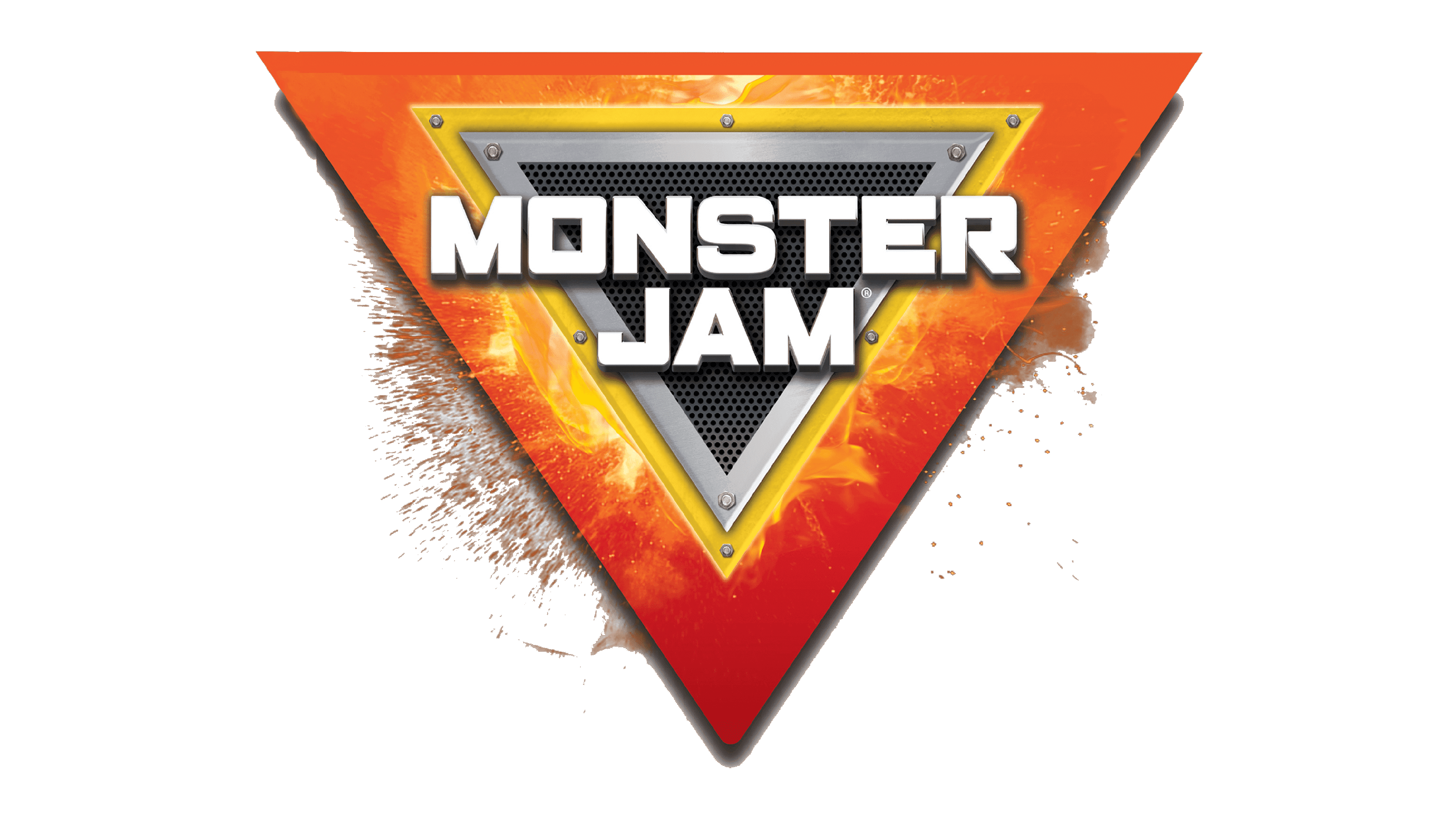
2016 – Today
![]()
In 2016, the designers added color and more details to the emblem. It now had a silver and yellow frame with a perforated dark gray center. The inscription was done using a different font that looked cleaner and stood out thanks to the shiny metallic color. This version looked like an emblem taken right from one of the Monster Trucks.
Font and Color
For the first ten years, golden, red, and black were the predominant colors. They stand for energy, power, danger, courage and all the other elements so closely connected with Monster Jam competitions. The metallic silver and dark gray color palette, which was also used for a little over ten years were better associated with the strong material these trucks were made from. Later, the designers added a yellow color that served as a caution of the danger associated with Monster Jam events. It is also an energetic color that instantly grabs attention and fills with positive emotions.


