

![]() Lacoste Logo PNG
Lacoste Logo PNG
High-end clothing company Lacoste was founded as a tennis shirts manufacturer, but today its range is very diverse and includes not only apparel, but also footwear, perfumery, leather products, watches, and glasses.
Meaning and history
![]()
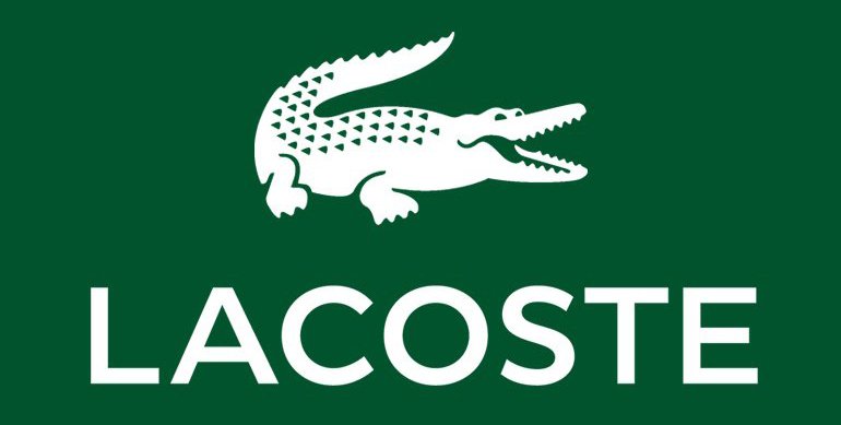
Lacoste is one of the iconic casual and sports brands, which started from the production of tennis apparel, as its founder, Rene Lacoste, was one of the brightest stars in the world of tennis in the 1920s. The instantly recognizable today green crocodile, the emblem of the brand, was first placed on a tennis polo in 1926, and since then became an inevitable part of the Lacoste visual identity.
1933 — 1984
![]()
The Lacoste logo, introduced in 1933, featured a detailed image of a crocodile with its mouth opened. The creature was placed horizontally and faced right, being executed in gradient shades, which made the image realistic and vivid. In this version, no additional lettering was set, though this emblem was the most ornate among all, created for the brand throughout the years.
1984 — 2002
![]()
For the first time, the logo was redesigned in 1984, and this is when the crocodile became getting its iconic shape we all can see today. The bold green silhouette featured small white details and a red to glue and was accompanied by bold black lettering under it. The wordmark in all capitals was executed in a sleek sans-serif with thick likes and soft edges of the letters.
2002 — 2011
![]()
The redesign of 2002 kept the composition and color palette of the previous version but made the emblem smaller and the wordmark — bigger. The letters of the logotype were now placed a bit farther from each other, which gave a sense of solidness and power to the whole image. As for the emblem, the contours of the crocodile were cleaned and sharpened, and the number of white accents over its body was reduced. There was also a monochrome version of the logo, used by the brand for the official needs and papers.
2011 — Today
![]()
The crocodile got even smaller in 2011, with the inscription being enlarged more. The lettering changed its typeface to a thinner and stricter one, with its rounded edges replaced by straight distinct cuts, which add a sense of seriousness and dedication, along with timelessness and reliability.
Alligator Symbol Appears on Tennis Shirts
In 1933 Lacoste created the La Chemise Lacoste company together with André Gillier, the head of a large knitwear company based in France. They manufactured the short-sleeved tennis shirt that Lacoste had created and worn during his matches. Needless to say, the shirt had the alligator emblem on the chest.
That’s how the Lacoste logo started its way as one of the most recognizable commercial emblems in the world. For more than a decade the alligator symbol was licensed to the Izod company, but later Lacoste managed to win back its reputation and rebuild its brand.
Emblem dispute with Crocodile
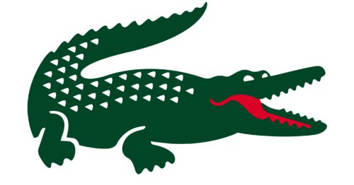
Lacoste had a legal conflict with the textile and garments company Crocodile Garments headquartered in Hong Kong. Their emblems looked very similar, except for the fact that Lacoste’s logo faced right, while the Crocodile’s one faced left. Because of the resemblance Lacoste was trying not to let Crocodile register its emblem in China during the 1990s. The conflict that lasted several years ended in a settlement. Crocodile agreed to modify its emblem: the reptile’s eyes became bigger, its tail rose vertically, and its skin grew scalier.
Font
![]()
The Lacoste logo sports a customized, slightly rounded type. The word is given in capital letters.
Color
![]()
Basically the crocodile is green with white dots and a red mouth. But the colors can be inverted: a white alligator on the green background.


