

![]() XNXX Logo PNG
XNXX Logo PNG
XNXX, one of the oldest and most popular websites in the world and second most popular after XVideos, has a distinctive blue logo. Interestingly, it contains not only the name of the project, but also the full address of the site.
Meaning and history
![]()
As of late 2018, XNXX was on the 13th line of the top websites ranking provided by Similarweb (for all categories) and on the third place of the ranking in the Adult category. In the summer of 2018, it was ranked the 8th most visited website in the word in the same ranking. However, according to Alexa, it was only on the 76th line of the ranking. The project was launched in 1997. While the headquarters are located in Paris, France, the company has its servers and offices in Montreal, Tokyo, and Newark.
What is Xnxx?
Xnxx is the name of a website, which was established in the middle of the 1997, and by today has become one of the top10 online destinations for those, who are looking for video content. The website is available in several languages and has a wide range of video categories in its catalog.
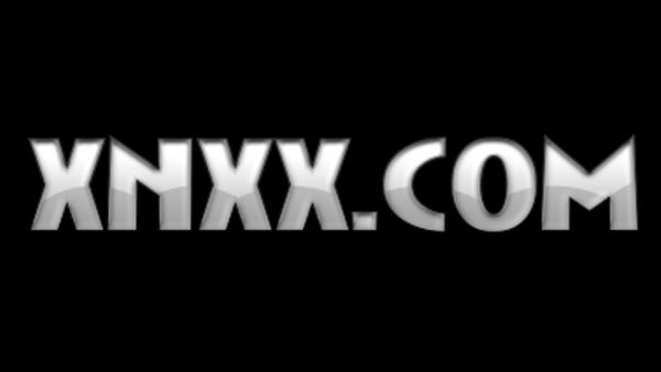
1997 – 2002
![]()
The original XNXX logo, designed for the website in 1997, was set in a black-and-white color palette, with the stylized lettering set across a solid black background. It was an uppercase inscription in a smooth designer typeface with extended massive characters. The three “X”s in the wordmark were set in solid white; while the “N” was contoured.
2002 – 2003
![]()
The redesign of 2002 has introduced a bright and a bit primitive version of the XNXX logo, set in a yellow and blue color palette. The lettering turned yellow and got placed on a solid blue rectangle. The enlarged lowercase “XNXX”, set in a geometric sans-serif font with jumping letters, was placed above the name of the website written in a futuristic font with shadowed characters.
2003 – 2004
![]()
In 2003 the color palette of the XNXX logo became even more intense and vibrant. The color of the background remained blue, but the inscription was completely changed: the new lettering was set in the uppercase of a stable geometric typeface, with the characters featuring gradient shades of pink, blue, green, and orange. The massive wordmark was accompanied by a lightweight white inscription with the full name of the website. You can give an example of a similar design from another company – the eBay logo, which also has multi-colored letters in its history that made the brand memorable.
2004 – 2005
![]()
The redesign of 2004 has brought back the blue and yellow color palette, but refined the inscription, writing it in the uppercase of a graffiti-style sans-serif font. The characters in the name of the website featured gradient shades, with the central part of the inscription in intense yellow.
2005 – now
![]()
In 2005 the XNXX logo was redrawn in a calmer and more professional style. Now the name of the website is executed in the uppercase of a modern geometric font with distinctive contours of the characters. As for the color palette, it turned white and blue, with each letter in gradient, going from light to dark — from top to bottom.
Symbol

The XNXX logo is actually the address of the website. The letters are given in several shades of light blue complemented with white. The darkest shade is the one used for the outline. While there’re no pictorial elements as such, the gradient inside the letters forms a pattern resembling an ocean wave. Due to the pattern, all the three letters “X” look different from one another. At one time, the software development company also used a similar visualization – the Wix logo: the brand name and domain name were written on a blue background.
On the website itself, the emblem is placed over the dark blue background.
Favicon emblem
![]()
In addition to the primary logo, the website also has a small icon displayed in the circumstances when the regular symbol is too large. It’s a dark blue box housing a large letter “X” in a lighter shade of blue. This icon, to some extent, echoes the current Twitter logo (or X.com). The X Corp logo, the new name of the popular messenger, makes its brand even more recognizable.
Font
The XNXX logo apparently sports a customized typeface. While it’s quite legible and classic, it also has something unique about it. The “C” looks rather distinctive due to the unusual curve, while the diagonal bars of the “M” and “N” form a visual “rhyme.”
Colors

The palette features various shades of blue, from the darkest to lightest hues. There’s also some white. On the whole, the color scheme is inverted: the letters are lighter than the background. This color palette belongs to the “team” of blue logos. The choice seems pretty reasonable as the white background may be too bright to be displayed late at night: it lights up the room in the dark.


