The international real estate company RE/MAX was established in 1973. The network now boasts over 100,000 agents in 6,800 offices.
Meaning and history
The original ReMax logo was unveiled in 1978. It all started at the Albuquerque International Balloon Fiesta when the red-over-white-over-blue hot-air balloon attracted TV cameras. The promotion event was designed by the Regional Director in New Mexico Currently. Today, the network boasts the largest hot-air balloon fleet including nearly 120 hot-air balloons.
A year later, the balloon received the status of the company’s official logo. Back then, it was accompanied by the motto “Above the Crowd!”
1973 – 2017
In the course of time, the slogan was removed, though. If you take a look at the modification of the emblem introduced in 2005, you’ll see only the name of the company. And yet, if this logo could talk, it would say: “We’re above the crowd!” or “We’ll take you above the crowd.”
The 2005 modification didn’t affect the overall style of the theme of the emblem. The proportions of the blue, white, and red parts were slightly altered. The design of the basket was also somewhat tweaked. Nevertheless, the updated probably weren’t visible for those who hadn’t compared the emblems side by side.
2017 – Today
Apart from the slight adjustment mentioned above, the original ReMax logo remained untouched for 44 years until eventually, the company introduced a refreshed look at the annual Re/Max Broker Owner Conference in San Francisco in August 2017.
The company representatives emphasized the fact it wasn’t a brand revolution, just an evolution.
The design grew brighter and more minimalistic, which seems to provide a stronger impact. The white lines separating parts of the hot-air balloon are gone. Due to this, the blue and red patches look more vivid. They still have some volume due to the gradient effect.
The basket and the part of the hot-air balloon above it were also simplified.
Our partner and creative advertising agency Camp + King created the refreshed logos including the balloon logo, wordmark, new sign designs and a refresh of both
Font
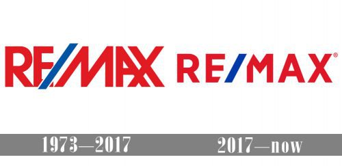
In comparison with the previous version, the current typography is simpler and better legible. While the letters on the old logo partly overlapped and were of a slightly irregular shape, now the glyphs have enough breathing space and have a traditional structure. Due to this, they are easier to read even at larger distances.
Colors
While the RE/MAX logo has always been built on the combination of red, blue, and white, there was some playing around with the hues. Also, the 2017 version includes grey accents.


