Below, you’ll find the most memorable and recognizable logos of companies working in adult entertainment. While the majority of them belong to industry leaders, we’ve also included several less known projects – just because these emblems are awesome.
20. HClips
The website logo, no matter how simple it is, is very memorable and distinctive. Its main part, the red triangle imitating a “play” button, houses a small red “h.” Next to it, there’s an anatomically suggestive part of an oval housing the word “clips” in blue. You can also come across a different version, where there’s no “play” button, while the “h” has an arrow on its top end.
19. YouJizz
Because of its colors, the YouJizz logo may look somewhat similar to the old YouTube wordmark. And yet, its overall style is completely different due to the unique typography. The word “You” on this logo is drawn in a way that it resembles a human face. One of the eyes is open, while the other is winking. The “You” face is wearing a hat and mustache. There’s also suggestive lettering “Yes, sir” below.
18. Tube8
With its red horns and a long tail, the Tube8 logo appears to be playing with the “devil” theme. The horns and tail belong to a creature consisting of two circles and the figure 8 inside. There’s certainly anatomical symbolism hidden in this roundel emblem.
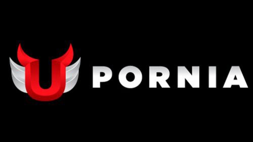
17. Upornia
Unlike the majority of its higher-ranked competitors, Upornia has a logo with a pronounced symbolic part. The distinctive winged “U” on the Upornia logo has two horns on its ends. Also, the very glyph is drawn in a way that gives an anatomical hint.
16. Bang Bros
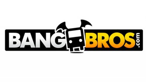
The Internet-based company was founded in Miami, where its headquarters have been based ever since. It’s known as the owner of more than 35 websites, from Bangbus to AssParade.
The Bang Bros logo is memorable due to the distinctive winged bus emblem.
15. Private Media Group
The logo of the adult entertainment brand is based on the word “Private” in large block capitals. They can be given either in red or in blue with a gradient. However, it’s not the wordmark that catches the attention but the two curvy female figures that appear to be dancing.
The headquarters of Private Media Group is located in Barcelona and San Francisco. The company, which evolved from the Private magazine, now deals with a variety of media, including print publications, DVDs, Internet websites, and mobile content. It’s most popular for its high-budget films like “Cleopatra.”
14. Bluebirds
The logo of the movie studio is remarkable for the tiny half-hidden female figure. At first glance, you see just the name of the studio in an inviting rounded type. The fact that the author of the design chose blue for the wordmark seems pretty natural if you take into consideration the project name.
The moment you take a closer look, you notice that there’s a picture to the left of the lettering – a small shapely creature. It appears to be a female with bird’s wings. She looks like she’s about to fly. The reason why the figure isn’t very visible is not only its size but also the fact that it’s semi-transparent.
13. Eromaxx Films
The logo appears to be inspired by some of the world’s most popular emblems. All of us know that when a project reaches the highest level of recognizability, there’s no more need to include its full name in the logo. So, some globally known companies need just the pictorial part of their emblems to be recognized (take, for instance, Twitter, Shell, Playboy, Nike or Pepsi).
Eromaxx Films apparently decided to move in the same direction by putting the major emphasis on the icon, a large yellow lowercase “E” inside an orange circle. However, as the logo of a movie studio could hardly become recognizable by everyone, they still have a full version where the word “Eromaxx” can be seen below the roundel emblem.
12. RedTube
One of the three highest ranking sites in the Pornhub Network, RedTube was launched in 2007. The project generates over 90 million visits monthly. Like many of its competitors, the company uses a logo where its name is broken into two parts with the help of different colors (red for the left part, white for the right). The combination of red, white, and black, which is extremely popular in the world of website logos, in this case is justified by the name of the project.
What makes the RedTube stand out is the red circle inside the “R” symbolizing the “play” button.
11. Lethal Hardcore
The logo of the movie studio does have the “lethal” touch that its name suggests. The combination of silver grey, black, and white, as well as the gradient, conjure up images of pistols or other weapons. The emblem gets some dynamism due to the unique, very sharp ends of the letters. On some of the glyphs (the “H,” for instance), they replace regular serifs, while on others they appear only for the dynamic effect.
10. PornTube
The logo of the website has been undoubtedly inspired by that of YouTube, which seems pretty natural if you take into account the fact that the name of the project also mirrors the word “YouTube” in its structure. We should point out, though, that it is the old YouTube logo that was copied, while the current one doesn’t look that similar.
Like the old YouTube emblem, the PornTube logo is broken into two parts by different colors. Its palette also includes black, white, and red (although a slightly different shade). Moreover, if you take a look at the type, you’ll notice an uncanny similarity to the one used on the YouTube logo, although it’s a bit wider.
9. Brazzers
The company, which now owns over thirty hardcore erotic websites, was established in 2005 and later joined a larger group operating under the name of Mansef. The company is based in Montreal, Canada.
The Brazzers logo is focused on the two “Z’s” given in orange. As far as there’re three letters to the left and the right of the “Z’s,” there’s a sort of symmetry. The typeface is pretty minimalistic and masculine.
8. Bang! Originals
One of the most popular movie studios, Bang! Originals has a perfectly legible and recognizable two-line insignia. The word “Bang” seems to have been inspired by the Samsung logo.
To begin with, there’s the distinctive “A” without the horizontal bar looking like a flatter version of the “A” from the Samsung wordmark. Also, the letters “NG” are very close to those used on the emblem of the Korean manufacturer. What makes the Bang! Originals logo unique is the red exclamation mark and the second line, which is given in an entirely different typeface. Here, the letters are thinner and slightly more rounded.
7. Vivid Entertainment
The American erotic film production company has a highly memorable emblem combining a star and large “V.” To the left, the full name of the brand in light blue is placed. The Los-Angeles-based company was mentioned by Reuters among studios dominating the US film industry.
6. Digital Playground
The California-based company is one of the most known studios in the country’s industry. The logo features the letters “DP” inside a red horse’s head. The letters are the initials of the company name, but that’s not the only reason why they were used. They also attract the attention of those familiar with abbreviations popular on websites. Below the horse’s head, the full name of the company can be seen.
5. YouPorn
Along with Pornhub and RedTube, YouPorn is among the three highest ranking sites in the Pornhub Network. While its old logo was rather playful, the current one is by far more minimalistic, with its plain sans serif typeface. And yet, you can still see the heart “O,” which in a way conveys the playful essence of the site. The pink color serves the same purpose.
4. xHamster
Among the highest rated erotic sites, XHamster is the only one with a mascot. According to the company representative, the hamster was chosen for a variety of reasons, including its soft fur, friendliness, and erotic energy.
3. XNXX
XNXX is known as one of the oldest erotic sites in the Web. It started working in 1997. Its listed registrar is VLab Ltd, a Hong Kong-registered company. According to other sources, it belongs to the same Polish company that is the owner of XVideos.
The blue color scheme makes the XNXX logo stand out among other logos in the industry. While the typeface is highly readable, it’s also unique, with its sharp edges and the wave pattern.
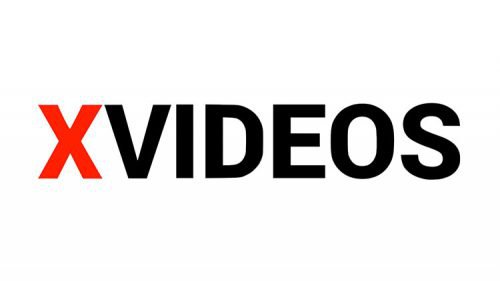
2. XVideos
XVideos is the most visited website, according to SimilarWeb ranking (late 2018). While the Canadian company MindGeek owns some of the ten most visited sites in the industry (including Pornhub), it doesn’t own XVideos.
Judging only by the logo, it’s hardly possible to guess what industry XVideos works in – such an emblem might belong to just any company. It’s just the name of the website in a pretty generic sans serif font positioned inside a black rectangular.
The first letter stands out due to its red color. Interestingly enough, the palette seems rather close to that of the YouTube logo.
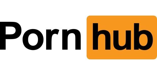
1. Pornhub
As of late 2018, Pornhub was the most visited erotic video sharing website, according to Alexa rank, while the ranking provided by SimilarWeb placed it behind XVideos.
Launched in 2007, the project is now owned by MindGeek. MindGeek, which used to be called Manwin, is a privately held company that owns several major Internet websites, including the so-called “Pornhub Network,” which, in its turn, includes about ten websites, from RedTube to YouPorn. While the company is officially registered in Luxembourg, it works primarily from Canada.
If you compare the Pornhub logo with the old YouTube emblem, you’ll see a striking resemblance. Similar to the YouTube logo, the website name is broken into two parts, and its second part is placed inside a rectangle with rounded corners. In the case of Pornhub, though, the red elements were replaced by orange, while the white background was replaced by the black one.
How are these logos different?
In what way is the logo of a website or production studio different from that of any other company? While the emblems vary greatly, you can still point out a couple of tendencies characteristic to many of them.
For one, they tend to be dominated by darker colors, mainly black. White is used very sparingly (typically, for the lettering). The approach seems fully justified taking into consideration that the white color tends to light up the room in the dark and may even make one’s eyes sore, which isn’t desirable for those who visit the websites at nighttime.
Another tendency is to allude to the YouTube logo, in one way or another, which can be noticed in the emblems of Pornhub, YouPorn, PornTube, and RedTube, to name just a few. The resemblance serves as a clue to the way the websites work: they provide video hosting services for their users, like YouTube.
Conclusion
In the ever-evolving landscape of the adult entertainment industry, our exploration of the Top 20 Best Porn Logos sites and studios has revealed a dynamic and competitive arena where creativity and brand identity play pivotal roles. These logos not only represent the visual identity of porn companies and studios but also encapsulate the essence of the global porn industry’s commitment to high-quality and engaging content.
Among the most successful porn companies, Playboy Enterprises stands out not only for its iconic bunny logo but also for its foundational role in shaping the porn experience through Playboy Magazine. Similarly, Naughty America and New Sensations have carved their niches by offering exclusive content that caters to diverse preferences, from traditional themes to innovative narratives.
The adult entertainment industry, with its vast array of porn production companies, has seen a significant transformation, driven by the digital revolution. The transition from traditional publishing groups and entertainment groups, such as Hustler Magazine, to platforms with a strong online presence, like OnlyFans, illustrates the shift towards digitalization. These platforms enable creators to produce and share their own content, from premium videos to own playlists, enhancing the porn experience with popular filters and exclusive features like days of free premium access.
The global reach of these companies is not without its challenges, including complaints and lawsuits, which underscore the importance of maintaining a secure online environment for both subscribers and site owners. Innovations in security solutions have become paramount, ensuring that the total revenue generated contributes positively to the growth of the industry while safeguarding user data.
Furthermore, the industry’s ability to adapt to changing consumer demands, such as the introduction of free premium periods and the emphasis on unique and engaging content, has solidified its position as a key player in the entertainment sector. The inclusion of diverse content, from strip clubs to exclusive cable networks like Hot Network, reflects the industry’s expansive approach to catering to a wide audience.
In conclusion, the logos and brands within the top adult entertainment companies serve as beacons of innovation, quality, and resilience in the face of evolving market dynamics. From Playboy Enterprises to OnlyFans, these entities have demonstrated an unwavering commitment to delivering an unparalleled porn experience, underscored by a dedication to security, exclusivity, and a global perspective. As we look towards the future, the porn industry, buoyed by its iconic brands and studios, is poised to continue its trajectory of growth, diversity, and innovation, ensuring that it remains at the forefront of adult entertainment worldwide.


