

![]() Pepsi Logo PNG
Pepsi Logo PNG
One of the most well-known beverage brands, Pepsi owns an iconic logo. The combination of red, white, and dark blue inside a spherical shape looks incredibly appealing due to a “smile” effect, created by the white swirl inside the sphere.
Meaning and history
![]()
The iconic brand, which has been around for more than 100 years has had more than ten redesigns of its visual identity throughout its history. Started as Brad’s Drink in 1893, Pepsi has become synonymous with sweet soda water and no matter what emblem is used, it has always been very well recognized and loved all over the globe.
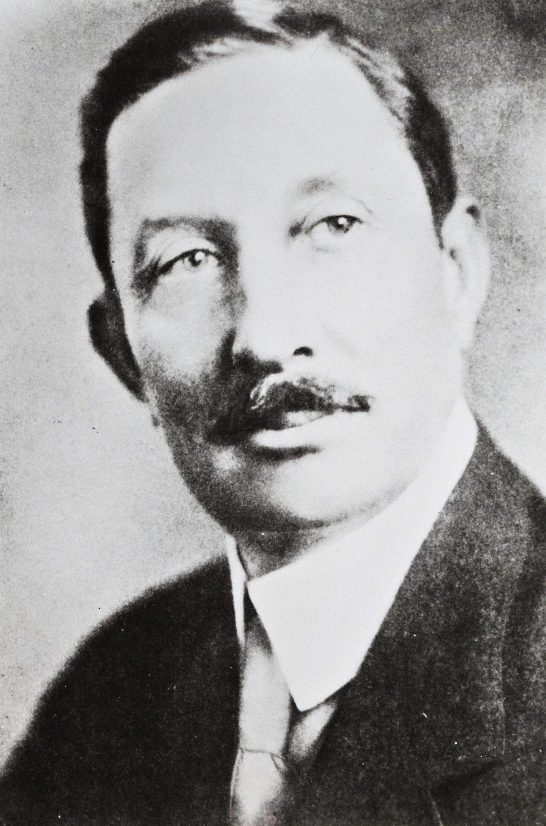
Who designed the Pepsi logo?
The original script logo for Pepsi was created by Caleb Bradham, the company founder, around 1903. The iconic Pepsi Globe traces its roots to the 1940s but it was only in 2008-2009 that the design received its current look, which was developed by designers from Arnell Group (New York).
1893 – 1898
![]()
The legendary drink was invented by the American businessman, Caleb Bradshaw, who owned a pharmacy in North Carolina. The drink was supposed to help people addicted to morphine, and it’s two main ingredients were pepsin, which is an enzyme used for digestion and cola nuts.
The logo was composed of a blue serif lettering. Its capital letters featured an elegant old-fashioned style with smooth curves. The wordmark was placed on a white background and enclosed in a thin ornate rectangular frame.
1898 – 1903
![]()
The name of the soda was changed to Pepsi-Cola, reflecting its ingredients. And the logo was redesigned to represent the new brand. Now the cursive red lettering with elongated and curved lines was the main and only element of the product’s visual identity.
1903 – 1904
![]()
The Pepsi logo, designed in 1903, has only stayed active for a few months. It was a custom red cursive lettering with wishbone details on the characters, and elongated lines, merging into thick red ribbons with white additional wordmarks. The letters in the main logotype were set far from each other, making up a pretty clumsy composition.
1904 – 1905
![]()
The redesign of 1904 has refined the contours of the fancy characters in the Pepsi logotype, boldening the lines and cleaning them up. The letters got closer to each other, creating a more confident and professional look at the badge. As for the main element of the logo, its red color, it remained unchanged.
1905 – 1907
![]()
The logo was redesigned again in 1905 and started resembling a causal identity of the brand’s main competitor, Coca-Cola. It was a bold script lettering in red, with a curved long tail of the letter “C”, and the connected lines of “P” and “C”, underlining the whole logotype and creating a double loop pattern.
1907 – 1934
![]()
The concept, introduced in 1904 was brought back to the Pepsi badge in 1907, with the contours of all elements modified and made more confident and clean. All characters got thicker, hence the red color of the inscription started looking even more intense and powerful.
1934 – 1951
![]()
In 1934 the red inscription was refined and the thin delicate “Drink” inscription was added on the upper line of the letter “C”. This logo looked more confident and solid than the previous versions, with thicker lines. It was placed slightly diagonally, adding a sense of movement and progress.
1950 – 1962
![]()
The redesign of 1950 made the logotype look more professional and modern. All the extra lines were removed and the inscription was now bolder and eater. This was the last version in the minimalist red and white color palette.
In 2014 the logo started to be used by the company again, and it still can be seen on the products today, just on the backside.
1951 – 1962
![]()
The prototype of the next generation Pepsi logo was introduced in 1951. It was an image of the metal bottle cap, colored in red, white, and blue, with the red script lettering from the previous version, placed on the white part of the cap.
1962 – 1969
![]()
The redesign of 1962 simplified and modernized the logo concept, introduced in the 1950s. The tricolor bottle cap got turned straight and the blue cursive lettering was replaced by a bold uppercase inscription in black sans-serif, with the words not fitting the cap’s contours, but coming out of them to both sides. This badge stayed in use by the brand for more than seven years.
1965 – 1969
![]()
The tricolor cap continued the main theme of the visual identity in 1965 — it was a background for a black bold “Pepsi” inscription in all capitals of the simple sans-serif typeface, with a modified letter “S”.
1969 – 1971
![]()
In 1969 the Pepsi badge was redesigned again, with the previous logo version modernized and strengthened. The contours of the Pepsi globe got cleaned and minimized, with the “Pepsi” inscription changing its color to deep blue. The contours of the letters were also refined, and getting taller and slightly thinner than on the badge from the middle of the 1960s.
1971 – 1987
![]()
The more modern version of the visual identity was designed for the company in 1971. The circle with a thick white outline was placed inside a rectangle in a white frame. The left part of the rectangle was red, while the right one — blue. As for the circle, it replicated the pattern of the bottle cap from the previous logos and had a bold blue nameplate placed on its white part.
1987 – 1991
![]()
In 1987 the white frame of the logo was removed and the lettering — enlarged. The typeface was also changed to a smoother and sleeker one, with rounded corners of the letter “E”.
1991 – 1996
![]()
The nameplate was placed outside of the circle in 1991. The logo was now composed differently — the inscription in too with the red horizontally placed rectangle under it and the circle in red and blue with a thick white curve in the middle, on the right of the rectangle.
In 1996 additional logo was designed — the white inscription on a blue background, using two different shades to create a geometric pattern. The signature circle was replaced by a part of a sphere, placed on the bottom right corner of the logo.
1996 – 2003
![]()
The visual identity of the famous soda sting was simplified in 1996. The white wordmark in a bold sans-serif typeface with smooth lines and slightly italicized letters featured a thin blue outline and shadow. The inscription was placed above a three-dimensional emblem, depicting a tricolor sphere. The emblem on this logo was resembling a globe, pointing on the international popularity of the brand.
2003 – 2006
![]()
The lettering Gaines a new more dynamic shape in 2003, as for the emblem — it was drawn in gradient colors, getting a glossy and vivid look. This logo only stayed with the company for three years, but it still can be seen on the products in some countries across the globe.
2006 – 2008
![]()
The wordmark was placed under the emblem in 2006. Now it was colored blue and had a thick white outline, while the emblem was drawn in more distinct lines and has a texture with water drops, which added volume and made it look realistic.
2008 – 2014
![]()
The completely new logo for Pepsi was created in 2008. The emblem was drawn in 2D and the inscription was executed in the lowercase letters. The iconic “globe” now had the white line placed diagonally and featured a thin double outline, composed of white and blue.
2014 – 2023
![]()
The recent insignia of the brand was designed in 2014 and is one of the most minimalist versions in the company’s history. The emblem, placed on the left of the wordmark has its frame removed and now looks modern and solid. As for the lettering, it is still in the lowercase, and the “E” of the custom sans-serif typeface resembles a white wave from the iconic emblem.
2023 – Today
![]()
The Pepsi company did not invent anything new when it updated the logo to celebrate its 125th anniversary. The emblem introduced back in 1987 served as the basis. They took the round portion of it and added a black outline around it to make it stand out on any background. To support the addition of the black, they also used it for the inscription, which featured a slightly different custom font. The letters have a slanted style and no serifs. The logo turned out great as it is a perfect blend of the long history of the brand and modern design elements.
Font

The wordmark features a custom-made italicized roman type, which is called Pepsi Light. If you are looking for a more popular typeface that looks close to the Pepsi insignia, you may try Harry Plain font.
Color
The combination of colors used by Pepsi symbolizes the product’s core emotional values. According to consumer research, dark royal blue, which is featured in the original beverage, conveys the idea of “cool”. The lighter shade that can be seen in Pepsi Max, associates with “cool and fresh”, while golden shade seen in the Caffeine Free version symbolizes balance and energy.
What does the Pepsi logo represent?
The iconic Pepsi logo is known as the Pepsi Globe, hence it represents our planet, symbolizing, first of all, the international expansion of the brand, and its recognizability, and secondly, standing for unity and togetherness.
Why is the Pepsi logo effective?
The Pepsi logo is considered to be one of the most effective logos in history, as it is based on a patriotic tricolor, composed of blue, red, and white, and uses a simple and smooth geometric shape of a circle, which is associated with unity and is perverted as a symbol of friendliness.
Why did Pepsi add blue to its logo?
The company’s logo gained blue color at the beginning of the 1950s, as an element, distinguishing Pepsi from its main competitor, Coca-Cola, as before that the logos of the two brands look very similar.


