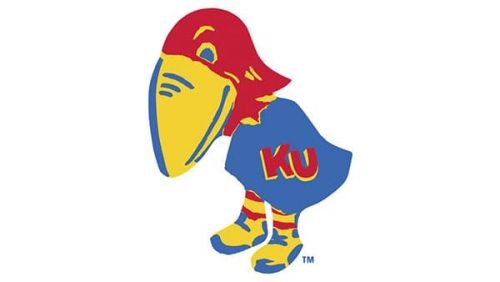
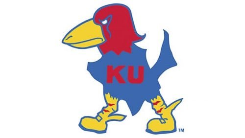
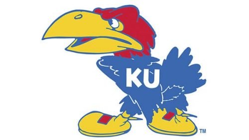
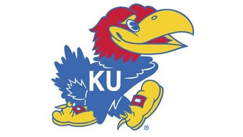
During its more than 100-year-long evolution, the bird on the Kansas Jayhawks logo has been growing more refined.
Meaning and history
The sports teams of Kansas University have been using one colorful and friendly symbol for its logo since the beginning of the 20th century. A funny and memorable caricature of a bird was only slightly refined and brightened up throughout the years, without losing its character and essence.
1912 – 1920
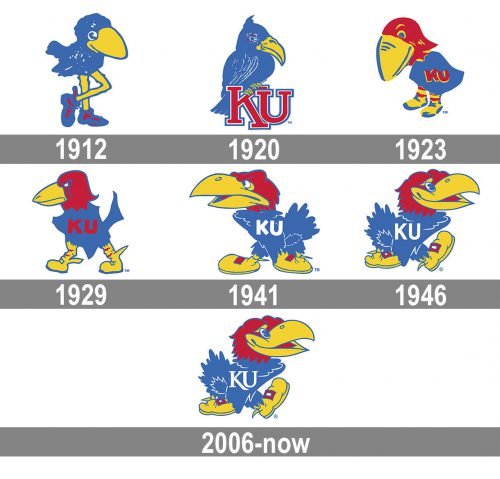
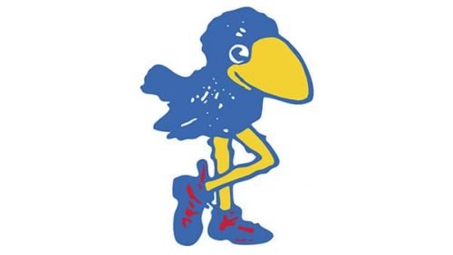
The original Jayhawks logo, introduced in 1912, featured a blue bird with yellow legs and blue shoes with red accents. It was standing with its legs crossed and looked easy and cool.
1920 – 1923
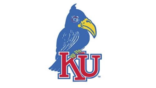
The redesign of 1920 made the logo more professional and strict, by redrawing the bird in a more realistic and detailed way and placing it on the “KU” monogram in red and white, executed in a strong and straight geometric serif typeface. The bird was still executed in the same blue and yellow palette, which evokes a sense of dynamics, energy, and professionalism, while red added some passion and warmth.
1923 – 1929
In 1923 the emblem was redrawn again and this time in a more refined caricature style. The Jayhawk’s head was colored red, while his yellow black was enlarged and harmonized by yellow and red shoes. The bird had a Ted “KU” monogram placed on its blue jersey.
1929 – 1941
The iconic Jay hawk was redrawn again in 1929. Now the bird was placed in profile, walking to the left, with a determined look and a serious attitude, it was still executed in the same color palette, but with the contours refined and strengthened.
1941 – 1946
The white color appeared on the Kansas Jayhawks visual identity in 1941. The bird, facing left, was refined and drawn with more details, having two white “KU” letters on its blue jersey. The beak of the Jayhawk was now a bit opened, creating a visual sense of smile and making the whole image friendly and welcoming.
1946 – 2006
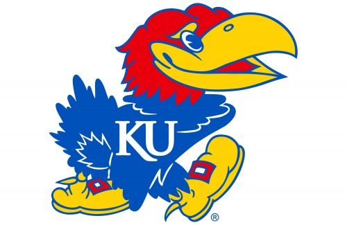
The Jayhawk changed its direction from left to right in 1946. The bird’s face gained a bigger smile and a kinder look, making the whole image lighter and brighter. As for the other elements, they all feature the same palette and style as on the previous version of the logo, but with their contours cleaned. This emblem stays with the team for sixty years, being the most long-standing and recognizable logos in the Kansas Jayhawks history.
2006 – Today
The iconic badge was redesigned in 2006, but the only visible change was about the typeface of the “KU” inscription. The style of the lettering was switched from a bold and simple sans-serif to a more elegant and chic serif font, with the lines of the letter “K” elongated.
Kansas Jayhawks basketball
Among the athletic programs of the University of Kansas, the men’s basketball team is probably the most well-known one. In fact, it’s among the most successful intercollegiate basketball teams in the US. Interestingly, the very first coach the university had was James Naismith, who invented basketball. Quite a few well-known professional players used to play for the University of Kansas (Clyde Lovellette, Wilt Chamberlain, and Jo Jo White to name just a few).
The women’s team, which was fielded in 1968, can boast three Big Eight championships, one Big 12 Championship, and six conference tournament championships in 1973–2004 when it was coached by Marian Washington.
Kansas Jayhawks football
The first football game was played by the university team in 1890. The list of well-known players who used to belong to the Jayhawks includes Gale Sayers, John Riggins, and Mike McCormack. The team has made three Orange Bowl appearances (won in 2008). The home arena is Memorial Stadium.
Kansas Jayhawks ice hockey
The team coached by Andy McConnell plays in the ACHA. While the primary logo of the ice hockey program is the one used by all the other Kansas Jayhawks teams, their alternative logo contains a reference to the Vancouver Canucks emblem.
Kansas Jayhawks Colors
KU BLUE
PANTONE: PMS 293 C
HEX COLOR: #0051BA;
RGB: (0, 81, 186)
CMYK: (100, 55, 0, 5)
CRIMSON
PANTONE: PMS 186 C
HEX COLOR: #E8000D;
RGB: (232, 0, 13)
CMYK: (0, 100, 80, 5)
JAYHAWK YELLOW
PANTONE: PMS 116 C
HEX COLOR: #FFC82D;
RGB: (255, 200, 45)
CMYK: (0, 15, 100, 0)
SIGNATURE GREY
PANTONE: PMS 430 C
HEX COLOR: #85898A;
RGB: (133, 137, 138)
CMYK: (5, 0, 0, 45)


