

![]() Columbus Crew SC PNG
Columbus Crew SC PNG
Columbus Crew SC is the name of a football club from Ohio, United States, which was established in 1994. The club joined Major League Soccer in 1996 and is being its member since then, without any loud wins and a huge success. The Columbus Crew SC is owned by Dee and Jimmy Haslam and has Caleb Porter as the head coach.
Meaning and history
![]()
The club, founded in the middle of the 1990s, has been using the “miners” logo for almost twenty years, until its first and the only one redesign in 2014, which brought a completely new style to the Columbus Crew badge.
1996 — 2014
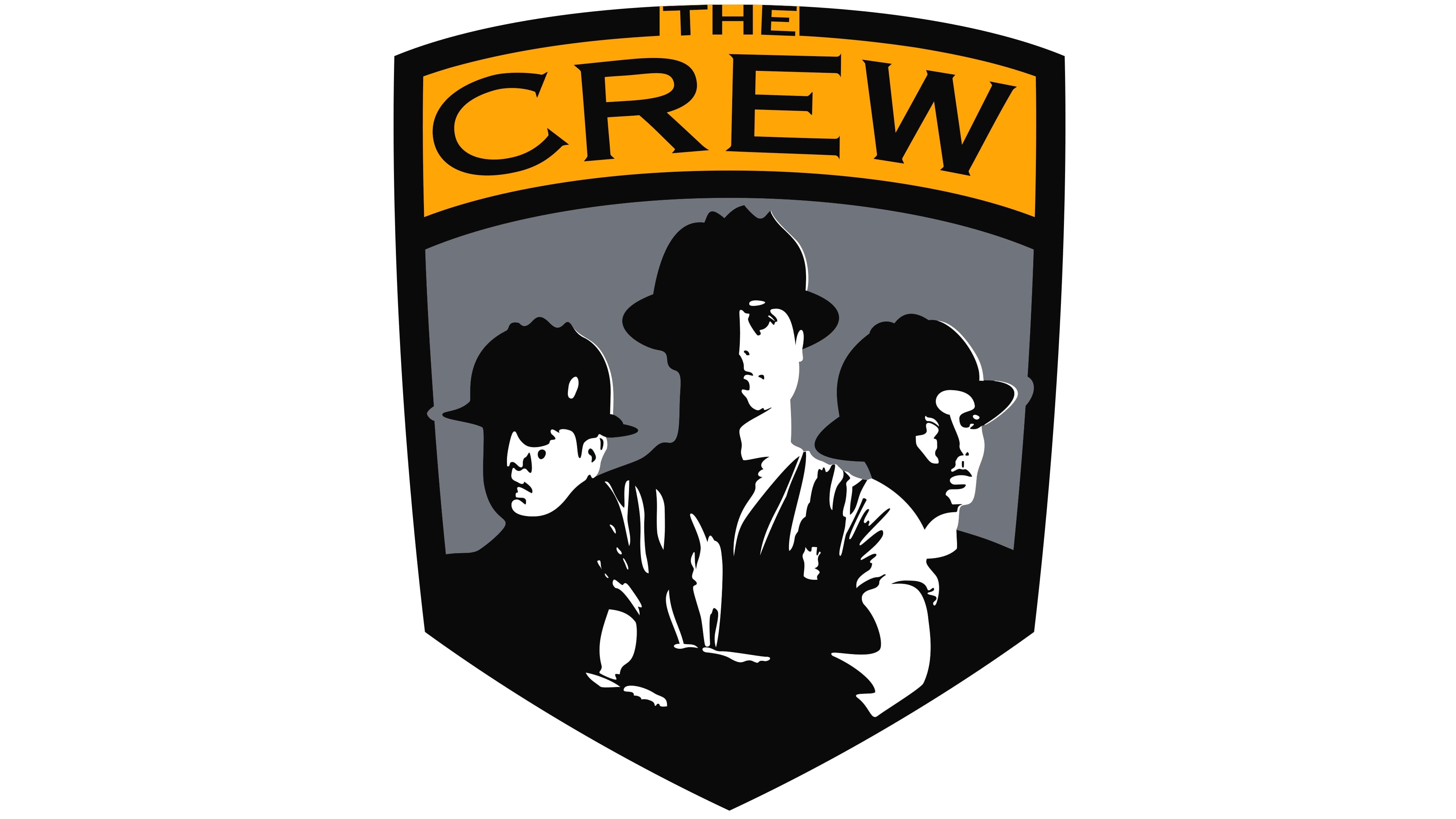
The original logo for the club was introduced in 1996 and was drawn based on its name. The crew, consisting of three men in miners’ helmets, was drawn in black and white and placed on a gray background, enclosed in a black shield-shaped frame.
The upper part of the shield was colored yellow and featured a black arched “Crew” inscription in all capitals, executed in stylish font with sharp and delicate serifs. Above this lettering, the “The” part was written right on the frame. It used a different, sans-serif typeface, putting the emphasis on the “Crew”.
It was a strong and very masculine emblem, which showed the roots of the club and its region, and at the same time reflected the true mannish character and approach.
2014 — 2021
![]()
In 2014 the “SC” part was added to the club’s name, and the logo was redesigned in the same year. The new Columbus Crew SC badge was rounded and featured a simplified black and yellow color palette with white lettering.
The black circle has a double yellow outline, and in between two thin yellow circles, the strong and bold wordmark in white was placed. As for the main part of the emblem, it featured a diagonally split circle with the striped pattern in its upper left part and the checkered one — in the bottom left. The black crest with white “96”, standing for the year of the club’s establishment, was put on the striped part of the circle.
The combination of black and yellow colors represent energy and power, while the white lettering show confidence and loyalty of the club, pointing on their strongest qualities.
2021
![]()
The 2021 emblem was a brand new design. The central bit was a sort of banner shape with twin tips in the bottom. It was mostly black, but had a yellow outline and a big white ‘C’ inside. The font was a unique style with abrupt corners and sharp tips. ‘Columbus’ was written in black above this image, and ‘SC’ was put in the free space between the two tips below. The styles were similar to the big letter inside.
2021 — Today
![]()
The same year, they updated it slightly. The ‘SC’ bit was replaced with the word ‘Crew’, and there was also the year of founding – ‘96’ – now. They put it inside a right tip, where there was a sort of white meaningless shape before.
Columbus Crew SC Colors
YELLOW
PANTONE: PMS 803 C
HEX COLOR: #FEF200;
RGB: (254, 242, 0)
CMYK: (4, 0, 93, 0)
BLACK
PANTONE: PMS BLACK 3 C
HEX COLOR: #231F20;
RGB: (35, 31, 32)
CMYK: (70, 67, 64, 74)


