While the first PLC team appeared in Tacoma, Washington, in 1904, the Tacoma Rainiers trace their roots to 1960. During the first 35 years of its history, the club changed several names. Today, the team belongs to the Pacific Coast League and is the Triple-A affiliate of Seattle Mariners.
Meaning and history
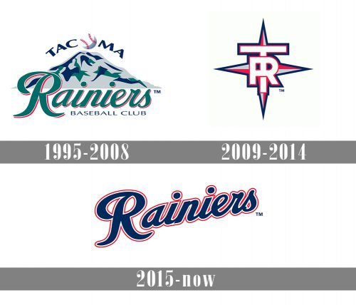
Since 1995, when the Tacoma Rainiers adopted their current name, minor league baseball team has gone through three logo redesigns.
1995 — 2008
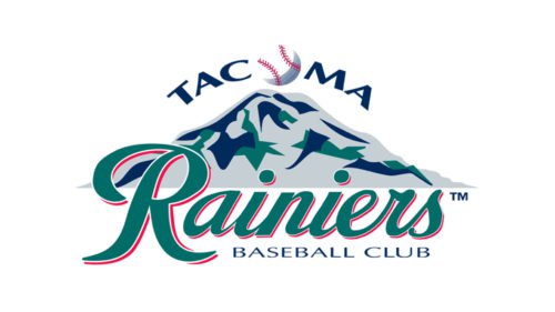
 The first Tacoma Rainiers logo (1995) sported Mount Rainier, probably the most popular peak in the neighborhood. The white baseball with red seams, which could be seen right above the peak, served as the letter “O” for the word “Tacoma.”
2009 — 2014
 The following emblem, which was unveiled in 2009, featured overlapping letters “T” and “R” over a classic wind rose.
2015 — Today
At last, in 2015, the team went for a wordmark emblem featuring the text “Rainers” in a curvy script imitating handwriting. While the 2009 logo visually aligned the Rainers with their parent team, the new one eliminated this link.
Colors
The palette of the Tacoma Rainiers logo seems to use the most popular baseball logo colors – red, blue, and white, – which are also the colors of minor league Baseball logo.


