At the core of Ford’s operations lies an unwavering commitment to innovation and reliability, encapsulated by its iconic blue oval. This emblem, a hallmark of quality, underpins Ford’s activities in the automotive industry, setting it apart from competitors. Founded in the bustling streets of Dearborn, Michigan, Ford has consistently pushed the boundaries of automotive design and technology. From the introduction of the first car, the Model T, Ford has championed a vision that marries classic design with groundbreaking innovation, ensuring a secure environment for its legacy to evolve. Today, Ford’s global presence is a testament to its enduring commitment to excellence and sustainability, navigating the future with a clear trend towards electrification and advanced technologies.
Meaning and history
Who owns Ford?
Ford is still owned by the Ford family (40% voting power), other stack holders of the company are The Vanguard Group and Evercore Wealth Management.
In the annals of automotive history, Ford’s story begins with Henry Ford’s signature vision in 1903, marking a significant change in the industry. The company, with its foundation rooted in Detroit, swiftly rose to prominence by introducing the Model T, an embodiment of affordability and reliability that became the blueprint for mass automobile production. This innovation, characterized by the assembly line method, not only solidified Ford’s position as a trailblazer but also democratized car ownership, transforming the Ford brand into a household name.
Throughout the years, Ford has maintained its edge through continuous innovation, from pioneering aluminum in car manufacturing to adopting the most advanced encryption technology for protecting customer data. The company’s achievements mirror its dedication to improvement and excellence, with the blue oval logo serving as a beacon of heritage and purity in design. In recent times, Ford has embraced a new design philosophy, focusing on electric vehicles and smart technology, reflecting a significant shift in its product lineup and strategic direction. The company’s trajectory underscores a legacy of adaptation and forward-thinking, positioning Ford as a leader in a rapidly evolving automotive industry.
Who was Henry Ford?
Henry Ford is the name of the famous American businessman, who established the Ford automobile brand. H. Ford was born in 1863 and died in 1947.
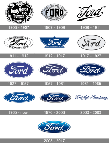
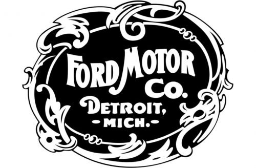
1903 – 1907
The very first logo of the Ford Motor Company was composed of an ornately rounded badge in a frame with leaves and curves. The badge was colored black and has a white inscription on it, accompanied by a white framing. The letters were arched and placed in a wave, with the “Detroit, Michigan” tagline in a bold sans-serif typeface. It was the tradition for its time emblem, very elegant and simple.
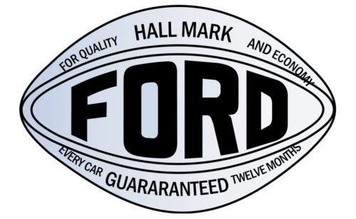
1907 – 1909
In 1907 Ford decides to change its style to a modern and strong one. The badge now features a completely new style and shape — the rhombus with rounded smooth angles has a bold black “Ford” inscription in the middle and additional lettering above and under it.
The eye-like shape of the new badge made the whole logo remarkable and memorable, and its metallic-gray and black color palette added a sense of professionalism and progressive approach.
Who designed the Ford logo?
The original Ford emblem was designed by Childe Harold Wills in 1907, though it was just the lettering. As for the oval framing and blue color, they only appeared on the insignia in 1927, and have been slightly refined and modified throughout the years.
It was a very decent and contemporary logo but stayed with the company for only two years.
1909 – 1911
In 1909 the automaker starts during the signature of Henry Ford for its visual identity. It is still the core of the whole company’s concept today, just slightly modified and with the new color palette.
The script lettering features an elongated tail of the letter “D”, which will be removed in the further versions.
The version of the 1910s was executed in monochrome and had no framing, only the quotes.
1911 – 1912
The company redesigns its logo in 1911. Now the signature of the founder is enclosed in a double horizontal oval, where “The Famous Motor Cars” inscription is placed around the perimeter.
1912 – 1917
The version of 1912 is the most interesting one. It still features the same style of the nameplate, but now it is located on a blue badge, stylized like a bird. All the details are executed in white and there is a delicate yet strict tagline, “The Universal Car”. This design stayed with the company for five years and is the only one with such an unusual shape.
1917 – 1927
In 1917, Ford decides to come back to minimalism, refining the logo from 1911. Now the signature of Henry Ford is placed inside a white oval with a thin frame. It was a simple yet very elegant logo, which lasted for ten years.
1927 – 1957
The color palette was changed to blue and white in 1927. The frame was slightly changed, now it is double — with thick white and thin blue lines. This logo became a prototype for the one we all know today.
1957 – 1961
 Ford redesigns its badge again in 1957. The oval is now extended and the letters are bolder, with elongated lines. The blue color of the background gained a new intense shade and the frame is now composed of two thin white and two blue lines. It was the design, that didn’t stay for long, though it had its influence in the future versions.
1961 – 1965
The logo, which was designed in 1961 and used by the automaker as the main one for 15 years, is still in use today as the secondary emblem. The white script nameplate is located in the middle of the blue oval with a thick white frame. It is simple, elegant, and instantly recognizable.
1965 – Today
The badge, introduced by the legendary automaker in 1965, is still used on the most part of the company’s vehicles. It was a horizontally-stretched narrow oval in a smooth blue color palette, with a simplified double outline in blue and white, and a refined and emboldened white inscription in the center of the banner. This version of the badge has also became a basis for the voluminous badge, created for the brand in the beginning of the 2000th.
1976 – 2003
In 1976 Ford decides to use a three-dimensional version, switching white color to silver and adding some gloss to the surface of the badge. The blue here is darker and has gradient shades.
2000 – 2003
For just a couple of years in the 2000th the American automaker was using a cursive text-based logo with the full name of the brand executed in an ornate sophisticated typeface, using a dark and bright shade of blue for the bold and playful lines of the characters, set against a plain white background.
2003 – 2017
The version of 2003 looks like the one from 1961, but with more volume and light. The lettering got a delicate shadow and the background — gradient blue, so now it looks alive and dynamic. The contours of the inscription are refined and look sophisticated and timeless.
Symbol
What font is used for the Ford logo?
The custom typeface of the famous Ford logo was designed exclusively for the brand, but looks similar to FordScript font, and has something in common with Neville Regular and Fabiola Script, with their bold smooth lines and connections between the letters.
It is interesting that the symbol of Ford essentially became the name of the brand itself, favorably “stacked” in a horizontal oval. And if in the first and second logos – vignette and pseudo-hippies – there was a strong influence of fashion, then when a classical and (as it later turns out, unchanged) oval with a font inside
Emblem
The shape of the Ford emblem has changed slightly throughout history. In particular, this applies to 1912-1927, when several logos were simultaneously encountered – first, openwork, then – caligraphic, the third – “Egyptian”, and a new, oval one. In the mid-1950s, even this form was attempted to improve. And the logo turned from oval into diamond-shaped in a short time.
Font
Since the main element of the logo is precisely the font writing of the brand, then the font becomes very important. The art-nouveau style is distinguished by strictness with respect to fonts and riotous graphics. However, capital letters could be extended, and designers are actively using it. But if the font was strict enough in 1903, already in 1909 calligraphy came to replace the hard, albeit exclusive, art nouveau aesthetics. Exquisite writing (it will be partially preserved and later, slightly modifying) has given the brand both originality and strict adherence to the rules.
What font is on the Ford logo?
The iconic script Ford lettering is executed in a custom typeface, which is very close to the FordScript commercial font, and also close to elegant and sleek Fabiola Script and Neville Regular. Though is it believed, that the Ford logotype was based on the Henry Ford signature.
Color
Where is Ford made?
Ford automobiles are being produced in several countries across the globe, including China, Thailand, Russia, and Germany. Although most of the company’s production facilities is still located in the USA, Ford keeps expanding to all continents.
The logo gained color in 1912. The logo was presented in two colors – orange and blue, and blue was recognized as a more successful color. Silvery letters look great on a blue background, and also symbolize the aristocracy, restraint and impeccable reputation of the brand.


