Chevrolet is an American brand of car designer and manufacturer, which was established in 1911 by Louis Chevrolet and Willian Durant. It is the leading brand of GMC, which is the company’s owner, and one of the top-selling car marques in the USA.
Meaning and history
Chevrolet, known around the world as Chevy, has an iconic logo with a rich history. Chevy’s logo is one of the most recognizable in the world and is considered to be the classics of the brand identity design. The logo, which had a nickname “bowtie”, hasn’t changed much through the history. It was designed by the brand’s founder, Willian Durant, in 1913. There are three most popular versions of how it was created.
The first one says, that it was inspired by the pattern of the wallpaper in a Parisian hotel, where Durant once stayed. The second — is a founder’s daughter story about Durant drawing the logo during the dinner in the family kitchen. The last, but no the least version is that Durant modified existing logo of “Coalettes”, a product made by one of the American Coal Companies, which advertising he saw in the newspaper. The Coalettes logo was a slanted bowtie with a bold, graphic look.
What is Chevrolet?
Chevrolet is one of the largest automaking companies in the United States, which was established in 1911. Today the company manufactures passenger and commercial vehicles, and trucks, which are being distributed all over the globe through several Chevrolet subsidiaries. The brand is owned by General Motors company.
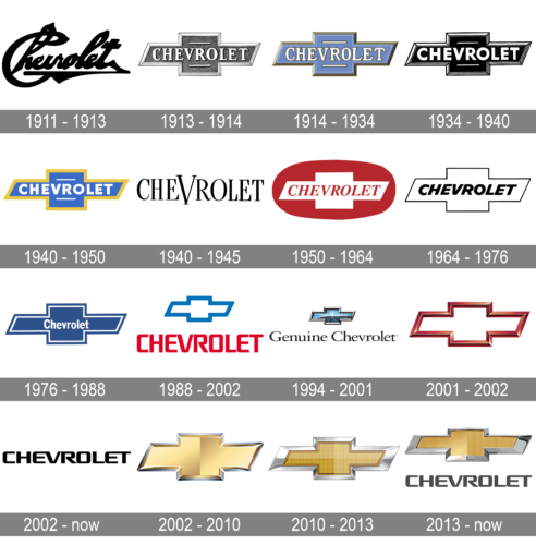
1911 – 1913
The first brand’s logo was composed of a black signature of the founder, Louis Chevrolet, executed in a bold and distinct handwritten typeface.
1913 – 1914
1914 – 1934
The famous bowtie logo was created. The color scheme of the first emblem’s version was light blue and gold with a white and gold lettering. This combination made the logo look elegant and luxurious. The wordmark was placed on the horizontal line of the Chevrolet cross.
1934 – 1940
The color scheme of the logo changed to monochrome and the typeface became more modern, while the letter’s – bigger. The logo is more masculine and strong now.
1940 – 1950
The company decided to come back to the original blue and gold color palette, but this time the Chevy blue is brighter and more intense, making a good contrast with the white font of the nameplate and a gold frame of the cross.
1940 – 1945

The Chevrolet logo from the 1940s featured a simple uppercase black lettering in an elegant serif typeface, with the letter “V” in the middle of the nameplate enlarged and looking like a stylized Victory sign or a bird. It was the simplest of all Chevrolet badges, which had no additional graphics and was not even framed.
1950 – 1964
The most radical changes to the logo during its history. The color scheme changed to red and while, with the emblem placed on a rounded red background. The cross is now white with the red italicized wordmark on it.
1964 – 1976
The period of the most minimalist Chevy logo. It is executed in monochrome, with thin lines of the bowtie contour and bold italicized wordmark.
1976 – 1988
The logo was painted blue again, but now with a thin white framing from the inside of the bow and the black shadow. The lettering has become smaller and was placed in the middle of the horizontal line.
1988 – 2002
The Chevy logo is now composed of a single emblem, the wordmark is gone. The color scheme of the cross is blue and red on a black background.
1994 – 2001
The redesign of 1994 introduced a modern three-dimensional version of the Chevrolet emblem. The Bow was executed in gradient blue with a glossy surface and a voluminous silver framing. The “Genuine Chevrolet” logotype was written in black under the emblem, using the slightly extended serif typeface with smooth sleek lines and delicate serifs.
2001 – 2002
The cross became three-dimensional, in a dark red. It is now just the contour on a white background. The logo looks modern and confident.
2002 – Today

The version of the logo created for Chevrolet in 2002 is probably the most recognizable of all. This black logotype in a custom typeface with smooth thick lines, and some of the letters connected, looks chic on almost any background and can be seen in metal on the cars of the brand, or in plain black on posters and printed materials.
2002 – 2010
In 2002, Chevrolet began to use the gold bowtie for its visual identity. The emblem reflects the brand as powerful and confident. The change reinforced the strength of what was already one of the most-recognized car emblems in the world.
2010 – 2013
The redesign of 2010 added texture to the iconic Bow. The gold patterns gained some small dots, and now it was enclosed into a thick silver frame. As for the logotype, it was placed under the bow, in a slightly narrowed black typeface.
2013 – Today
The latest redesign, introduced in 2011 to celebrate the company’s 100 anniversary, kept the gold color of the emblem, but made it more luxurious, by thickening the silver framing. The logo now looks more dynamic and strong.
The Emblem
Chevrolet’s bowtie emblem is a wide, stylized cross. The horizontal parallelogram is overlapped by the square, forming a cross figure.
Many variations in coloring and detail of the Chevrolet bowtie have come and gone over the years since its introduction, but the essential shape has never changed.
Chevrolet cars have been associated with the iconic bowtie emblem since 1914, when it first appeared, which makes it one of the longest-standing logos in history.
Color
The Chevrolet logo, often recognized by its iconic bowtie emblem, has evolved through the years, symbolizing the brand’s commitment to quality, innovation, and the American automotive spirit. This emblem, steeped in history, carries the essence of its founder’s vision and the vibrant community of real people who have grown to love and identify with the Chevrolet car.
The color of the Chevrolet logo, primarily a rich shade of gold or sometimes blue, signifies the brand’s legacy and its journey from the sketches by William C. Durant to the modern designs that resonate with today’s creative entrepreneurs. It’s a testament to Chevrolet’s security solutions against the challenges of time and market. The gold color in the logo not only represents luxury and quality but also warmth and optimism. On the other hand, the blue color echoes Chevrolet’s commitment to safety and reliability, serving as a security service to its customers. Each element of the logo, from its color to its design, is a piece of Chevrolet’s storied history, mirroring the nameplate designs that have been part of American culture for over a century.
Font
The Chevrolet logo, famously known as the bowtie, is a hallmark of design that encapsulates more than a century of automotive history and innovation. Crafted with an eye for infinity and a nod to the brand’s status as a world traveler, the logo’s font embodies the essence of creative goods, merging special goods with kind items in every curve and line. Its timeless appeal is not just a testament to Chevrolet’s enduring legacy but also a beacon for interested buyers and small businesses seeking inspiration from a global marketplace that values handmade pieces and expert support. The bowtie logo’s latest version resonates with the opinions of individuals and garners five-star reviews for its ability to represent a brand that stands for quality, reliability, and the spirit of adventure.
Incorporating elements that suggest exclusivity and attention to detail, the logo’s typography speaks to those in pursuit of made-to-order items and exclusive offers, mirroring the brand’s commitment to meeting the unique needs of its customers. Chevrolet’s approach to design is evident in the maintenance data and customer reviews, which often highlight the company’s dedication to excellence and innovation. The logo not only garners an average rating that speaks volumes about its acceptance and relevancy but also reflects the brand’s partnerships with advertising partners and its support for creative goods. Through the lens of Chevrolet’s bowtie logo, one can see a world where recommendations, purchases, and 5-star reviews drive a brand forward, making it a symbol of trust and quality for employees, customers, and advertising partners alike.
What inspired the creation of the iconic Chevy bowtie logo?
The Chevy bowtie logo, emblematic of Chevrolet’s heritage, has sparked numerous theories regarding its origin. One popular narrative suggests that William Durant, co-founder of Chevrolet, was inspired during a vacation. While staying at a French hotel, Durant was captivated by a piece of the wallpaper design, which he envisioned as a good nameplate for his automobiles. This moment of inspiration from a seemingly ordinary object highlights Durant’s imagination and keen eye for design, leading to the creation of a very good emblem that has stood the test of time.
What significance does a black bow tie on a Chevy bear?
A black bow tie on a Chevy symbolizes a blend of sophistication and power, embodying a special variant within the Chevrolet lineup. This color variation of the chevy bowtie is often associated with premium or performance-oriented models, offering a distinct aesthetic that appeals to enthusiasts seeking a combination of style and substance. The choice of a black bowtie serves as a nod to Chevrolet’s commitment to innovation and excellence, making it a sought-after feature among discerning buyers.
How has the Chevrolet logo evolved to become known as the “Chevy bowtie”?
The Chevrolet logo, known affectionately as the “Chevy bowtie,” has evolved through a century of automotive history, becoming an emblem of reliability and American craftsmanship. Initially inspired by a wallpaper design during William Durant’s stay in a Paris hotel, the logo has undergone several refinements to embody the automaker’s vision and values. This evolution reflects Chevrolet’s journey from its early days to its current status as a major player in the global automotive industry. The bowtie has become more than just a logo; it’s a symbol of the enduring legacy and innovative spirit of Chevrolet, proudly displayed on every vehicle that rolls off the assembly line.


