![]() Mazda Logo PNG
Mazda Logo PNG
Mazda is a Japanese brand of car manufacturer, which was established in 1929 in Hiroshima by Jujiro Matsuda. The company presented its first automobile in 1931. Today it is one of the top 15 automakers in the world by volume and one of the most selling car brands in Asia and Russia.
Meaning and history
![]()
The brand’s name is derived from the name of its founder, Jujiro Matsuda, which European pronunciation is Mazda. But it also has another meaning — in Asian civilizations there is a god of harmony, wisdom and light, Ahura Mazda. The brand’s founder was a very spiritual man, so Mazda name and logo are considered to have a lot of hidden meanings inside.
In the first years of its history the company was focused on manufacturing tools and heavy machinery. So the original brand’s logo was simple and minimalistic.
What is Mazda?
Mazda is one of the most popular Japanese automaking companies, which was established at the end of the 1920s, and released its first car in 1931. Today Mazda is one of the industry leaders, with its sedans and commercial vehicles exported worldwide.
1920 – 1928
![]()
The very first Mazda logo was introduced in 1920 and stayed with the famous Japanese brand for eight years. It was a powerful abstract geometric badge, executed in thick black lines and placed on a plain background. The circular shape of the logo resembled of shuriken, one of the most famous ninja weapons.
1928 – 1931
![]()
The redesign of 1928 introduced a minimalist red and white badge, with the clean perfect circular shape and two thick horizontal lines coming out of the red frame to the center of the badge. The ends of the lines had a pretty big space between each other.
1931 – 1934
![]()
The Mazda badge, created in 1931, used a famous Mitsubishi diamond emblem, composed of three rhombuses connected by the corners, forming a triangle. The white and blue logotype in fancy custom cursive was written over the geometric badge.
1934
![]()
Only the logotype remained on the badge in 1934. It repeated contours of the wordmark from the previous version but had thinner lines of the letters and this time they were solid and black, in-line the blue outlined “Mazda” from 1931.
1934 – 1936
![]()
The first Mazda logo appeared in 1934 and it was just a simple wordmark, italicized with elegant lines of the letters. The company’s first three-wheel truck was launched in the same year.
1936 – 1959
![]()
The symbolic geometrical logo, which was inspired by the Hiroshima emblem. Three parallel lines, forming three letter “M” in its middle points. Three “M”s stand for Mazda Motor Manufacturer. The icon, which represents the flow of Hiroshima river, resembles of aviation.
1951 – 1972
![]()
The Black and white geometric badge was introduced by the Japanese automaker in 1951. It featured a very interesting abstract composition of three triangles pointing down. They all featured different elements — black and white thin lines with straight cuts, placed in various ways and creating unique shapes of the symbols. This mysterious and modern logo was in use by Mazda for more than twenty years.
1954 – 1974
![]()
The redesign of 1954 introduced a text-based logo in a new blue and white color palette. It was only “Mazda” inscription in the uppercase, executed in a narrowed italicized sans-serif typeface with solid and strict letters, clean contours, and bold lines with distinct edges.
1959 – 1975
![]()
This period’s logo is showing the letter “M” in a more soft way. It was released which the first Mazda passenger cars, and was aimed to be eye-catching and memorable. The bold lines of the letter in a round frame reflect the powerful brand, which values design.
1975 – 1991
![]()
For almost 30 years the company used a letter mark logo, with no additional details and symbols. The typeface of that logo became iconic and is being used by the brand even today. It is futuristic and bold, instantly recognizable and has no analogues.
1991 – 1992
![]()
Mazda decided to come back to symbolism in its logo. The brand used a diamond-shaped emblem, which was a representation of light and sun. It’s first version was geometrical and in 1992 it was redesigned using smooth and soft lines. The 1992 Mazda logo is the basis of the current logo we all know.
1992 – 1997
![]()
The logo was refined and softened in 1992. All shapes were cleaned and made more rounded and thin. As for the lettering, it also became a bit lighter, with the size of the letters getting smaller. The Diamond and the framing became more circular than angular, which balanced the straight lines of the inscription, adding friendliness and a sense of loyalty and trustworthiness to the badge.
1997 – 2015
![]()
The well-known today brand’s symbol was created in 1997. The “V” shapes wings, representing “M”, in an oval frame, reflecting the brand’s flexible thinking and vitality. It celebrates movement and looking into the future. It is progressive and stylish.
The brand’s nameplate from the 1970s is also here. It is placed under the emblem and is executed in a bright blue, evoking a sense of flight.
2015 – 2018
![]()
The iconic silver Mazda emblem remained untouched, only its glossy surface became matte. As for the logotype, now it also turned silver but gained a thin yet distinct blue outline, which resembled the early brand’s logos, and their color palette, although also pointed to the progress and growth of the automaker.
2018 – 2024
![]()
Mazda logo is a slightly redesigned emblem from the 1988 and a wordmark, where all the letters except “D” are in the lower case. The logo is modern and sophisticated, which is elevated with the silver gray color palette. It is neat and futuristic, showing all the best sides of the brand and its values.
2024 – Today
![]()
Font and color
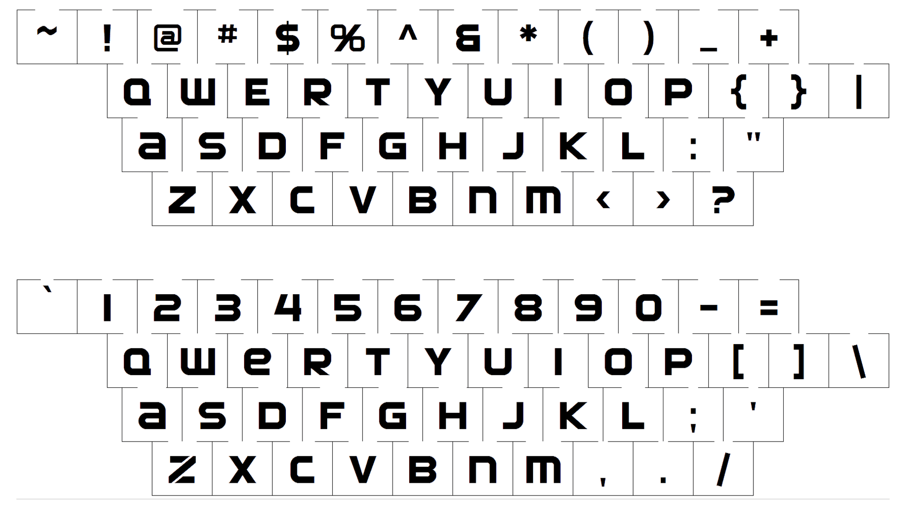
The bold stylized lowercase inscription from the Mazda primary badge is set in a custom futuristic sans-serif typeface, which looks pretty similar to such fonts as Snasm Regular and Toxigenesis Bold, but with some modifications, and stencils added to the “Z”.
As for the color palette of the Mazda visual identity, it is based on gradient silver metallic shades, with no colorful accents. The simplicity of the badge elevated its look and makes it elegant and timeless, allowing placing the emblem on any background without losing its individuality.
Font