The Honda’s logo, a symbol of Honda Motor Company’s “Power of Dreams,” can be registered in the Guinness Book of Records as the most conservative one. Actually, it remained unchanged in the entire history of the company, reflecting the Honda brand’s commitment to consistency and quality. Although this situation is the result of many different reasons, which were determined not only by the brand’s ideology, the fact is that it is the most stable logo of the XX century.
Meaning and history
The brand was founded by Soichiro Honda in 1946 for building engines for motorized bicycles, as well as complete motorcycles, marking the beginning of the Honda wing logo’s journey. The independent motor-making company appeared in 1948. In 1962, they started to produce cars, including the Honda Civic. The first automobile, which was a small pick-up truck for commercial purposes, had a Honda car’s logo on the hood, showcasing the first logo of the brand. The second production car was a sports car with the body style of a 2-door roadster.
Soichiro Honda, the brand founder, was a talented engineer. He quit school at 16 and didn’t continue his studies anymore. In spite of the absence of education, he learnt a lot in car workshops. He was about 20 when he managed to open his own auto-repair shop.
What font is used on the Honda logo?
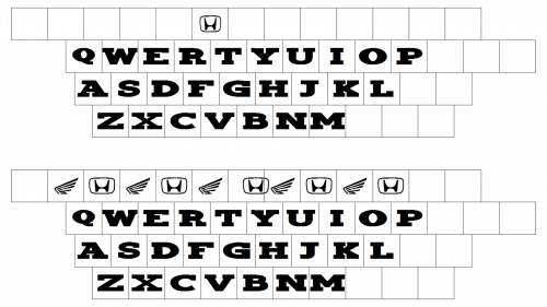
The bold and solid Honda logotype, which can be seen on vehicles such as the Honda Civic and other Honda cars, is executed in a strong serif typeface with thick lines and strict contours. It is a custom font, which is very similar to Colt Family fonts and Clarendon Bold. The main feature of the lettering is in the massive serifs, which still look elegant and add sharpness to the wordmark, reflecting the new logo’s design philosophy.
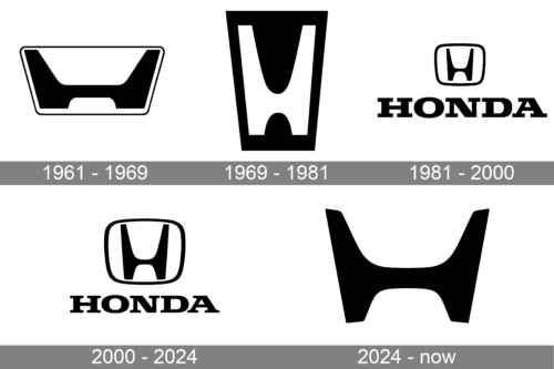
1961 – 1969
The first badge for Honda Auto was created in 1961 and stayed with the brand for eight years. It was a dark burgundy rectangular logo with two light blue, almost white, elements. The upper part of the badge had a massive stylized letter “H” with its vertical bars drawn diagonally from the center, a precursor to the Acura division’s emblem. The emblem was set above the uppercase logotype in a delicate traditional serif typeface with full shapes of the letters and clean contours.
1969 – 1981
The badge was first redesigned in 1969, keeping the emblem as the only element of the visual identity and removing the logotype from the insignia. The style and shape of the Honda logo were changed. Now the rectangle was placed vertically and the letter “H” was changed to a narrow and tall one. As for the color palette, it has also been redesigned — the burgundy and blue combination was switched to monochrome, with the white “H” on a solid black background.
1981 – 2000
The redesign of 1981 refined the lines of the logo and redrawn it in the reverse color palette — with the black “H” on a white background. The contours of the letter have been cleaned and the new badge featured a more square shape, with the rounded angles of its black thick framing. The emblem was now set above the enlarged black logotype in the uppercase, executed in a strong bold serif typeface with thick geometric contours and massive square serifs.
2000 – 2024
Volume and color were added to the Honda visual identity in 2000. The emblem was redrawn and the letter “H” got its lines elongated, so now they were touching the frame. The emblem got switched from monochrome to gradient metallic gray, with a matte sleek surface. As for the logotype, it turned red and got its lines thinner and more elegant. The size of the letters was also rethought — the inscription became a bit smaller, so the whole image looks better balanced now.
2024 – Today
The image features a simple yet iconic logo, distinguished by its minimalist design that is instantly recognizable worldwide. The emblem consists of a bold uppercase ‘H’ which stands starkly in black against a white background. The ‘H’ is stylized with particularly distinctive features: the vertical bars are slightly wider at the top than at the bottom, creating a subtle optical effect that gives the logo a sense of grounding and stability. The crossbar connects the two verticals not at their center, but slightly above, lending an asymmetrical balance to the design. This placement imparts a dynamic tension, as if the letter is in motion, poised to leap forward. The overall silhouette of the ‘H’ is housed within a square with soft, rounded corners, which adds to the logo’s approachable and modern aesthetic. The absence of any additional ornamentation or text allows the emblem to convey its message with clean efficiency, reflective of the brand’s focus on precision engineering and forward-thinking technology.
The logo encapsulates the essence of the brand it represents, which is known for manufacturing vehicles and machinery. It communicates values of strength and reliability, with the sturdy construction of the letter symbolizing durability and the black color suggesting sophistication and elegance.
Lastly, the logo embodies a timeless quality, striking a balance between tradition and modernity. It suggests that the brand it represents is rooted in a rich history of craftsmanship and industrial success, yet always looking to the future with its design and innovation. The emblem is more than just a letter; it’s a statement of quality and assurance, a badge that signifies a legacy of trust and a promise of continued excellence.
Honda motorcycle logo history
In the late 1940s, company founder Soichiro Honda started a small business making piston rings, but within a year he was already building the first cheap mopeds. The first “real” Honda motorcycle saw the world in 1949 – just three years after the registration of the “Honda Institute for Technical Research” and just one year after the founding of the Honda Motor Company. The inexpensive outboard power units for bicycles and reliable mopeds with simple motors that the company’s founder relied on proved extremely popular, paving the way for the “adult” motorcycle.
Soichiro Honda from childhood was possessed by the desire to design cars and motorcycles and his genius in all its glory was revealed in the 1960s – during the heyday of the company, when Honda motorcycles began to win the first awards on race tracks. Active production of Honda motorcycles began in ’82. Since that time, the manufacturer has been producing 3,000,000 units per year. The company is deservedly considered the most popular in the world along with Suzuki, Kawasaki, and Yamaha.
Today, Honda is a recognized leader in the world of motorcycles, producing the most advanced models of two-wheeled vehicles.
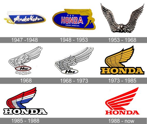
1947 – 1948
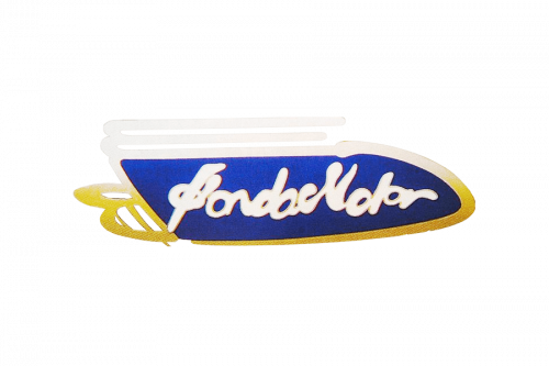
The first Motorcycle Honda badge was introduced in 1957 and only stayed for a year. It was a rounded horizontally stretched blue banner with a smooth bold white “Honda Motor” lettering in a handwritten cursive typeface on it. The badge was outlined in gold and white and had a stylized delicate wing-like element in its left part. The smooth white lettering was also outlined in gold.
1948 – 1953
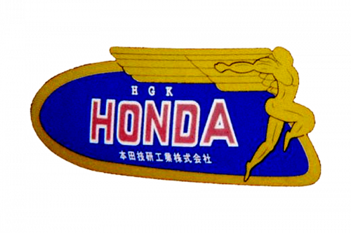
The redesign of 1948 made the Honda Motor logo more confident and readable. The blue badge became wider and taller, and the white cursive lettering turned Ted uppercase sans-serif in a white outline. The gold framing of the badge was complemented by the gold figure of a human running to the right, placed along the right border of the badge. The stylized wide geometric wing in gold was placed behind the man figure, covering the “Honda” inscription and adding a sense of movement and motion to the logo.
1953 – 1968

The badge, used by Honda Motor from 1953 to 1968 featured two metallic wings coming up and slightly to the sides. There was no lettering or any other color additions to this version, and it just spoke for itself, representing speed and freedom, the things the motorcycles of the brand gave to their owners.
1968
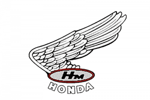
In 1968 the new Honda Motors badge saw the light. It was a horizontally oriented oval with the “HM” lettering inside and the thick outlines “Honda” inscription arched under it. The oval frame had a massive yet sophisticated wing coming out of its left part and spreading up-right. The whole badge was executed in a monochrome color palette, with only the nameplate outlined in thick red.
1968 – 1973
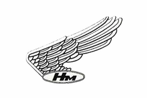
A few months later the logo was simplified, and the red oval outline was removed, being replaced by a double black and white one. Another thing that was deleted from the badge was the arched “Honda” inscription. Now the “HM” in bold black sans-serif, was the only brand’s signifier on the badge.
1973 – 1985
The fancy wing was refined and strengthened in 1973. Its contours were emboldened and cleaned and the color palette was changed to gold and black. As for the main thing — the oval badge, — it was removed and now the wing was coming out of the massive and strong “Honda” logotype in the same color palette. The wordmark was written in the uppercase and executed in the iconic corporate Honda serif typeface with strict confident lines and a thick black outline, which added more professionalism and stability to the whole image.
1985 – 1988

The contours of all the elements were refined and a bit softened in 1985, and the color palette of the Honda Motors logo was now composed of white and black for the inscription, and white, black, red, and blue for the wing. The style of the lettering and the wing remained recognizable, though in the new color scheme the logo looked more airy and fresh, being progressive and modern and evoking a sense of freedom and willingness to move.
1988 – Today
The redesign of 1988 changes the style of the iconic Honda Motors logo to an abstract and contemporary one. The wing was redrawn, using thick red lines with rounded angles. As for the lettering, it is still executed in the same typeface, but with no outlines. The new red and white color palette of the Honda emblem is a representation of the power and professionalism of the famous Japanese manufacturer.
Symbol
It was long considered that in the first twenty years of existence Honda didn’t have any logo. However, even brief overview is enough to detect a stylized letter “H” on all products of the brand. It’s worth to be mentioned that this sign is obviously symbolic, though many people still don’t realize it. Apart from the reference to the first letter of the founder’s surname, the logo signifies cosiness and safety due to its shape of a classical armchair. The first motor bicycles made by Honda were meant to be associated with the comfortable seat (by the way, they were even called “stools”, because they were very comfy for drivers).
Emblem
The Honda’s emblem, in its modern concept, was created rather late, in 1960s. Before that, the logo was introduced as a blurry image on the hood (covering practically the whole its surface).
The great practical knowledge made him not only a professional engineer, but also a famous inventor. It’s Soichiro Honda who was first to create and use a piston ring.
Yet, by the middle of 1960s, due to the development of the car industry and export marketing, the emblem got smaller and took the most traditional place at the top of the radiator grille. Such size changes were made several times and actually represented the most significant transformations of the logo.
Font
The stylized design of the capital H had a certain influence on the print. It is distinguished by the absence of decorative details and minimalistic design bordering on austerity. At the same time, chromium coating of the innovated logo’s font makes it quite prestigious and valuable. The line width helps it stand out clearly on the background.
All in all, there is always a text in the logo. As a rule, it is lettering HONDA, which is placed under the graphic element.
Colour
The Honda’s logo had different shapes depending on different periods of the company’s development. Nowadays it is a chromium coated symbol which can be seen on the cars, as well as on published and commercial materials. Red colour, which is typically associated with royalty, is the brand colour. It is used for the background and in some cases for the text element going together with the graphic logo.
What is Honda?
Honda is one of the largest Japanese companies, which is engaged in many spheres and industries but is most known internationally for its cars and motorcycles directions. The automobiles and bikes of the brand are considered to be one of the best representatives of Asian brands and are distributed all over the globe.


