The team started its history in 1979 as Ogden A’s. After more than two decades spent under the name of Edmonton Trappers, the team eventually relocated to Round Rock, Texas, in 2005 and adopted its current name. By the way, it was inspired by the senior Ryan’s pitcher nickname, “The Ryan Express.”
Meaning and history
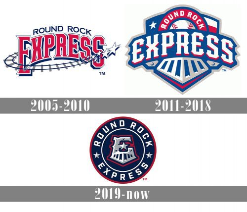 The baseball team Round Rock Express competing in the Pacific Coast League has a logo inspired by the “train” theme, which perfectly fits its name.
What is Round Rock Express?
Round Rock Express is the name of the baseball club from Texas, which was established in 2000. Today the club competes in the Minor League Baseball and is managed by Kenny Holmberg.
2005 — 2010
 The original Round Rock Express logo featured the arched lettering “Express” in red with a railroad track (navy blue, grey) going around it. The text “Round Rock” can be seen above.
2011 — 2018
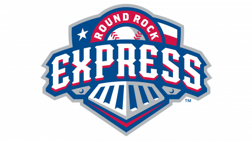 When the team was upgraded from Double-A to Triple-A and became an affiliate of the Texas Rangers in 2011, the brand identity was modified, too. The primary emblem developed by Louisville, KY-based Studio Simon placed the team’s name on the front part of a train.
2019 — Today
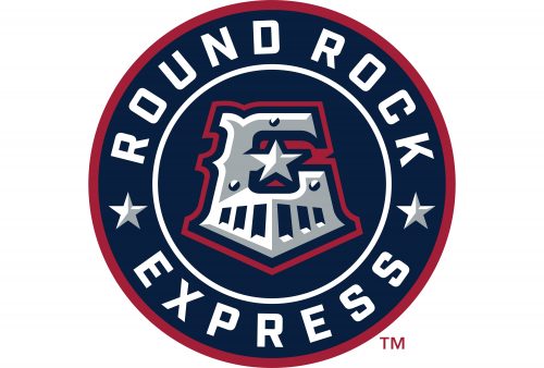
The Round Rock Express logo, created for the club in 2019, is based on the previous version, but in a more stylish and modern interpretation. This time the logo is circular, with the sharp train grille as the part of the letter “E”, placed in the very center of the badge. The stylized letter, standing for “Express” also has its middle horizontal bar replaced by a five-pointed star, as a tribute to Texas, known as the Lone Star State. The “E” is placed on a dark blue background and has a double circular white and red framing. The white uppercase lettering is placed around the perimeter of the badge, with the two parts of the inscription separated by two white and gray five-pointed stars.
Colors
The palette is based heavily on that of the Texas Rangers logo. Similar to the parent team’s emblem, the Round Rock Express logo features blue, red, and white. However, due to the addition of silver, their logo looks a bit softer and more subdued than the Ranger’s emblem.


