The team represents the twin cities that, though called the same, Bluefield, are located in different states, Virginia and West Virginia. The history of the team started in 1937. Its original name was the Bluefield Blue-Grays.
Meaning and history
The logo of the baseball team Bluefield Blue Jays playing in the Rookie Appalachian League is heavily based on that of their parent team, the Toronto Blue Jays.
1977 — 1996
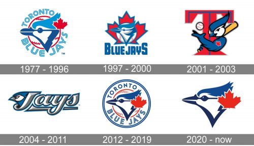
The logo, designed in 1977, was created for the club’s name Toronto Blue Jays and features a cold and light blue, red, and white color palette, bold lettering, and a memorable bird drawing. The bird was depicted in profile, facing to the left, and enclosed into a circular frame formed by two parts of the inscription — “Toronto” on top, and “Blue Jays” at the bottom. The red maple leaf, a symbol of Canada, was placed in the right part of the bird’s head, as a patriotic symbol and as a colorful eye-catching element.
1997 — 2000
The redesign of 1997 refined the contours of the emblem and made it look three-dimensional by adding some light-gray gradients to the bird’s head. The profile was now set on a white and red baseball, which was placed on an enlarged red maple leaf in a thick blue outline. The “Toronto” part of the lettering was removed and only the “Blue Jays” stayed, written under the image in an extra-bold sans-serif typeface, in blue uppercase, with the first and last letters enlarged.
2001 — 2003
The logo, designed in 2001 was a funny caricature, with the bird depicted as the baseball player, wrapped around an enlarged red letter “T” in a square serif font with thin blue lines coming through both of its bars. The bird was holding a baseball bat in one winged hand (the one with a red maple list tattoo), and throwing a white and red baseball with another one. It was funny, lively, and a very friendly image, with lots of charm and playfulness.
2004 — 2011
The red color was gone from the Blue Jays visual identity in 2004. For the next seven-year the club has been using a classy modern badge in blue and white, with the bird’s head on the left and a slanted cursive wordmark emerging from it. The “Jays” inscription was executed in white and gray, outlined in blue, and underlined by a thick element, drawn in the same three colors. This script logo was very elegant and cold, evoking a sense of progress, willingness, and power.
2012 — 2019
With the redesign of 2012 the old logo, created in 1977, was brought back as the official one for the baseball club. Although it was strengthened and refined, with the colors of its traditional tricolor darkened up, it was still almost the same as the original emblem. The “Toronto” part of the wordmark was executed in a simple sans-serif, white the bottom “Blue Jays” has been using the same outlined typeface. Another addition was in the thin double blue circular frame around the whole composition.
2020 — Today
In 2020 the Blue Jays logo was minimalists to just the bird’s head. All the framing, lettering, and even a baseball background of the emblem were removed from the composition. The bird’s head got enlarged and started looking sharp and progressive. The red maple leaf in a thin white outline was slightly enlarged compared to the previous version.
Colors
The palette comprises royal blue, navy blue, red, and white.


