

![]() Brooklyn Cyclones Logo PNG
Brooklyn Cyclones Logo PNG
The Short-Season A affiliate of the New York Mets, the Brooklyn Cyclones have an independent brand identity that doesn’t coincide with that of their parent’s team neither in the color palette nor in shape.
Meaning and history
![]()
The Brooklyn Cyclones were established in 1986 and have been part of the New York–Penn League ever since.
![]()
Primary symbol
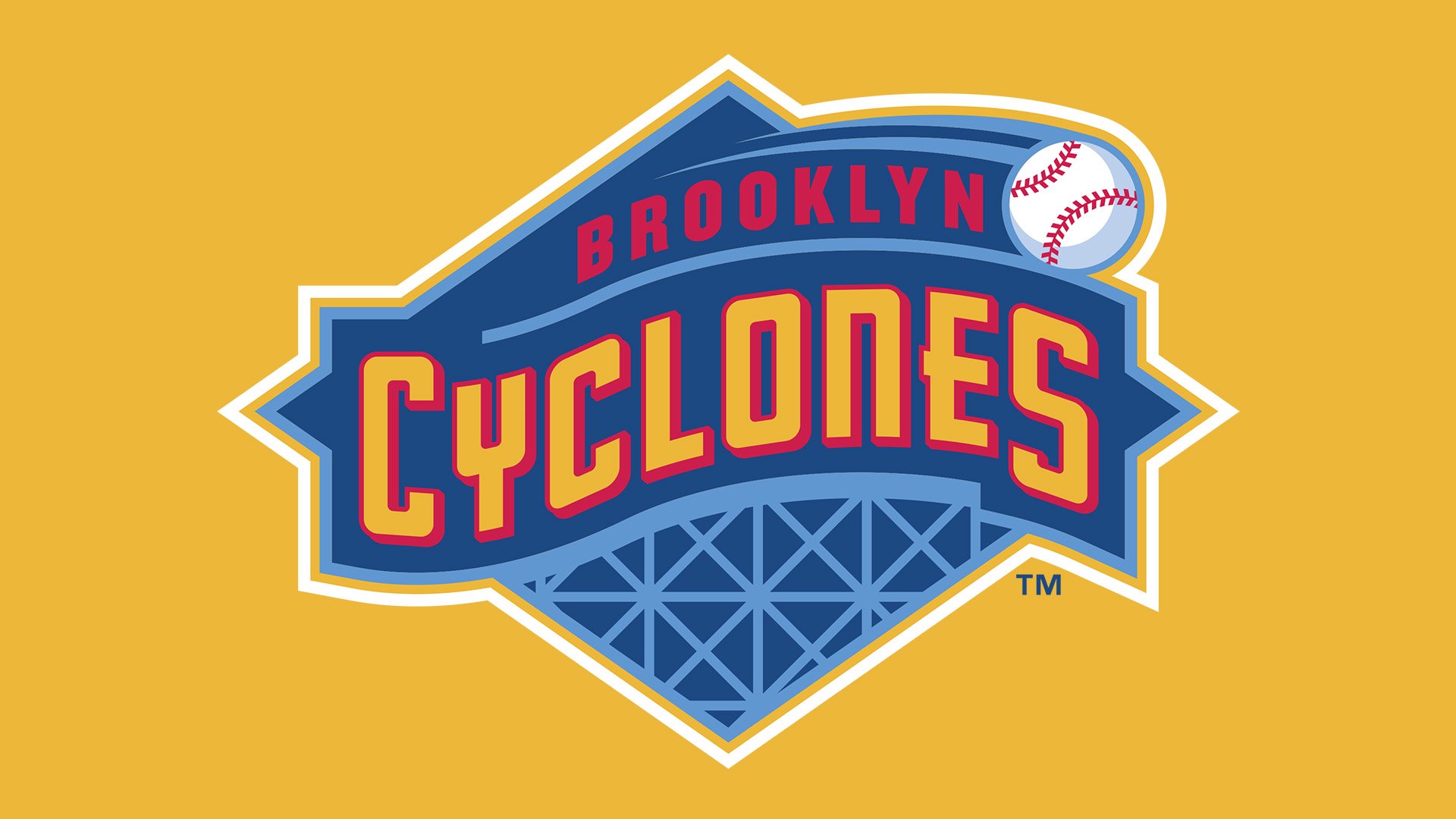
The Brooklyn Cyclones logo depicts a cross-hatch pattern of the structure that forms a roller coaster. Also, you can see a baseball going down the roller coaster. The logo was developed by designer Todd Radom.
Cap emblem
The large “B” on the cap insignia was inspired by the original Dodgers’ B cap, while the “C” stands for “Cyclones.”
Colors
![]()
While the combination of the blue and orange was inspired by the parent team’s logo, in fact, the shades are different from those used by the New-York Mets.


