

![]() Oklahoma City Dodgers Logo PNG
Oklahoma City Dodgers Logo PNG
The logo of the Minor League Baseball team the Oklahoma City Dodgers visually aligns it with its parent club from the Major League, yet it’s far from a copy.
Meaning and history
![]()
The history of the Oklahoma City Dodgers officially started in 1962. They began playing under the name of the Oklahoma City 89ers and went through two more names until they finally received the current one in 2015.
![]()
Symbol
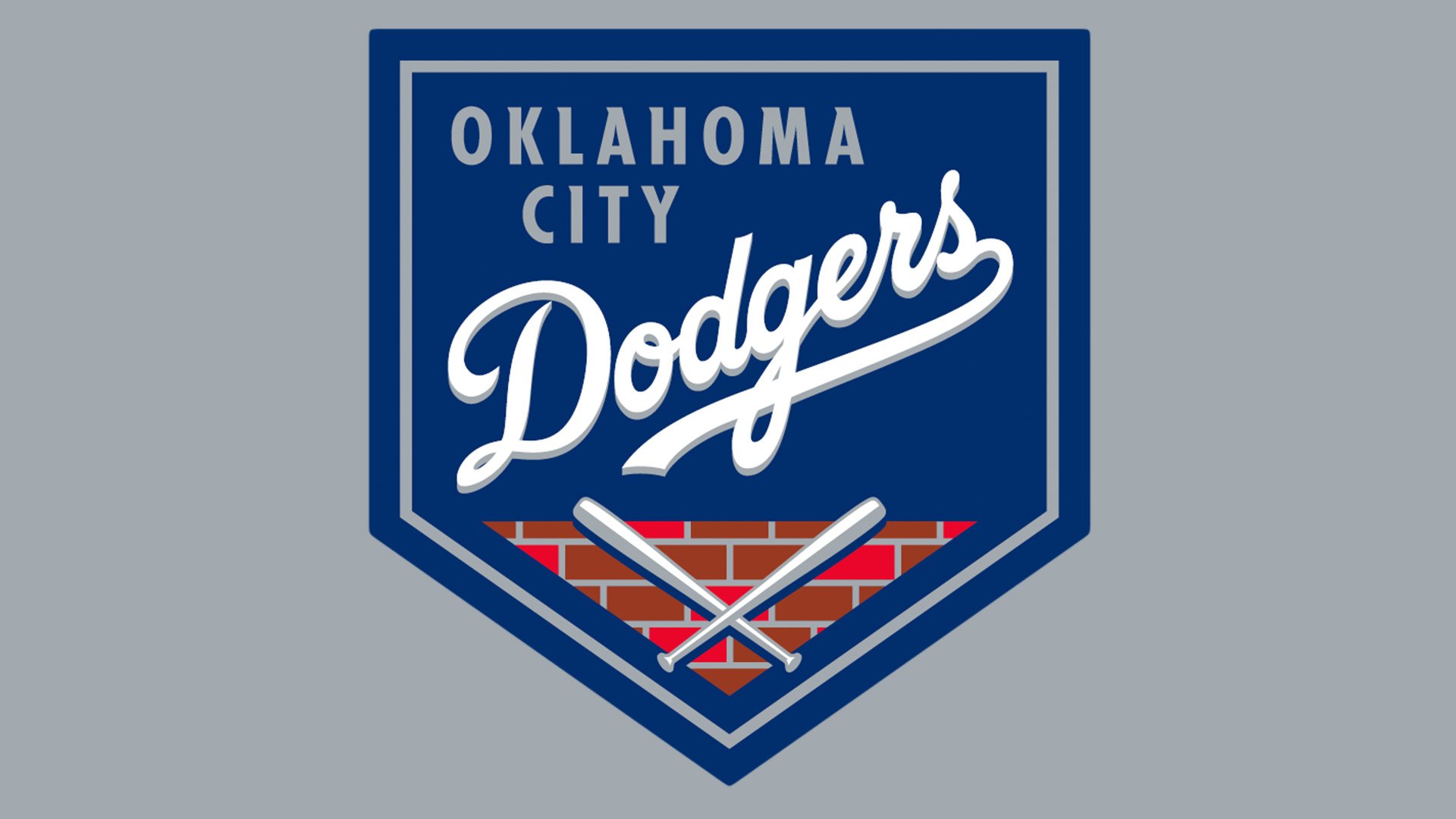
Together with the new name, the franchise unveiled a corresponding Oklahoma City Dodgers logo. Its focal point is the word “Dodgers” given in the same script as on the logo of the Los Angeles Dodgers, with which the Oklahoma club is affiliated. However, the logo of the minor league team has the word written in white, while the logo of its parent features the text in blue.
Except for the lettering, the two logotypes are utterly different. The Oklahoma City Dodgers logo has a shield shape. Apart from the text “Dodgers” in white, it comprises a fragment of a brick wall with two crisscrossed baseball bats over it and the lettering “Oklahoma City” in grey.
Alternative emblems
There’re more than five secondary symbols, which have a different shape but share the same color scheme.
Colors
![]()
While the colors are generally the same as those of the parent team’s logo – blue, white, and red, – the shades appear to be slightly different.


