

![]() Mello Yello Logo PNG
Mello Yello Logo PNG
Mello Yello is a uniquely flavored drink that has been refreshing the American consumer for nearly 50 years. The drink was first introduced in 1979. Back then, Coca-Cola wanted to release a worthy competitor to the incredibly popular soda from PepsiCo, Mountain Dew.
Meaning and history
![]()
Mello Yello, introduced at the end of the 1970s, was the Coca-Cola response to PepsiCo, whose Mountain Dew was at the peak of popularity. It was a carbonated soft drink with a lemon-citrus flavor full of freshness and sweetness. Besides the main one, there were some less common flavors of the drink, such as Melon or Cherry. But they didn’t become as popular. Also, Mello Yello was loved by the people as it gave energy — one of the beverage’s main components is caffeine.
During its long history, Mello Yello has often changed its coverage and geography. For example, in the 1990s it was no longer sold in Australia and New Zealand, but in the latter Mello Yello returned to the market in 2006, though in a limited edition.
On the territory of America, the drink is also sold today only in “selected” locations. Mello Yello can only be found on store shelves in the eastern part of the country. The rest of the state can enjoy the citrusy energy drink from vending machines in some retail and restaurant chains.
What is Mello Yello?
Mello Yello is the name of a citrus-flavored soda water, produced by the Coca-Cola Company. The brand was introduced in 1979, yet in 2021 the product started to be available only in the eastern part of the United States. Although, you can still find it in the machines in some of the Cracker Barrel and Golden Corral locations.
In terms of visual identity, the Mello Yello brand has had many “faces” throughout the years. In 2010 they decided to bring back its retro logo, and already in 2015, the company introduced a completely new badge, which perfectly suits the eco-friendly policy of Coca-Cola and its new transparent packaging.
1978 – 1985 (USA and International), 2003 – Today (East Asia)
![]()
The original Mello Yello logo featured a solid yellow background and two-leveled lowercase lettering in a rounded Helvetica typeface. The upper, “Mello”, line was set in green, while the bottom “Yello” — was in red. All the four “L”s were elongated and went slightly under the line.
1985 – 1988
![]()
The redesign of 1985 has kept the Mello Yello color palette but significantly changed its style. First of all, the lowercase lettering was replaced by the uppercase one. Secondly, the typeface was changed to a strict and sharp geometric one, with clean lines and straight angles. Thirdly, the inscription has a light outline and a green shadow.
1988 – 1994
![]()
In 1988 the red and green lettering was placed against a solid black background. The lines were now wavy and the typeface changed to a bold yet smooth serif one. The inscription was placed above the yellow emblem depicting a rising sun behind the mountain.
1994 – 1999
![]()
The redesign of 1994 introduced something new for the brand: a sharp solid-red banner with geometrically-cut edges, outlined in black with a medium-weight black shadow. The uppercase lettering on the banner was set in solid yellow and executed in a fantasy designer typeface with straight lines and cuts.
1999 – 2010
![]()
The logo, created for the Mello Yello brand in 1999, was lighter than the previous version, as the main color here was yellow. The two-leveled black lettering in a double yellow and red outline was set diagonally across the yellow oval medallion in a black outline. The badge stayed in use for more than ten years.
2010 – 2015
![]()
In 2010 the brand decided to bring back its original design, but with some interesting modifications, which reflected the progress of the iconic label. The rounded two-leveled lettering in red and green was set against a yellow background, with the “L”s in “Mello” elongated to the very top of the banner, and the “L”s of the “Yello” — to the very bottom.
2015 – Today
![]()
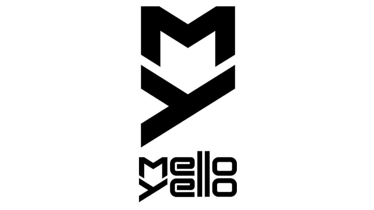
The redesign of 2015 has introduced a super stylish and futuristic badge for Mello Yello, which is completely different from all the previous versions. It is a yellow two-leveled inscription in a stylized geometric sans-serif typeface with the shared “LL”, placed against a transparent background, on the right from the “MY” monogram. The secondary version of the logo is black-on-white.
Font and color
The lowercase designer lettering from the Mello Yello logo is set in a custom futuristic sans-serif typeface which has something in common with such commercial fonts as Terranova NF or Neo Afrique Pro but with significant modifications of the characters’ contours.
As for the color palette of the Mello Yello visual identity, it is based on a light and vivid shade of yellow, which, firstly, represents the name of the drink, secondly, its citrus flavor, and thirdly, stands for energy and joy it brings.


