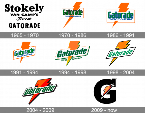
Since the 1970’s redesign, the Gatorade logo did not change that much until 2008, when a completely new design was introduced. However, the lightning bolt, which has been the distinctive feature of the logotype for almost all of its history, has remained.
Meaning and history
The Gatorade visual identity has been using one symbol, which became iconic, since the 1970s. Before that, the brand had only one logo version, created in 1965, and it was more a trial badge.
What is Gatorade?
Gatorade is the name of an energy drink, owned and manufactured by PepsiCo. The brand was established in 1965 in the United States, and today is known as one of the most popular sports drinks producers in the world. Gatorade has its drink with several flavors available.
1965 – 1970
The original Gatorade logo was introduced in 1966 and featured monochrome lettering set in four levels. It was more of an official badge than a label, strict, laconic, and simple. The banner featured “Stokely” on the top level, executed in a massive serif font, “Van Camp’s” under it, in smaller lettering, “Finest” in cursive with elongated lines, and, finally, “Gatorade”, placed on the bottom level and executed in a bold sans-serif font, using capital letters.
1970 – 1986
The rebranding of 1979 brought an iconic colorful symbol to the Gatorade visual identity. The logo of these years was composed of a bold green wordmark in a black outline, enclosed in a thin orange rectangular frame, with a solid orange lighting bolt coming through it. There was also a blue “Thirst Quencher” tagline in all capitals, placed under the main wordmark inside the frame.
1986 – 1991
In 1987 the lettering becomes bolder and its outline is changed from black to blue, balancing the color of the tagline. The lightning bolt is being slightly shortened, which gives the image a more solid and stable look.
1991 – 1994
The Gatorade logo is being redesigned again in 1991. The color palette remains untouched, though the composition slightly changes — the banner with the wordmark is inclined and now placed diagonally, having its upper left and bottom right corners rounded, and the other two — sharp.
1994 – 1998
The redesign of 1994 simplified the logo color palette to just orange and green. The tagline is placed under the frame now, and the main wordmark is executed in a bolder sans-serif with smooth rounded lines and straight cuts of the letters. The orange lightning bolt gains gradient shades and a thin yellow outline with a green shadow, which adds dynamics and motion to the image.
1998 – 2004
The tagline is being removed from the logo in 1998, as well as all the green details. Now green is used only for the wordmark, as for all the other color accents — they are made black. The gradient of the bolt is back to flat orange, so the composition looks minimalist and laconic.
2004 – 2009
In 2005 the logo is redrawn in a sharp and modern manner. The rectangular frame is gone, and now the green sans-serif inscription is placed on a white background, which repeats the contour of the inscription and is outlined in black. The orange lightning bolt is now gradient red, looking more powerful and progressive than ever.
2009 – Today
A completely new concept was introduced. Y the brand in 2009. The wordmark was removed and replaced with a massive gray “G”, which now is the main element of the visual identity. In the middle of the huge letter, there is a yellow lighting bolt with a doubly red and black outline. No additional details, no gradient shades. Just a plain flat logo, composed of two symbols.
Font
All the versions feature a custom drawn serif typeface. There are, however, several fonts that share something in common with it. For instance, the international logo has similarities with the Linotype Rory Oblique. The classic label sported a different font, a bolt sans serif one.
Colors
The international version of the Gatorade logo combines dark grey (for the letter), black and two shades of orange (for the lightning bolt), and white for the outline. The palette of the special edition logo launched in North America in 2015 was more complex. In addition to orange, grey, yellow, black, and white, it also included bright shades of green.
What does the Gatorade logo represent?
The confident and stable logo of the Gatorade brand depicts a heavy black capital letter “G”, which stands for the name of the brand, with a sharp orange and red lightning bolt, which represents the energy and power the drink gives. The Gatorade bolt is a graphical explanation of the brand’s energetic drinks purpose and the company’s essence.
When did Gatorade change its logo?
The Gatorade badge was changed more than half-dozen times throughout the years, with the latest redesign held in 2009. The current version of the Gatorade badge is one of the most long-lasting in the brand’s history.
Why did Gatorade change its logo?
Gatorade is a brand about power, energy, and determination, and its logo has to perfectly represent all these qualities, this is why Gatorade has been trying to strengthen its badge many times throughout the years, with the last redesign, held in 2009, introducing a heavy bold image, which suits all the needs of the company.
What is Gatorade’s slogan?
The slogan of the Gatorade brand, “Win From Within”, was introduced in 2013, replacing the iconic “Is It In You?” The catchphrase, used by the brand for years. There were several more motto options, Gatorade used. For example, “Be Tough”, “Shine On”, and “Gatorade Thirst Quencher”.


