

![]() Fanta Logo PNG
Fanta Logo PNG
Fanta, a soda drink from the Coca-Cola family of products, has a cheerful, full of energy logo. But it has not always been the same. The brand has a long history, and so does its logo.
Meaning and history
![]()
The history of Fanta’s visual identity is one of the most intense and colorful in contemporary marketing history. Here have been more than a dozen redesigns held for the famous orange beverage, and with each change, the look of the label became fresher, brighter, and friendlier.
1940 – 1962
![]()
The original Fanta logo was created in 1940 and consisted of a bold black logotype in the lowercase with a fancy elongated tail of the letter “F”, elegantly curved, and aging a special mood to the whole image.
1962 – 1970
![]()
The redesign of 1962 brought a light blue and white color palette to the logo, putting a white sans-serif inscription in a title case on a rectangular blue badge with its upper bar arched down, resembling a smile.
1970 – 1980
![]()
In 1970 the inscription was redrawn, it’s sand-serif typeface gained smooth thick lines and softened angles. The black wordmark looked sleek and confident and was accompanied by three orange circles, arched over the bar of the letter “N”, representing oranges, the main drink’s flavor.
1980 – 1995
![]()
The redesign of 1980 changed black to intense blue, and orange to red, adding a smooth neat leaf to the oranges. The all-caps lettering was replaced by the title case inscription, and the red and green icon was moved to the left.
1995 – 1997
![]()
In 1995 the three oranges were replaced by an abstract orange leaf, looking contemporary and creative, and adding uniqueness to the brand, showing its ability to change and grow.
1997 – 2004
![]() The same logotype in a bit different shade of blue was diagonally placed on bright orange or yellow (depending on the drink’s flavor) background, having a stylized green leaf in a blue outline coming out on the letter “N”.
The same logotype in a bit different shade of blue was diagonally placed on bright orange or yellow (depending on the drink’s flavor) background, having a stylized green leaf in a blue outline coming out on the letter “N”.
1997 – 2008
![]()
All the additional details were removed from the logo in 1997, only the blue wordmark stayed, but was redrawn in a modern and stylish way, with its thick letter lines a bit uneven and artsy.
2000 – 2004
![]()
The version, created in 2000, featured some white details, used as an outline of the logotype, and for diluting the gradient orange of the background, which makes the whole logo brighter and the contrast between colors — stronger.
2004 – 2008
![]()
The logo was simplified in 2004, bringing back the blue wordmark and white background, but placing it diagonally, and adding a green leaf above the inscription. The contours were cleaned and the shade of blue got elevated.
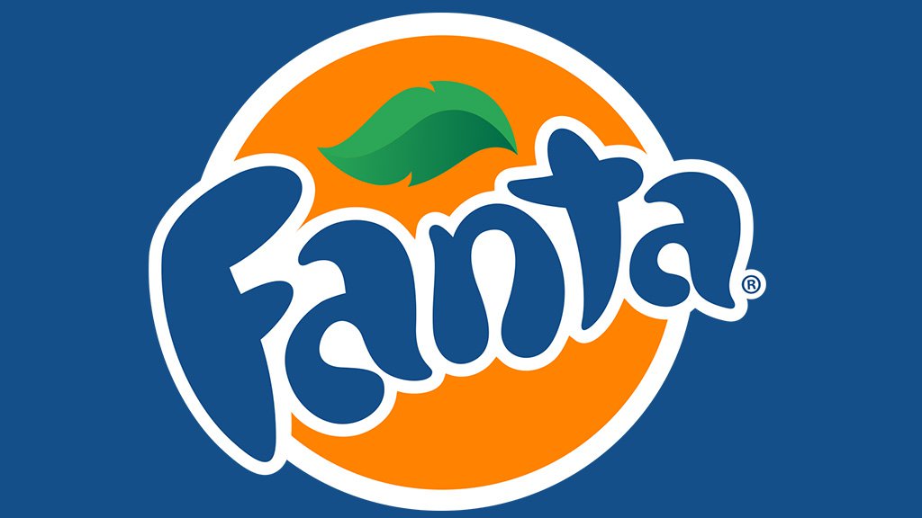
2008 – 2010
![]()
The Fanta logo version from 2008 was composed of a dark-blue inscription in a white outline, placed on a solid orange roundel, with the gradient green leaf placed above the “an” part of the wordmark. The lettering was set diagonally and had all character heavier yet smoother in contours, than the one from the previous version.
2008 – 2016
![]()
By 2008 Fanta had spread around the world, offering consumers more than 70 flavors. It needed a new identity. The positive imagery consisting of an orange with a green leaf and the wordmark against it was designed by San Francisco-based Office.
In fact, the designers developed a whole range of branding elements ‒ shapes, colors and a playful lettering ‒ so that the company could use them in different ways according to the flavors and the audience.
Surprisingly, the very word “Fanta” is a derivative from “Fantasy”, “Imagination.” Having received the task to create a short (no more than two syllables) and capacious name during the brainstorm, the workers of the German Coca-Cola company simply removed the “excess” syllable from the German word “Fantastik”. The result was pleasantly surprising – the original name encourages the client to play this game – to quench own fantasies with this drink.
The old logo is still in use in some markets, and it works well.
2010 – 2016
![]()
In 2008 the inscription got enlarged, and the orange circle became smaller. The new logo looked stylish and bright, being memorable and instantly recognizable all over the world.
2016 – Today
![]()
The new geometry of the logo was adopted by the brand in 2016. The rounded shapes of the wordmark were switched to the square ones, and today’s Fanta logo boasts a bold and confident sans-serif inscription, where each capital letter in white featured a bold purple outline. The green leaf was also redrawn and enlarged, and now it is coming out from the letter “N”, directed up left. The logotype is placed on a solid orange circle, resembling sun, summer, and oranges, of course.
2017 – 2021
![]()
In 2017 the Fanta badge was redesigned again, with the heavy blue shadow of the logo from 2016 removed. All other elements were the same, but the white lettering in a geometric sans-serif in a thick blue outline looked completely different that when it was heavily shadowed. This version stayed in use by the brand until 2021.
2023 – now
![]()
The redesign of 2023 has removed the orange roundel from the Fanta badge composition, as well as the green leaf, keeping only the white uppercase logotype in a thick blue outline with a massive shadow, just like in the badge from 2016, but here the shadow is elongated and makes up a triangle pointing down. This minimalistic badge is still very intense and bright, showing the new angles of the company and it’s progressiveness.
Font and Color
The bold uppercase lettering from the primary Fanta badge is set in a designer sans-serif font with the capitalized characters jumping above the line. The closest fonts to the one, used in this insignia, are, probably, P22 Nudgewink Bold, or Surfer Shop BTN Bold, with some minor modifications.
As for the color palette of the Fanta visual identity, with the redesign of 2023, it got reduced to just blue and white, with the orange and green shades removed. In a new scheme, the badge started looking more refreshing and stable, showing the main target of the brand, and leaving all the bright shades to its taste.


