

![]() Jack Daniels Logo PNG
Jack Daniels Logo PNG
Among all the US whiskey brands Jack Daniel’s boasts the largest sales volumes not only in the US, but in the world as well. The beverage is still made by the historic Jack Daniel Distillery in Lynchburg, Tennessee, where the first bottle was created by the legendary Jasper Newton “Jack” Daniel.
The beverage is not sold anywhere in the vicinity of the Distillery, as it is located in Moore, which is a dry county.
Meaning and history
![]()
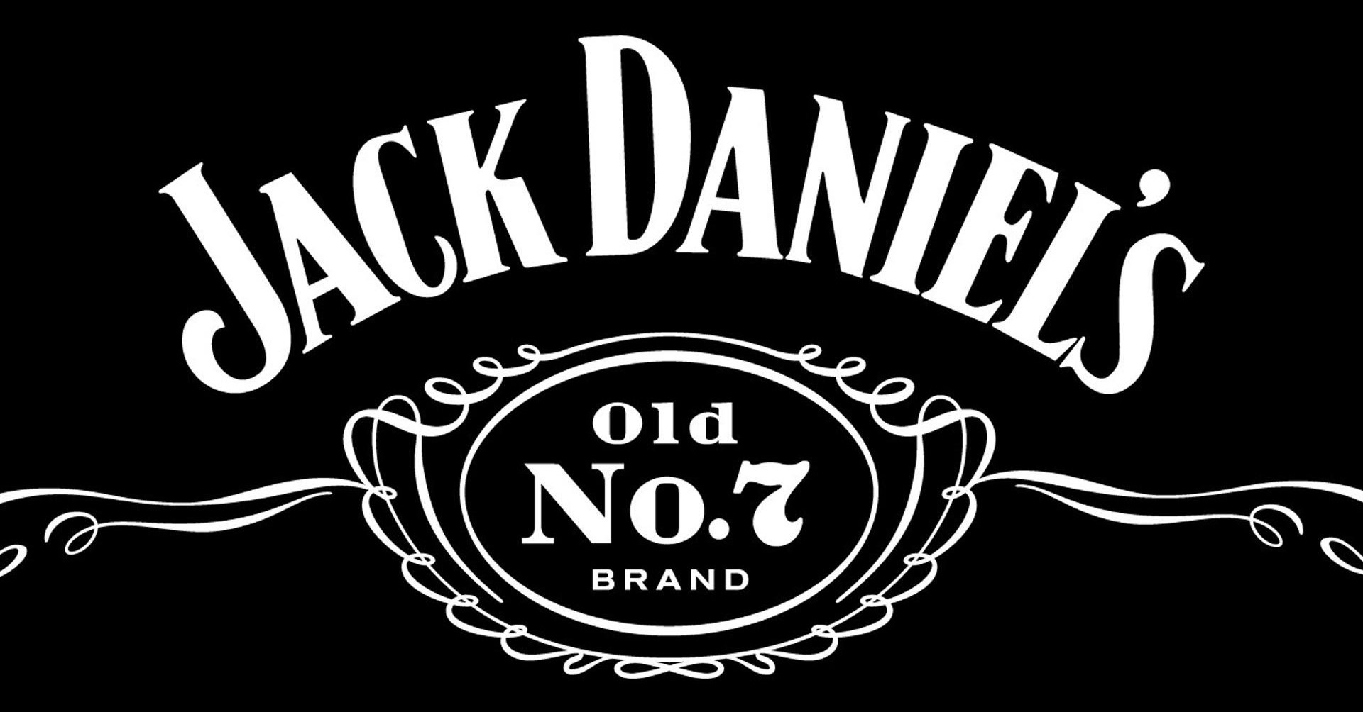
Jack Daniel’s label has steadily evolved in the course of time. Quite a few details have been changed. Generally, with every new version the presence of black became greater, while the decorative elements became simpler.
The central part of the current label is an oval-shaped element with a kind of coiled strand around it. Inside the oval structure, there is the “Old No.7” insignia. The square bottle is as easily identifiable as the iconic label itself.
What is Jack Daniels?
Jack Daniels is one of the most famous American brands of whiskey, which was established in 1975 in Tennessee. Today the beverages of the brand, owned by Brown-Forman Corporation, are sold all over the globe.
1950’s – 1990’s
![]()
The earlier version looks like a chalkboard shop sign typically seen in front of various shops. The blackboard has a delicate elegant frame design. The company’s name is arching across the top, featuring all uppercase letters with wedge serifs. Underneath, it says “Old Time” using a simpler, smaller font. An oval element right underneath also had an intricately designed frame. Besides the “Old No.7 Brand” inscription in the oval shape, the logo has other information, including the address and establishment date. This makes it look even more like a chalkboard sign. All the inscriptions feature custom, handwritten fonts. The name, for instance, is printed using a font similar to Black No.7 designed by a Typocalypse typographer from Germany.
1990’s – 2011
![]()
The company placed an accent on its name this time. It was enlarged so much that the characters went beyond the frame and the designers removed a portion of the decorative framing. The oval shape along with the “Old Time” inscription above it and several lines underneath was made smaller, which further placed emphasis on the name and made it stand out from a multitude of other inscriptions. The latter now had even more information. Just like in the previous logo, the designers used different fonts and character sizes to separate various information. Unless you are a fan of the brand and know every line by heart, the updates did not change the brand image in any way.
2011 – now
![]()
Even though more than half a century has passed since the first logo was created, the company’s logo had almost the same visual identity. It changed only small details without modifying the overall style and look. The company minimized information provided in the logo, which is in line with modern trends and encourages the viewer to read everything that is included in the emblem. However, this mainly touched the fine lines at the bottom, while the upper two-thirds of the logo stayed almost unchanged.
Symbol
The iconic black-and-white label was introduced in 1911. This was exactly the year when Jack Daniel died, and some sources mention that the black color was chosen for the label in honor of Mr. Jack’s passing.
Emblem
The latest update of Jack Daniel’s Tennessee Whiskey logo was made by the Minneapolis-based brand design company Cue. The new version preserves the white filigree of the iconic label, yet there are changes in the way the elements look. The inscriptions on the front part of the label have grown shorter, thus accentuating the contrasting design of the logo.
The side parts of the label were changed much more. They tell a new version of the product story. The iconography on the left explains that the legendary beverage is still mellowed, matured, and tasted at the historic distillery in Lynchburg, Tennessee. It also mentions the product’s awards. On the right, there is Jack’s photo, with a brief story of his distillery. The modified version looks balanced and communicates both the premium quality and the independent spirit of the iconic product.
Font
![]()
The Jack Daniels logo features several custom typefaces. The full name of the company is written on the top of the label in capitals. The second largest inscription, “Whiskey”, is also made in capitals and features another typeface. The font used for the word “Tennessee” looks like handwriting.
Color
![]()
The contrast of black and white is a distinctive feature of Jack Daniels emblem. Although the logo has undergone several redesigns since its introduction in 1911, the color scheme has never changed.
Who designed the Jack Daniels logo?
There is no information on who was the original author of the iconic Jack Daniel’s logo, introduced in the first years after the company a foundation, however, the latest refinement of the badge, which was held in 2011, was entrusted to Alan Colvin from the Cue design bureau.
What is the explanation for the logo of Jack Daniels?
Apart from the simple and obvious explanation of the Jack Daniels logo, the name of the brand, and its product, written on a solid black background, there is something worse about this badge. The iconic “Old No.7” inscription is the original Jack Daniels label. It is also called the Black Label. This insignia was the district identification number assigned to Jack Daniels, the founder of the brand. After the district change, the federal government assigned the brand number 16. Jack kept the old number because it gained popularity with customers. At the time, distilleries advertised their products with numbers, not logos.


