The Winnipeg-based team Manitoba Moose belongs to the American Hockey League and has the NHL’s Winnipeg Jets as its parent club.
Meaning and history
Manitoba Moose is a young sister of Winnipeg Jets, a professional Canadian hockey club, which plays in the National Hockey League. As for the Moose, which was established in 2000, it is today a part of the American Hockey League, which is a bit weaker than the NHL.
Manitoba Moose is owned by True North Sports & Entertainment company and has Canada Life Center stadium as the home ground. The General manager of the club is Craig Heisinger, and the head coach is Mark Morrison.
What is Manitoba Moose?
Manitoba Moose is the name of an American professional hockey club, which was established in 1994 in Winnipeg, Manitoba, Canada. The club is a member of the American Hockey League, which is the second-tier hockey association in the United States and Canada.
1994 — 1996
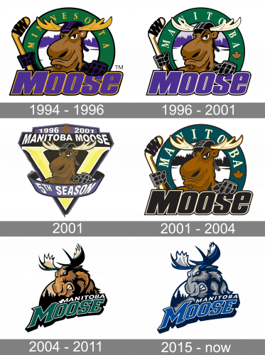
The original logo depicted a human-like moose with a smug expression, wearing a blue helmet and wielding a hockey stick. It’s surrounded by a green circle with the word ‘Minnesota’ (changed to ‘Manitoba’ later) written in yellow letters on it. As a foundation for these elements, they had ‘Moose’ written in big blue letters below.
1996 — 2001
The original Manitoba Moose logo, which was introduced for the 1996/97 season, featured an anthropomorphized moose, who, in spite of the hockey stick, looked more like a tourist on a winter resort than a determined hockey player.
2001
2001 celebrated the team’s 5th active season, and, as such, they decided to introduce a celebratory logo. Is used the same moose, except it was now put inside a golden ‘V’ (the Roman ‘5’) symbol. There were additional details. One included a ribbon near the bottom saying ‘5th season’. There was also text above saying ‘1996-2001’ and ‘Manitoba Moose’ in white letters.
2001 — 2004
The same could be said about the 2001/02 logo, which differed from the original only in its color palette.
2004 — 2011
In advance of the 2005/06 season, though, the team adopted an emblem with an aggressive moose, which looked more like a sports emblem. The only modification so far has been a shift to a new color palette before the 2015/16 season.
2015 — Today
The redesign of 2015 switched the color palette of the Manitoba Moose logo to blue and gray, which made the emblem look colder and fresher. The contours of all the elements were cleaned and emboldened, hence the refined logo started looking more confident and professional.
Colors
The Manitoba Moose logo features cool, discreet shades, including Polar Night Blue, Aviator Blue, two shades of grey, and white.


