The Monster Energy drink has been manufactured by Hansen Natural Company (which is now called Monster Beverage Corporation) since 2002. The modernistic Monster Energy logo was created by McLean Design, a branding company headquartered in California.
Meaning and history
The company has been alleged for using Satanic symbols. Some people mention that the Monster Energy logo seems to include three Hebrew characters, which have the numerological meaning of 6. Therefore, in their view, the emblem is nothing but the Biblical Number of the Beast. However, the design firm responsible for creating the logo claimed the emblem did not include any Satanic implications.
2002 – Today
The emblem represents a large neon “M” on the black background. The characters look “torn” and somehow resemble the claws of a monster trying to get out of the can.
Monster Energy logo has never been modified since its introduction in 2002. One of the reasons can be that the beverage’s sales have stayed rather high, while logotypes are very often redesigned when profits start dropping. However, there are several versions of the emblem created for various types of the drink (Absolutely zero, Assault, Khaos etc). Having the same shape, they vary in terms of the color palette.
Who created emblem?
The authors of the Monster Energy emblem were designers from McLean Design. The firm based in Walnut Creek, California, specializes in brand and packaging design. In addition to Monster Energy, the company boasts such famous clients as Nestle, SunSweet, Bosch, Epson, Unilever, and Coca-Cola. While developing brands, McLean Design puts an emphasis on consumer engagement as the way to making a lasting connection.
Font
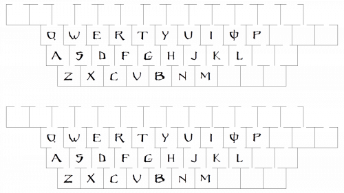
Every letter in this custom typeface is unique. Characters have slightly different sizes, due to which a very unusual visual effect is produced. Probably the most eye-catching one is the “O” character with an overlapping vertical bar.
Color
The distinctive neon green is accentuated by the black background. This combination embodies the product’s core features (aggressive, exclusive, energetic, youthful, exciting) perfectly well.
What does the Monster Energy logo stand for?
The Monster Energy logo, symbolizing a dynamic and bold visual identity, is often interpreted as three claw marks that create a vibrant impression of energy and power. This design, embodying scratches that seem to tear through the background, represents the brand’s energetic essence. The logo’s simplicity and the use of the brightest shade of green against a stark black frame contribute to its memorability and association with high energy.
Who designed the Monster Energy logo?
The iconic Monster Energy logo was crafted by a professional design studio, renowned for their expertise in creating memorable and impactful visual identities. This studio successfully combined simplicity with a striking visual concept, incorporating unique lettering and vibrant green stripes against a black background, to capture the brand’s essence.
Why was Monster banned?
Monster faced bans and online attacks due to concerns over its high stimulant content. Critics pointed to the combination of caffeine, ginseng, and other chemicals, suggesting they could pose health risks. This controversy led to scrutiny and calls for regulation, sparking debates about the safety of energy drinks.
Where is Monster Energy made?
Monster Energy is produced in various locations worldwide, ensuring that the brand’s signature blend of energy-boosting ingredients is available to its global audience. The manufacturing process adheres to strict quality control to maintain the beverage’s unique taste and energy-boosting properties.
Why are Monster Energy bad for you?
Monster Energy drinks are criticized for their high content of stimulants and chemicals, including caffeine and ginseng, which can pose health risks when consumed in excess. These concerns are amplified by reports of adverse effects, leading to debates about the beverage’s safety and calls for consumers to read labels carefully and consume responsibly.


