Cadillac is a luxury automobile brand from the USA, which was established in 1902 and today is fully owned and managed by GMC. It is one of the most popular high-end car manufacturers in the world, that sells around 350 thousand vehicles per year.
Meaning and history
The luxury brand was named after Antoine de la Mothe Cadillac, the founder of Detroit, the car manufacturing capital of the USA. Since the very beginning of its history, the Cadillac aimed to provide only the best in design and quality.
What is Cadillac?
Cadillac is the name of the iconic American automobile manufacturer, which is known for its huge luxury cars, loved by celebrities and billionaires from all over the globe. Cadillac is synonymous with chic and luxury.
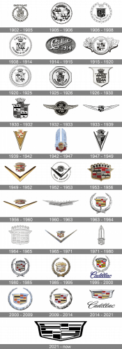
The iconic Cadillac visual identity is instantly recognizable and is still based on the original brand’s logo from 1906, however, the famous logo was redesigned around 30 times during its history.
1902 – 1905
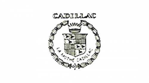
The first Cadillac logo was designed in 1902 and featured a crest with swans and parallel lines, with a crown on top and an ornate circle framing. The crest was inspired by the Detroit founder’s cat of arms. The wordmark “La Mothe Cadillac” was placed on the bottom part of the logo. The trademark was registered in 1906.
1905 – 1906
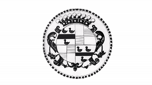
The Cadillac logo from 1905 was based on the previous crest version, but it was stylized and redrawn in circular shapes. It was a lighter version of the black crest with ducks and checkers, enclosed into a thin rounded frame with a stylized crown on top and some floral ornaments on the sides. The whole composition was placed on a bigger white circle with an interesting black framing.
1906 – 1908
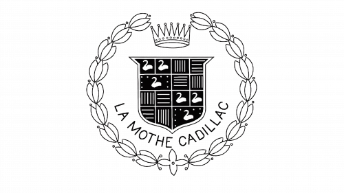
The redesign of 1906 has brought back the original composition, refining the contours of all elements and cleaning up the background of the logo. The crest got enlarged, so all the small elements on it became more visible. As for the lettering, arched at the bottom of the logo, it was set in a medium-weight sans-serif typeface with modern contours of the characters.
1908 – 1914
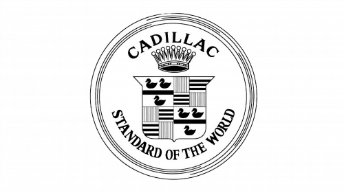
In 1908 the Cadillac logo becomes more graphical and bold. The frame now features clean lines, the nameplate gains thicker typeface and is now placed on the top of the emblem, right above the crown. The tagline “Standard of The World” is added to the bottom.
1914 – 1915
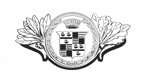
The logo from 1908 was slightly changed in 1914. The “Cadillac” lettering was replaced by a massive and elegant crown image, and the. Additional arched lettering from the bottom of the badge — by a sophisticated leave wreath. The circular medallion was placed between two wing-like elements, composed of elongated leaves in different shapes.
1915 – 1920
In 1915 the American brand brings back the badge created in 1908, with the iconic crest surrounded by a strong and bold black lettering in a classy serif typeface. The uppercase “Cadillac” was slightly enlarged and arched above the crest, and the “Standard of the World” featured smaller sizes of the letters and was arched from the center, along the bottom border of the medallion.
1920 – 1925
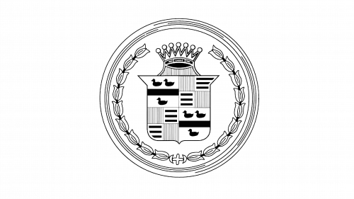
The lettering was removed from the Cadillac logo in 1920. The ornate tulip ring from the first brand’s emblem was added and the crown was changed a little. Now it features seven points. The crest itself remains almost untouched, just slightly refined.
1925 – 1926
The badge, introduced by the company in 1925, has stayed with Cadillac for less than a year. It was an experimental design, with the circular medallion placed on a solid octagon. The logo was accompanied by the “Cadillac” lettering on top and the “Standard of the World” at the bottom.
1926 – 1930
The circular shape has left the Cadillac visual identity concept in 1926, with the crest being placed on a larger crest with elongated lines and sharp corners. The new badge looked sleek and powerful and stayed with the brand for four years.
1930 – 1932
The redesign of 1930 changed the shape of the Cadillac badge again. This time the main crest was enlarged and placed on a transparent background without any additional framing. It was slightly extended and had its upper border straight, while the bottom was rounded at the sides and sharpened in the middle.
1932 – 1933
In 1932 the company has introduced an experimental version of the badge, where the small crest was placed between two stylized extended wings, against a solid black background of a circular medallion with a thick silver frame. This version of the badge was used by Cadillac for only several months.
1933 – 1939
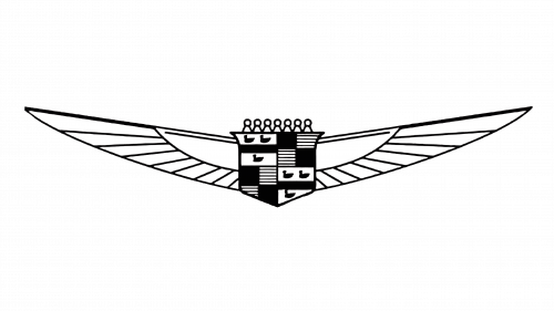
The redesign of 1933 introduced a modern and sharp Cadillac badge. The legendary crest was redrawn in darker shades and placed between two stylized Li gated wings, executed in wide and sharpened lines and spread far to the sides. The winds were drawn in white with thin black lines as accents. The seven small elements were placed in the upper line of the crest, symbolizing the crown.
1939 – 1942
Another interesting geometric version of the Cadillac logo was created by the designers in 1939. This time the iconic coat of arms was set on the upper part of the sharp and narrow triangle, which had its peak elongated and pointing down. The triangle featured a geometric monochrome pattern, composed of several rectangles, set in numerous rows, separated by thick white horizontal lines. The crown on this version of the badge was more traditional — its rounded contour was set right above the crest.
1942 – 1947
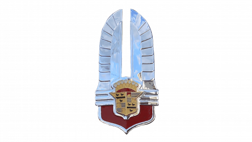
The Cadillac logo from 1942 is an amazing example of the Art-Deci style in the logo design. The crest was placed on the wider one, with smooth sides and a pointed bottom. Two stylized white wings were spread up from the bigger gray crest, forming an interesting elongated to the top shape, resembling a feathery crown. It was something completely new not only for the brand but for the whole world. This logo only stayed with Cadillac for five years.
1947 – 1949
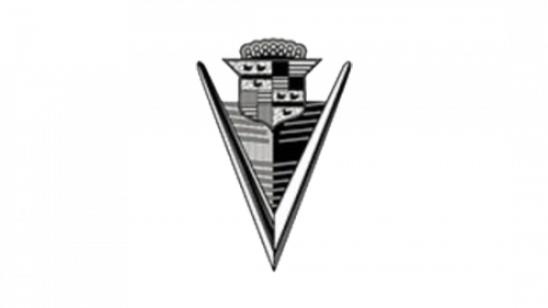
The Cadillac logo has undergone some major changes in 1947. It now featured sharp angles and straight lines of the V-shaped symbol, placed underneath the crest.
1949 – 1952
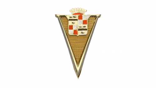
The logo, introduced in 1949, was executed in gold, red, white, and black color palette, and featured a combination of a sharp bold tick, extended horizontally, placed under the enlarged Cadillac crest.
1952 – 1953
The redesign of 1952 made both elements of the Cadillac badge smaller and placed them on a plain white medallion with a thin circular outline. The badge was also accompanied by the “Golden Anniversary” lettering and the datemark, written on the sides of the crest.
1953 – 1956
The Cadillac badge gets redesigned again in 1953, with the enlarged golden crest placed directly on a white background without any accompaniments. Despite the simplicity of the concept, this was a very powerful crest, representing the brand at its best.
1956 – 1960
In 1957 the V-logo was modified. It became wider and gained a more luxurious style due to the modification of the crest. The crown was completely changed, as well as the images of the coat of arms. The swans are not readable anymore. The shield’s frame became bolder and sleeker.
1960 – 1963
The redesign of 1960 has introduced a completely new badge, with the crest merged with the tick. It was a silver emblem, with the sharp V-shaped element drawn as the top part of the iconic Cadillac crest, with its bars elongated and sharpened. The body of the crest was horizontally stretched.
1963 – 1964
The most famous Cadillac emblem was created in 1963 and stayed with the brand for more than 40 years. It was composed of a colorful crest with a silver wreath framing. The crest featured yellow, fuchsia and blue colors with white and black details, which made the logo look creative and modern.
1964 – 1965
In 1964 the company comes back to the design concept from 1953, but the crest here is executed in silver with all the elements in one color, engraved on the surface of the shield. This badge was very minimalistic and looked super stylish.
1965 – 1971
The logo, created for Cadillac in 1965, brought back the tick, and this time it was thinner and looked sharper, with the bars executed in gold and silver, and the small elegant crest executed in the same palette, with an addition of red and white.
1971 – 1980
The redesign of 1971 has placed the silver Cadillac crest under a vertically extended geometric element, which looked litho fraught wings straight up, porting a triangular top border. This badge stayed in use by the company for almost ten years, and it was something new, not typical for the brand.
1980 – 1985
In 1989 the Cadillac badge get a new redesign, with the gold, red and black colors added to the surface of an enlarged silver crest, which was placed against a plain transparent background and enclosed into a circular frame, drawn as a leafy wreath with its contour open on top. It was a sleek and elegant version of the badge, which stayed untouched for another five years.
1985 – 1995
The redesign of 1985 brings back the golden color palette, with all the silver shades replaced. As for the geometry and concept of the logo, it remained almost unchanged. But in warm and shiny gold all elements started looking more delicate.
1995 – 2000
In 1995 the company draws the emblem in for two-dimensional lines above a large cursive “Cadillac” lettering executed in a smooth custom typeface, with the rounded title case characters written in a calm yet deep shade of blue.
2000 – 2009
The logo was refined and the color palette was slightly changed to more traditional tones. The Cadillac logo from the 2000s is modern and sophisticated, it reflects the brand’s high-end segment and confidence.
2009 – 2014
The Cadillac badge, used by the American automaker in the beginning of the 2010s was pretty much the same as the previous version, but with the contours refined and modified, with the darker shades and more distinctive lines inside the crest, as well as in its outline and the wreath, used as a framing.
2014 – 2021
In 2014 the company removes the wreath from its logo. Now the Cadillac visual identity is composed of a modernized crest with an elegant cursive wordmark underneath it. The smooth sophisticated lines of the lettering perfectly balanced the sharp and brutal shape of the crest.
The Cadillac logo is one of the strongest and instantly recognizable examples of the car industry. The brand is not afraid of using colors, which make its three-dimensional emblem interesting and creative. The different thickness of the crest lines resembles the mosaic and celebrates the brand’s legacy and rich history.
2021 – Today
The redesign of 2021 has removed the cursive wordmark from the primary badge, and switched the color palette of the crest to black-and-white, making the logo of Cadillac extremely minimalistic and powerful. The new logo is sharp and brutal, evoking a sense of professionalism and excellence.
What does the Cadillac logo mean?
The Cadillac logo depicts a modernized version of the Antoine Laumet de La Mothe Cadillac coat of arms, as a sign of honor and celebration of the brand’s founder. The crest is a representation of the company’s value of its root, and respect for its historical heritage, along with the progressive and innovative approach to design and production.
When did Cadillac change its logo?
Cadillac has had more than two dozen redesigns of its logo throughout the years, with the last update made in 2021. The latest redesign has switched the color palette of the iconic badge to black-and-white, and removed the lettering from the primary version of the logo, creating a powerful minimalistic image.
Is there any Cadillac in India?
Even though Cadillac has never had an official sales office in India, you can see the Cadillac cars on the streets of some cities in India, like anywhere else in the world. Cadillac is an internationally famous brand, which is synonymous with luxury, so everyone eats to own it, whether it is a European, American, or Indian citizen.
Is Cadillac a luxury car?
Cadillac is considered to be a luxury American automaking brand, however, it is not as chic and expensive as some of the European marques, such as Roll-Royce, Ferrari, or Bentley. Cadillac’s fanciest model is the Cadillac Escalade, which you can see in the music videos of American rap musicians.


