Jaguar luxury brand, created in 1922 in the U.K., is famous for designing and manufacturing high-end cars. During its history, it has been a part of BMC and Ford, and finally was bought by Land Rover in 2013. It grew up into Jaguar Land Rover Group, owned by Tata Motors.
Meaning and history
The Jaguar emblem is known as the “Leaper” and is an image of a jumping jaguar.
The iconic British Jaguar car marque is owned by the Indian giant Tata Motors since 2008. In 2013 Tata has merged the two brands into the Jaguar Land Rover Group. But Jaguar has not always been Jaguar. The automaker was established in 1922 under the name Swallow Sidecar Company, and stayed under this banner for more than 20 years, turning into Jaguar only in 1945, after World War II.
The leaping wild cat emblem appeared on the bonnet of the company ‘a cars in the same year and has never left the visual identity of the automaker ever since. The badge of the brand has only slightly been refined and strengthened throughout the years, keeping all the original contours and reflecting the heritage and legacy of the legendary company.
But the visual identity is the only thing, that keeps Jaguar in its past. The company has been releasing new models of its luxury sedans and SUVs constantly, and at the beginning of the 2020s, the company announced that by 2025 all the models of the brand will be electric.
What is Jaguar?
Jaguar is the name of a luxury British automobile marque, which was established at the beginning of the 1920s, and by today has grown into the iconic brand, known for its high-end sedans and SUVs, exported all over the globe, and synonymous the British style and quality.
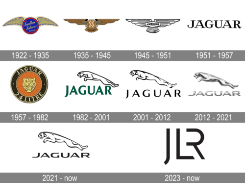
1922 – 1935
The Swallow Sidecar Company logo was composed of a bright-blue circle in a red frame, with two gold wings. The handwritten-styled wordmark was placed inside the circle and executed in yellow-gold.
1935 – 1945
In 1935 the Jaguar logo looked pretty much as the German SS symbol, with the monogram, standing for Swallow Sidecar, set in a sharp geometric font on a hexagon, enclosed between two enlarged stylized wings. The composition was executed in brown shades with black accents, and straight lines. Under the hexagon a lightweight arched banner with the uppercase “Jaguar” inscription was placed. This badge was suspended after the World War II finished.
1945 – 1951
The most controversial period for the company’s visual identity. The 1930s logo was a hexagon with eagles wings and tail and an “SS” wordmark in the middle of the geometric figure. The straight bold lines of the typeface and the emblem looked powerful and decent in a monochrome palette.
1951 – 1957
The redesign of 1951 has completely simplified the Jaguar badge, making it up of just an uppercase logotype. The inscription in black characters was executed in a sleek full-shaped font with thick lines of the letters and thin elongated serifs on their ends. This version of the logo was used by the automaker for six years.
1957 – 1982
In 1957 the new concept for the Jaguar badge was created by the designers. It was a circular medallion with an orange-red background and a thick black frame in a double light-gold outline. The central part of the medallion was decorated by a stylized golden head of the wild cat, and the name of the company was written in elegant gold uppercase characters of a fancy serif font.
1982 – 2001
The leaping Jaguar logo was introduced in 1982. The first version was very similar to the one we have today. The jaguar’s contour was black, and it had a wordmark written in all-caps underneath. The color of the wordmark was dark green, which made the logo eye-catching.
The next version of the Jaguar logo was more streamlined. Angles were rounded to give the animal a more natural look. There were also added small details such as tech and ears. The wordmark became black and the lines of the typeface were now thinner and more elegant.
The third Jaguar logo was just a slight modification of the previous one, where mostly colors were changed. The Jaguar became darker, while the lettering turned gray.
There was also a short period of time when the brand used a red circle with an image of the jaguar’s head as its logo. It didn’t stay long, but the brand still placed it on the grill of come models.
2001 – 2012

The redesign of 2001 simplified the color palette of the Jaguar visual identity to black on white. It was also the year when all elements of the badge got refined and modernized. Thus, the leaping cat became cleaner and more professionally drawn. As for the wordmark, it changed the typeface to a contemporary sleek sans-serif with smooth lines and slightly softened corners of the bars’ ends.
2012 – 2021
The Jaguar logo is a three-dimensional animal’s figure in a silver gray with a bold and confident silver wordmark. The gray color of the logo is gradient in order to accent the 3D shape. It looks sleek and adds movement and vitality.
The Jaguar logo is instantly recognizable. It is an example of high-end style and quality. Elegant, modern, and remarkable.
2021 – now
The redesign of 2021 has brought back the flat contoured design of the Jaguar badge, with the lines of the leaping cat emboldened and a bit modified. As for the uppercase inscription, it was rewritten in a new extended Sans-serif with futuristic and progressive contours of the capital characters.
2023 – now ( JLR Logo )

Jaguar brand has always been known for its sophisticated, powerful, and stylish logos. This logo is no exception. The stokes are thick enough, yet they do not look bulky and ruin the elegant look of the letters. The soft curves are combined with sharp cuts that reflect the cutting-edge technologies and luxury combined in the JLR automobiles.
Font and Color
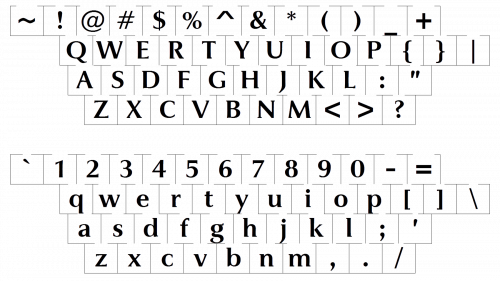 The elegant uppercase inscription from the primary Jaguar logo is set in a sleek custom sans-serif typeface, which looks very confident and sophisticated, showing the rich heritage of the company and its fundamental approach to the design and production of the vehicles. The closest fonts to the one, used in the Jaguar insignia, are, probably, Ordin Ordin and Sofachrome Book, but with the contours of the “A”s modified.
As for the color palette of the Jaguar’s visual identity, it is based on gradient silver, with a matte surface, which looks very modest and elegant, adding a special chic to the metallic badge, and making it stand out in the list of competitors.
What does the Jaguar logo represent?
The stylish and instantly recognizable Jaguar logo depicts a leaping wild cat, a Jaguar, executed in three-dimensional silver metallic. The cat is moving to the left, above the enlarged uppercase wordmark, set in the same palette and metalized texture. The Jaguar on the badge symbolizes motion, speed, and freedom, which the cars of the brand give to their owners.
Why did Jaguar change its logo?
The redesign of the Jaguar logo, held in 2012, was not only for aesthetic reasons. Before that, the brand used a large figurine of a leaping wild cat on the bonnet of the cars, but it was claimed that the figure was not safe for pedestrians, hence the company decides to take it off and replace it with a flatter version of the logo, placing it on the radiator grille.


