JLR is not just a shortened name of the famous Jaguar Land Rover group, but a whole new era for the company. The rebranding, held by the group in 2023, has completely changed both the visual identity and the structure of JLR, under the “Reimagine” program.
Meaning and history
JLR’s recent history began in 2008 when Jaguar and Land Rover became part of India’s Tata Group and were merged into one company – Jaguar Land Rover. The early 2000s was a challenging period for both British brands, and under Tata, Jaguar Land Rover’s sales almost tripled. Sales peaked in 2017 when the British company sold 621,109 vehicles globally.
Unfortunately, during the pandemic, things went downhill for the company and there was a need for restructuring, which happened in 2023. In addition to updating the company’s structure and approach, there was also a global rebranding.
The name Jaguar Land Rover was shortened to JLR, and now it is not even an acronym, but just three letters without deciphering, because the company’s brands are no longer two, as it was before (Jaguar and Land Rover), but four: it was decided to split Land Rover into three separate brands – Defender, Discovery and Range Rover.
What is JLR?
JLR is the new name of the British automaking company Jaguar Land Rover, which was founded in 2008 through the merger of two famous car marques, Jaguar and Land Rover. In 2023 JLR has become the official name of the company, after the complete rebranding.
In terms of visual identity, until 2023 the company has been using a logo, composed of two emblems of the two brands — Jaguar and Land Rover. But after the concern changed its official name to JLR (without deciphering), the logo was completely changed and now looks minimalistic and very stylish. Today, JLR has four separate brands: Range Rover, Defender, Discovery, and Jaguar. The new alliance of brands in the company is called the House of Brands.
2008 – 2012
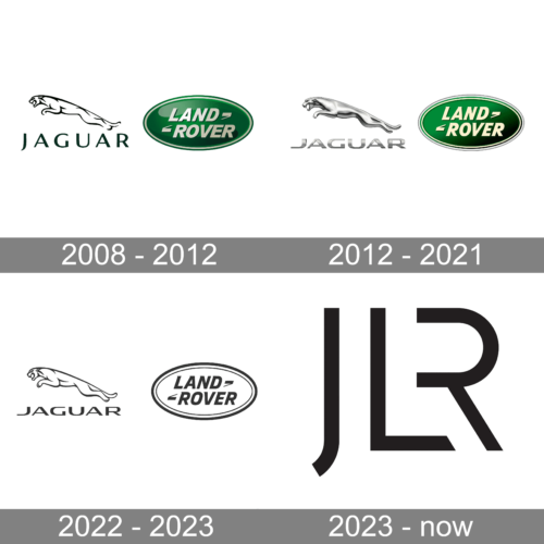
The first Jaguar Land Rover logo was introduced right after the merger of two brands, in 2008, and stayed untouched for four years. It was a union of two emblems — the contoured leaping cat above the uppercase Jaguar wordmark, and a glossy green medallion with a light-silver inscription.
2012 – 2021
The redesign of 2012 has added metallic gloss and volume to the Jaguar badge, while the Land Rover medallion became flatter, gaining a more visible white frame and a lighter shade of lettering. The Jaguar wordmark was also rewritten, the letters became bolder and extended, and now we’re set in gradient silver.
2022 – 2023
In 2022 the company introduced a minimalistic version of the logo, with both parts redrawn in flat black lines, with no additional colors and no three-dimensional elements. This badge was only used by Jaguar Land Rover for several months, as the global rebranding happened already in 2023.
2023 – Today
In 2023 the company was officially renamed JLR and the new logo was introduced. Now it is a minimalistic badge with just three letters written on a transparent background. According to the company, the “descending” letter J is responsible for the elegance of JLR’s image, while the combined L and R are responsible for the gradual transition to sophistication and modernity.
Font and color
The laconic JLR lettering from the primary logo of the company is set in a custom designer typeface with bold clean lines, minimalistic shapes, and an absence of the vertical bar in the “R”. Even though, it is a unique font, created for the company, it was something in common with Blacktie Bold.
As for the colors, the minimalistic approach of JLR is adopted for the palette too. The lettering is set in flat black lines, and placed on a transparent background with no bright accents.


