Tata is the name of one of the world’s largest automobile corporations, which was established in 1868 in India. Tata Motors, created in 1954, is highly recognizable in Southern Asia, as well as Africa and the U.K.
Meaning and history
The name of the brand, Tata, can be translated from Parsi as “Father”. The brand, created by the huge corporation, always put quality and legacy in the center of its value system. The Tata visual identity history is not very colorful, as had only one major redesign held throughout the years.
Overall, the Tata brand has an interesting and bright logo, which is symbolic and modern, intriguing to look at and reflecting the company’s industry segment.
1945 – 1988
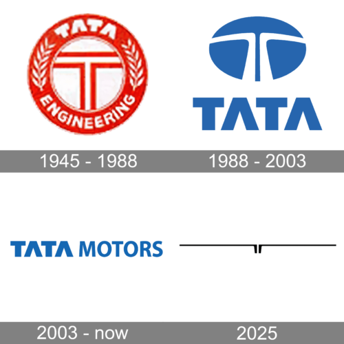
The first Tata logo featured a letter “T” enclosed in the round frame and used red and silver for its color palette. The logo also featured a leaves ornament around its framing.
1988 – 2003
The Tata logo was redesigned in 1988 by the British bureau, Wolff Olins. It features a solid blue oval with two white lines that start parallel at the bottom of the emblem and change their direction at 90-degree angles, forming a letter “T”.
The blue and white color palette of the Tata logo is a reflection of the brand’s reliability, loyalty, and prosperity, while the bold lines of the lettering show the company as strong and confident.
When placed on the cars, the brand uses a three-dimensional version of its emblem, which is executed in metallic-gray and looks elegant and sleek, accenting on the brand’s futuristic and individual approach to engineering and design solutions.
The lines of the stylized “T” look more sleek and full in the silver of the badge.
2003 – now
The wordmark, executed in a traditional sans-serif Helvetica typeface is placed under the emblem and featured the same blue color. Both the letter “A” does not have its horizontal bars.
The Tata emblem symbolizes movement and fluidity. It shows the brand as progressive and forward-looking.
2025 (tentative)
In 2023 the Tata Group has introduced its new minimalistic concept of the logo. The new badge of the auto maker is a stylized letter “T”, composed of two mirrored elements, and executed in plain black on a flat white background. The elements feature short and bold vertical bars, which do a bit wider from bottom to top, and the thin extremely elongated horizontal bars, coming out of the vertical ones to the sides. There is no lettering on the new logo.


