

![]() Greenville Drive Logo PNG
Greenville Drive Logo PNG
The Greenville Drive is a minor league baseball team based in Greenville, South Carolina. The team, which is a Class A affiliate of the Boston Red Sox, is owned by Craig Brown. Greenville Drive plays its home games at Fluor Field, a stadium designed to mimic the iconic Fenway Park. The team operates primarily in the South Atlantic League, competing against other minor league teams in the southeastern United States. The Drive is well-known for its strong community engagement and efforts to promote baseball at the grassroots level, making it a beloved institution in Greenville.
Meaning and history
![]()
The Greenville Drive was founded in 1993 as the Capital City Bombers in Columbia, South Carolina, before relocating to Greenville in 2005. The team was initially established by a group of investors who aimed to bring minor league baseball to the region. Since its inception, the Drive has achieved significant milestones, including numerous playoff appearances and developing several players who advanced to Major League Baseball (MLB). The team’s relocation to Greenville was a pivotal moment, marked by the construction of Fluor Field, which features a replica of Fenway Park’s Green Monster and other unique attributes.
Throughout its history, the Greenville Drive has been a vital part of the community. The team has won several division titles and has been instrumental in the development of future MLB stars. The Drive’s commitment to excellence extends beyond the baseball field, with numerous community initiatives and partnerships aimed at fostering a love for the sport among young people. The organization also focuses on creating an enjoyable fan experience, making game days a significant event in Greenville.
Today, the Greenville Drive stands as one of the most successful minor league teams in the country. The team’s affiliation with the Boston Red Sox has helped it attract top talent and maintain a competitive edge. The Drive’s continued success on the field is complemented by its strong community presence, innovative promotions, and dedication to providing affordable family entertainment. As a result, the Greenville Drive has solidified its position as a cornerstone of the Greenville sports scene, beloved by fans and respected by peers.
What is Greenville Drive?
The Greenville Drive is a minor league baseball team affiliated with the Boston Red Sox, based in Greenville, South Carolina. Known for its competitive spirit and community involvement, the team plays home games at Fluor Field. The Drive’s commitment to developing future MLB talent and providing family-friendly entertainment makes it a standout in minor league baseball.
The Logo
![]()
The logo belongs to the Greenville Drive, a Minor League Baseball team. This logo is visually dynamic and incorporates elements that symbolize motion and energy. The central feature of the logo is the large, stylized letter “G,” which curves into a circular shape. The “G” is rendered in bold red with a navy blue outline, giving it a strong and striking appearance. The design of the “G” includes a series of lines that create an illusion of movement, emphasizing the “Drive” aspect of the team’s name.
Within the lower part of the “G,” the word “Drive” is prominently displayed in a cursive script. The script is white with a navy blue outline, ensuring that it stands out against the red background of the “G.” The cursive style of the text adds a touch of elegance and fluidity to the logo, contrasting nicely with the boldness of the “G.” The placement of the word “Drive” within the “G” integrates the text seamlessly into the overall design, making it both cohesive and aesthetically pleasing.
An additional notable element of the logo is the grey wing extending from the left side of the “G.” This wing-like feature further enhances the theme of motion and speed, symbolizing the dynamic and competitive nature of the team. The combination of red, navy blue, and grey in the color scheme is both vibrant and professional, creating a logo that is memorable and distinctive. Overall, the Greenville Drive logo effectively captures the spirit of the team, blending elements of strength, movement, and style in a visually appealing manner.
Primary symbol
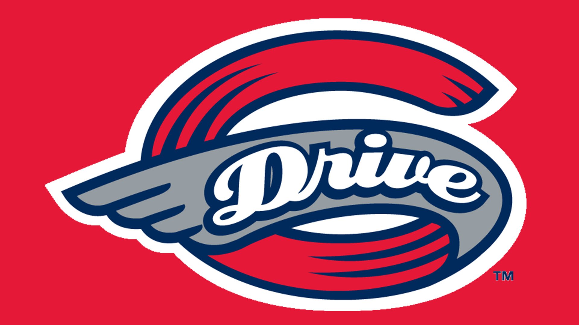
The Greenville Drive logo features a large “G” with its middle-end reminding a wing, which is supposed to symbolize speed. The body of the “G” also has a couple of strokes adding dynamism.
Cap emblem
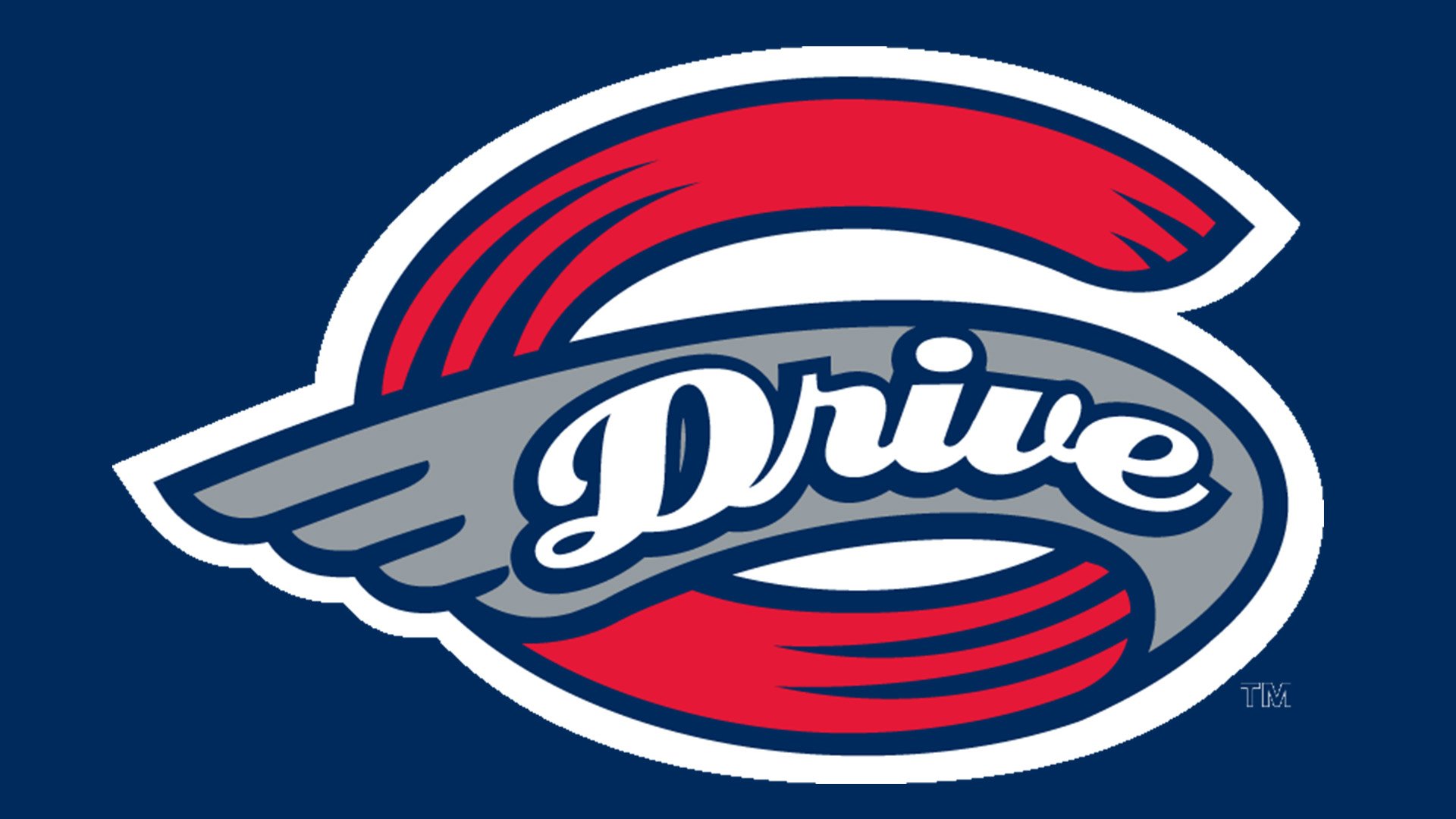
Looking almost identical to the primary logo, the cap insignia doesn’t contain the text “Greenville baseball.”


