While the history of professional baseball in Charlotte, North Carolina, started in 1892, the team Charlotte Knights began playing only in 1993. They declared themselves official heirs of the old team Charlotte Hornets.
Meaning and history
The logo of the Charlotte Knights has gone the way from an image overloaded with small details to a more minimalistic and contemporary one. Read on to find out how it happened.
1993 — 1996
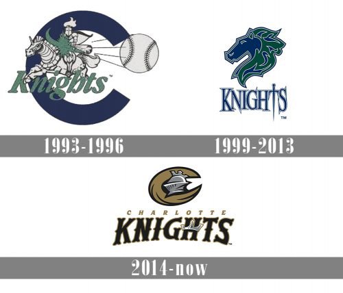
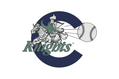 The original Charlotte Knights logo featured a medieval knight on a horse prancing out of a big blue letter “C.” There was also a baseball appearing to be rapidly flying on the forefront. While the emblem perfectly fit the team’s name, it seemed somewhat overloaded. It was difficult to make out details, especially at smaller sizes.
1999 — 2013
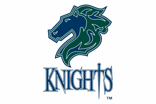 Whatever the reason, in 1999, a simpler emblem was introduced. Now, only the head of a horse was left with the word “Knights” below, in which the “T” formed a sword.
2014 — Today
The core of the current Charlotte Knights logo is the large “C” with a knight’s helmet inside. The name of the team is placed below. There’s a crown on the letter “H.”
Colors
The gold color seems to fit the concept of “knighthood.” The team added grey, black, and white as secondary colors.


