Google Photos is an online service, created by Google in 2015 in order to provide its users with a high-quality photo sharing and storing instrument. Today the app is available for both Android and iOS operating systems and there is also a desktop version, which has millions of users from all over the globe.
Meaning and history
Google Photos is a service for storing and organizing all your photos and videos. That’s right because Google offers unlimited free space. Photos are available on Android, iOS, and the web.
Google has come up with a great tool for storing and viewing your photos. Free unlimited space is a serious bargaining chip against competing solutions from Apple and Microsoft. On Android smartphones, Photos is the standard photo viewing app. On the iPhone, such a seamless interaction is not possible, even though the photos go straight to the program’s library.
Google Photos is great for creating a simple animation from a few of your photos. Sometimes the assistant in the app does this automatically, giving you options for your creativity, but you can also create a gif file by yourself.
Google Photosis no substitute for a serious professional image editor, but it still has the basic image editing tools. Users have access to a variety of filters, cropping, rotation, as well as adjustments to brightness, saturation, and details.
What is Google Photos?
Google Photos is a service from Google with free unlimited storage space for photos and videos. The service was introduced in 2015 and has its versions available not only for Android devices, but also for iOS, and web browsers.
2015 — 2020
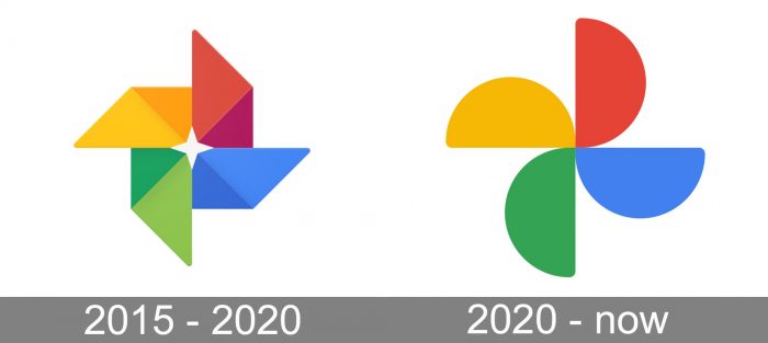
The original emblem already had the same core as the current one. The colors were the same (blue, red, green, and orange), but they were used in two shades each (a darker and a lighter one). The dynamic “flower” theme was also there, but the petals had a more complicated and sharper angular shape.
On the whole, we can say that the old Google Photos logo was more cluttered and not as sleek and friendly as the current one. Yet, it appeared more dynamic and “techy.”
2020 — Today
The visual identity of the Photo sharing online service is colorful and friendly, evoking a happy and welcoming sense. The logo of the platform is composed of two parts, which are used separately — the emblem, which is the most recognizable part, used as an icon for both website and applications, and the corporate logotype, representing professionalism and authority.
The emblem is a stylized flower, with geometric quadrangular petals, each of them in its own color, divided into two triangular parts, executed in two different shades. The whole emblem resembles a colorful camera lens and shows endless possibilities of photography and brightness of the world.
As for the logotype, it is composed of two parts and has two different versions. The first one is with the multicolor “Google” inscription, followed by a gray “Photos”. The second variant is all gray, where two parts vary only in the thickness of the letters, with “Google” in bolder ones.
Icon
The icon for Google Photos looks like a classic kids toy, the windmill. Executed in a traditional corporate color palette of Google, it has its petals composed of two triangles each. The triangles in one petal have different shapes and shades — one is taller and lighter, and another one, closer to the center, or shorter, wider and darker.
The red, yellow, green, and blue petals of the Google Photos icon look juicy, sharp, and trendy, they also brilliantly reflect the creative character of the app and its progressiveness.
![]()
Color
The corporate Google palette consists of four colors — blue, red, yellow, and green. Each of the colors has its own meaning. Blue stands for reliability and responsibility of the company, while red is a color of passion and love. Yellow evokes a sense of friendliness and happiness and green stands for growth and success. The gray of the product’s nameplate adds a sense of professionalism and stability. This calm and strict color perfectly balanced the brightness and creativity of the first part, adding solidness and confidence.
Font
The Google Photos wordmark is executed in a simple year solid and modern sans-serif typeface with clean and neat lines, evoking a sense of high quality and expertise. The lettering is well-balanced in terms of sizes and spacing.
The typeface of the nameplate is very similar to such fonts as Pulp Display Light and Glence Medium, minimalist and delicate.
What is the logo for Google Photos?
The Google Photos logo depicts a stylized flower with four petals, drawn in the iconic corporate Google palette, composed of yellow, red, blue, and green. The four petals of the flower are drawn like half-circles, and create a sense of motion, making up kind of a “mill”, swirling to the right.
How do I get Google Photos icon?
To get the icon of Google Photos you should download it from the official website, along with the brand’s guidelines, which have to be followed, if you want to use the logo on your web or business card.
Is Google Photo going away?
The Google Photo service is not going away, however, the unlimited free storage for the graphical part has been gone since 2021. Since then you have to pay for storing your photos, choosing one of the suitable subscription plans.
Is it OK to use the logo from Google?
To use a logo, found on Google, you need to check whether it is copyrighted or not. In case it is not, you can use it with no problem, but if it is, you should get permission from the copyright holder.


