

![]() iOS Logo PNG
iOS Logo PNG
The mobile operating system iOS was designed by Apple with the purpose of using in its own mobile devices. The list of devices where it is currently employed includes the iPhone, iPad, and iPod Touch. Although iOS is exceptionally popular, it is still used by fewer consumers than Android. Each year Apple updates the operating system.
Meaning and history
![]()
The iOS visual identity was redesigned with almost every system update, made by Apple, but always featured the brand’s wordmark, starting its launch in 2007, until today.
2007 – 2014
![]()
The first iOS logo was designed in 2007, with the debut of the first iPhone. It was the only logo composed not only of “iOS” lettering, but features a full hardware name “iPhone OS”. The monochrome lettering was executed in a traditional sans-serif Helvetica. It was clean and laconic. The brand kept using its logo until 2014, alongside other versions created in 2010.
2010 – 2016
![]()
In 2010 Apple simplifies the iOS logo, removing the “iPhone” part from it. The “iOS” lettering now executed in a two tones of silver, which makes it look alive and dynamic, adding volume to bold and thicker lines. The logo looks technological and futuristic.
2010 – 2017
![]()
Another visual identity design of 2010 features monochrome two-dimensional wordmark, which is a simple and timeless classics, and was used until 2017.
2012 – 2017
![]()
The iOS logo design of 2012 comes back to metallic and voluminous lettering, but in a dark gray color. It looks sleek and sophisticated, completely different from all the other brands on the market. Apple kept using the logo until 2017.
2013 — Today
![]()
In 2013 Apple starts using Myriad font with thin and fine lines for iOS logo. It looks light and elegant, the lettering is airy and sophisticated. Apple still uses the logo today.
2016 — Today
![]()
In 2016 iOS 10 was launched with the new logo, which was composed of the bolder San Francisco typeface lettering. The monochrome color palette remains, but the brand creates additional logo in thin Myriad, which features colors of the rainbow. It is playful, creative and welcoming. Both logos are still in use by the brand.
2017 — Today
![]()
The 2017 version of iOS visual identity is composed of thickened lettering in a sans-serif font, which is bright and confident in black, reflecting the brand’s influence and power.
iOS 4
![]()
The first iOS, introduced in 2010, featured a dark and serious icon, executed in quite a dramatic black and silver color palette with gradients. The bold geometric “4” in glossy silver was placed on a black square with rounded angles.
iOS 4.2
![]()
For iOS 4.2 the logo was significantly redesigned, with the digit rewritten in thinner lines, in black, and the background turned somewhat voluminous and ornate with a water bubbles pattern on a gradient gray to light blue background.
iOS 4.3
![]()
The difference between the iOS 4.2 and 4.3 icons was only in the last digit. The overall design was completely identical.
iOS 5
![]()
The iOS 5 used the same design concept as the iOS 4.2, with the black digit on a gradient gray-blue background with bubbles.
iOS 5.1
![]()
For the 5.1 version of the operating system, the bubble pattern was slightly changed and now the three large ones were grouped around the upper left corner of the “5”.
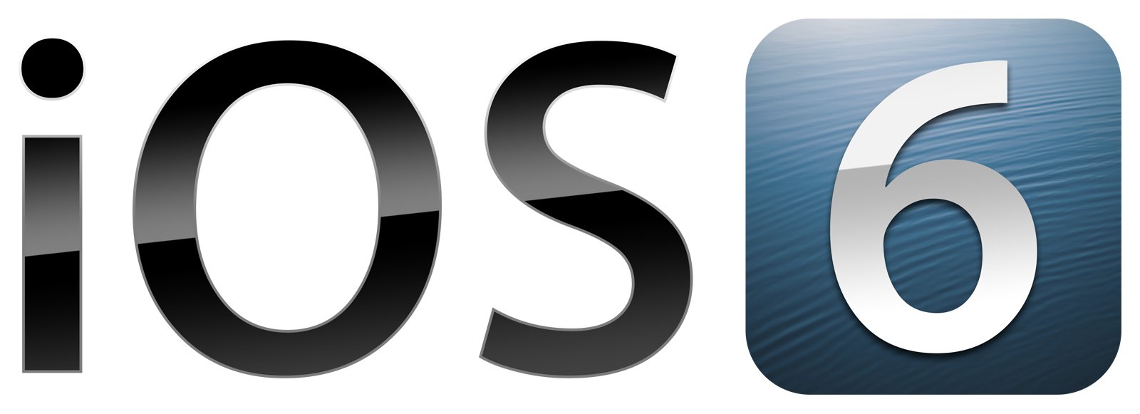
iOS 6
![]()
The iOS 6 has a new icon design, with the bold silver “6” in glossy gradients set against a dark blue gradient background with a thinly striped pattern. The lines were slightly arched and diagonal, making the background look like a water surface.
iOS 7
![]()
A modern design era started with the release of iOS 7. The new icon was super simple yet cool and memorable: it was composed of just a lightweight digit “7” drawn against a transparent background with no framing. The main thing here was the color palette — rainbowish gradient composition, made of turquoise-to-crimson shades.
iOS 7.1
![]()
The iOS 7.1 version was executed in the same concept and color palette, with just one difference — the narrower contours of the digits, so that they would fit into an invisible square frame.
iOS 8
![]()
Even though the design concept remained the same for the iOS 8 icon, the color palette was changed, and now orange became the leading color, with different gradient shades, accompanied by the blue ones in the bottom part of the digit.
iOS 8.1
![]()
For the iOS 8.1 icon, the orange shades got muted, going to autumn-red, and accompanied by green shades in the “8”, while the “1” was darker, made of brownish red and blue tones.
iOS 9
![]()
The color palette turned bright and juicy again with the release of the 9th iOS version. The prevailing color in the gradient palette of the icon was orange again, with a small yellow area in the upper left part, and green and blue tail of the digit.
iOS 9.1
![]()
The additional “1” in the iOS 9.1 emblem also had its top part colored in orange gradients, but the bottom was executed just in blue tones, with no green accents, unlike the “9”.
iOS 9.2
![]()
The digits in the iOS 9.2 icon were both set in the orange green and blue color palette, making up a very clean and balanced composition, which looked very joyful and energetic on a plain white background.
iOS 9.3
![]()
The same palette was used for the iOS 9.3 logo, with one small difference: the green gradients had quite a small space on the tail of the “3”, which made the digit look significantly darker than the “9”.
iOS 10
![]()
The iOS 10 logo was executed in the same concept: thin gradient lines and a plain white background. But this time the “10” was written in a more laconic color palette, composed of just green and blue delightful shades.
iOS 11 Logo
![]()
With the launch of iOS 11 Apple designs a new colorful logo, which almost repeats the version of 2016, but the lettering is more compact and lines are fuller, which creates a feel of balance and harmony, yet has a playful and funny character. The logo is stylish and modern.
iOS 12 Logo
![]()
The logo for iOS12 is executed in fine lines of San Francisco, which is used both in monochrome and rainbow palette, but the colorful version is more common. Placed on a white background, it looks playful and full of joy.
iOS 13 Logo
![]()
For the 13 version of iOS, Apple uses San Francisco bold. The lines are thicker and more confident in comparison to the previous version, and the priority is still given to the rainbow color scheme, placed on white.
iOS 14
![]()
For the 14th version of iOS, the designers decided to create two icons: the first completely repeated the logo of iOS 13, with rounded lines and yellow to dark red gradients, while the second icon was significantly different. It was a thin white “14” set on a gradient background with orange-to-blue tones.
iOS 15
![]()
The lines on the iOS 15 logo fit straight cuts and distinctive contours again. They were also slightly emboldened. As for the color palette, the gradients got calmer — yellowish and blueish tones looked great together.
iOS 16
![]()
The new concept for the iOS icons was introduced in 2022, with the release of the 16th version of the operating system. Now the digit was written on white and placed on a gradient background, made of smooth blue-green and muted yellow shades. The bottom right corner of the icon featured a more intense blue wave, as an accent.
iOS 17
![]()
The colors of the icon’s background were alternated in 2023 when iOS 17 was released. The tones got vivid and intense: orange, red, and fuchsia-to-purple waves made up a great background for the white lines of the “17”. The secondary version of the icon was calmer and more serious: green and calm orange at the bottom.
iOS 17.1
![]()
For the 17.1 version of the operating system, it was decided to use the primary color palette option of the iOS 17 badge — orange, red, and pink.
iOS 18
![]()
The logo is iOS 18, announced in 2024, and is executed in a very elegant and quite restrained color palette, composed of sea green intense shades and lightweight tender peachy gradients in the bottom part of the icon.


