DoorDash, Inc. is an on-demand food delivery platform created by four Stanford students in 2013. By early 2021, it served nearly 20 million consumers and one million deliverers. Headquartered in San Francisco, it operates not only in the US but also in Australia and Canada.
Meaning and history
Excellent legibility has always been a characteristic feature of the DoorDash logo, as was the red color in the palette. Over time, the logo has been growing more meaningful.
What is DoorDash
DoorDash is known as a major online food ordering and food delivery platform working in the US, Australia, and Canada. It holds a 56% market share in the US, which makes it the largest food delivery company in this country. In late 2020, it became a public company through an initial public offering.
2013 – 2014
The simplicity of the original logo is obvious. There is only the name of the brand in an austere sans without a single decorative detail – only the functional parts. All the letters are lowercased, which only reinforces the minimalist effect.
To make the name shorter, the team behind the brand identity removed the space between the two words forming the wordmark. However, as for the customer, it was essential to understand that the name consists of two meaningful parts, designers separated them from each other using color. So, the word “door” is black, while the word “dash” is red.
2014 – 2018
While this version is more cluttered, it is also by far more meaningful than its predecessor. To begin with, a red emblem appeared above the wordmark. The most obvious interpretation is that it’s a couple of wings, a universal symbol of speed. You can see the wings in logos of numerous delivery service companies, cars, airline companies, etc.
However, as the company explained in a blogpost on the Medium platform on November 10, 2014, those aren’t exactly the wings (or only the wings). The designers were inspired by the so-called Shinkansen, which is the Japanese bullet train. The two elements of the emblem are shaped to look like the frontal part of these trains.
What message does such an image convey? Some of the features DoorDash shares with this means of transport are “super fast,” “utilitarian,” “communal,” and “futuristic,” according to the company. Also, horizontal lines, in such a visual context, represent speed and precision.
In addition to the trains, the emblem also stands for the double “D,” thus representing the abbreviated name of the company. The wordmark is now capitalized.
2018 – present
The design has been streamlined without sacrificing much of its meaning.
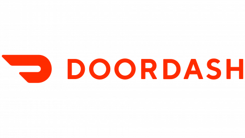
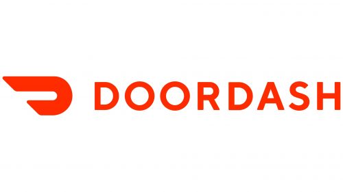
The updated emblem consists of a single element and has two, not four, horizontal lines. The lines have grown bolder. It’s obvious that, as a result of the update, the double “D” effect has been lost. Yet, this is hardly a considerable sacrifice, taking into consideration that the name of the company is still present in the main DoorDash logo. The “Dash” concept is conveyed by negative space.
The logo was updated by San Francisco-based branding and design agency Character, which simultaneously redesigned other parts of visual brand identity.
Colors and font
Red makes the design eye-catching. It is also one of the colors that are believed to provoke (or at least contribute to) the feeling of hunger. The problem with red is that it is exceptionally widely used, so, in terms of the palette, the emblem hardly stands out.
The simplicity of the typeface provides perfect legibility no matter what the size of the DoorDash logo is.


