Daewoo is the name of the automaking company from South Korea, which was founded in the 1930s and by the 1990s has become one of the most famous Asian producers of vehicles. The brand, owned by General Motors since 2001 and specialized in the production of affordable cars along with buses and commercial vehicles, stopped operating in 2011.
Meaning a and history
Daewoo was a South Korean conglomerate that became one of the most recognizable brands in the global industrial and consumer markets, particularly during the late 20th century. Founded in 1967 by Kim Woo-Jung, Daewoo initially started as a small textile trading company but quickly diversified into a vast range of industries. The automotive division, Daewoo Motors, was among the company’s most recognized ventures. Established in 1978, Daewoo Motors initially focused on manufacturing small, affordable cars in partnership with American General Motors.
In addition to automobiles, Daewoo made significant strides in electronics and consumer appliances. Daewoo Electronics, launched in 1971, became known for producing televisions, refrigerators, washing machines, and microwaves, competing with fellow South Korean giants like Samsung and LG.
However, Daewoo’s rapid expansion also led to significant financial strains. By the late 1990s, the company was heavily indebted due to overinvestment and the Asian financial crisis of 1997, which exposed the weaknesses in the chaebol system. As a result, the conglomerate was forced into bankruptcy, and the South Korean government initiated a massive restructuring of Daewoo’s operations.
The conglomerate was dismantled in the early 2000s, with its various divisions sold off or absorbed by other companies. Daewoo Motors was acquired by General Motors in 2002 and rebranded as GM Daewoo before eventually becoming part of Chevrolet’s global lineup.
Daewoo left a lasting legacy in the industrial and consumer landscapes. The brand played a critical role in South Korea’s transformation into a global economic powerhouse and helped popularize Korean products worldwide.
As for the visual identity, the Daewoo logo is very meaningful. The South Korean automobile brand took the structure of the Universe as its basis, and it all started with the naming name of the brand in Korean means “The Great Universe”.
The company adopted a stylized image of a seashell as its main symbol, as in the Asian philosophy a seashell represents the beginning and the end of everything.
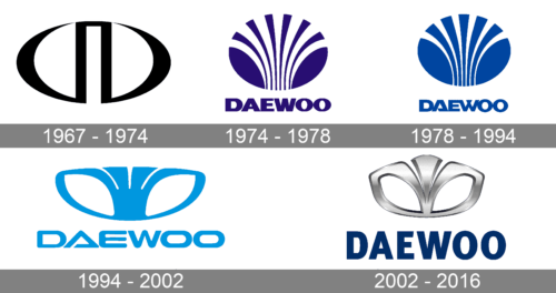
1967 – 1974
The original Daewoo logo, used by the company during the first seven years of its history, featured a horizontally stretched oval medallion with a narrow rectangular arch in the center, which resembled the Russian letter “П” (equivalent to the Latin “P”). The emblem was drawn in plain black strokes with distinctive contours.
1974 – 1978
In 1974 the Daewoo logo was redesigned for the first time. The new concept was built around a deep shade of blue, in which both the graphical part and the lettering were executed. The emblem of the brand featured a blue oval, with a thin slightly curved stripe cut out from its central part, making up an abstract image resembling a stylized geometric shell.
1978 – 1994
Another redesign has switched the main shade of the Daewoo logo to a lighter blue and reworked the contours of both the emblem and the wordmark. The number of “rays” inside the oval was reduced to five, with each stripe getting thicker. As for the lettering, it was rewritten in a geometric sans-serif typeface with an interesting shape of the “A” as the main accent.
1994 – 2002
The logo was redesigned in 1994 and gained new shapes and styles. The shell was now horizontally stretched and started resembling a flower, while the wordmark got a modern sans-serif typeface with softened angles of the letters, and the “A” repeating the shape of the triangle with an open contour. This logo looked modest yet progressive and elegant.
2002 – 2016
The resemblance of the shell to a flower increased in 2002 when the middle part of the badge got slightly elongated and rounded. The color palette of the badge was switched to silver and blue, where silver was used for a three-dimensional emblem, and blue was for flat lettering.
The shell looked luxurious and sophisticated in the new palette with a glossy metallic surface, and the additions of a strict geometric sans-serif wordmark made the whole logo balanced.
Font and color
For the last ten years of its existence, the company decided to change its custom recognizable typeface to something more minimalist and simple and chose a bold straight sans-serif, which is very similar to such fonts as FF Meta Headline Pro Bold, Thrifty Black, and Vista Sans Black.
The silver and blue color palette of the Daewoo logo was a good choice to represent the philosophy of the brand and its legacy. Blue stands for the universe and peace, while silver adds a sense of loyalty, unity, and reliability. The logos in this color palette always look professional and show the right values of the brands.


