John Cooper Works (JCW) is a British car marque associated with performance-oriented versions of MINI vehicles. Owned by BMW, JCW specializes in engineering, tuning, and development to enhance car performance. The company operates predominantly in the UK, leveraging its rich heritage to produce top-of-the-line vehicles renowned for speed and agility.
Meaning and history
Established by John Cooper in 2000, John Cooper Works (JCW) is the racing-inspired sector of the MINI brand. Famed for redefining the iconic MINI, Cooper transformed it into a championship-winning rally car. JCW’s hallmark achievements lie in motorsports, with numerous racing victories. Presently, under BMW’s ownership, JCW thrives as a symbol of performance, creating modified versions of MINI models, blending legendary British craftsmanship with aggressive sportiness.
What is John Cooper Works?
John Cooper Works (JCW) is a British car division focused on performance-driven MINI models. Founded by John Cooper, it’s renowned for turning the iconic MINI into a motorsport champion. Currently owned by BMW, JCW symbolizes speed and agility.
2002 – 200?
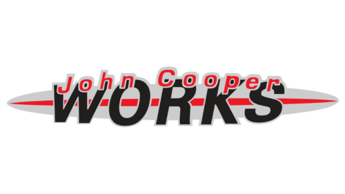
This logo looks a bit clumped as the inscriptions overlap and the red and black colors compete for the attention. The first line was done in red with a light gray outline and featured “John Cooper” printed using a basic font with the first letters capitalized. The inscription was slightly arched to repeat the shape of an elongated backdrop and covered the top of the characters of the next line. The latter had “Works” printed using a much larger font of black color and all uppercase letters. It was an interesting design, even though it seemed like a work-in-progress version that required a little fine-tuning to look more professional. Given that it was created in the early 2000s, the logo might have looked just fine at the time.
200? – now
The logo stayed very recognizable as the company preserved the color palette and the general idea. The main update was making the inscriptions part of the oval background. The word “Works” is printed using a simpler sans-serif font of black color and placed in the center, overlapping the red line running across. Above, there was the “John Cooper line that barely arched. It was printed using a smaller font but all uppercase letters of a red color. To make this inscription part of the whole logo, the designers added a silver outline that blended with the oval background. The latter, by the way, got a little shorter and had a metallic finish that gave it some volume and a modern touch. The updated logo looks cleaner and it is easier to read the name.


