Tesla
Tesla is an American carmaker, famously owned by the billionaire Elon Musk. They produce a variety of electric and hybrid cars, considered the pinnacle of EV technology. It’s the biggest manufacturer of such cars in America. Their logo is basically a letter ‘T’. Except, the forms on it are sharp and acute, making it look like a nail of sorts. There’s also a thin curved line lying along the top edge of the letter. Apparently, it’s supposed to be the insides of an electric engine.
Toyota
Toyota is a giant Japanese carmaker, among the biggest in the nation. Presently, much of their product line consists of crossovers, SUVs, utility vehicles and similar vehicles – electric and diesel. Toyota hybrid cars are some of the most popular such cars to come from this region. The Toyota logo consists of several ovals. The two of them are aligned athwart, which makes them look like a letter ‘T’. The third one acts as a frame for both other figure. There’s usually a wordmark, as well – written in big sans-serif characters.
Talbot
Talbot was a British brand of cars that eventually became the integral part of the Rootes Group. This company produced a variety of other sub-brands, including Simca, Sunbeam and other. These were primarily family cars, sports cars or compact models. Their logo depicted a letter ‘T’, placed inside a frame. The lines on both these elements were turned into double-sided bars, creating a slightly 3D feel to the emblem. The colors for them were blue and white. There was also a red background behind the letter proper.
Tamplin
Tamplin was one of the early British cyclecars. It was a light, two-seat vehicle with a pretty weak engine (by modern standards). Most of these were built in the 20s by Tamplin Motors. Tamplin didn’t have any actual badge or a logo. The cars were adorned with a big grey disc with the word ‘Tamplin’ written near the top edge of the circle, curved to mimic the latter. The very center was typically occupied by the release year of the car in question.
Tara International
Tara International is an Indian manufacturer that builds scooters largely. Their product lineup includes electric scooters, some cars, minibuses and trikes. All then non-scooter models are compact, as a rule. This company’s logo is a star. It’s blue with a thin red outline. The two right tips are missing, in their place the company name is placed there: ‘Tara’ in big red letters, ‘International’ in white letters on a blue line right below.
Tarrant Automobile
Tarrant was one of the first car models to appear in Australia, at all. It was an early automobile with two seats and no proper coach. A tiny handful of Tarrants was built at the start of the 20th century, and they mostly have historic value as such. Tarrant cars didn’t really have a logo, nor was there any brand emblem. They did decorate some car with just a circle on the radiator. It was nothing more than a wide ring.
Tata Motors
Tata is a large Indian corporation that specializes in the vehicle manufacturing. A lot of their current cars are compact models or small SUVs, but there are also small trucks, buses and other vehicle in production. It’s the largest carmaker in India overall. Their current logo is their name, written in two distinct styles. ‘Tata’ has long been written in bold, simplistic letters. So much so, the ‘A’ letters don’t have a central bar. ‘Motors’ uses a more typical sans-serif style. Both are colored turquoise, nonetheless.
Tatra
Tatra is an ancient automotive company from Czechia. The first of their vehicles were produced in the late 19th century. Although historically a producer of various car types, they now make trucks for the most part. The emblem is a burgundy circle with a ring of white on its inner side. Inside this ring, the company name is written tall stretched letters. The font is a normal sans-serif, and the color is just white.
Tauro Sport Auto
Tauro is a Spanish manufacturer of high-performance cars. They have a handful of released models, all the V8 sports cars of the luxury variety. Essentially, they are the same model, just with different features. The logo is a round badge with a black frame and a red center. There are also some golden elements, like the name of the brand, written along the edges, the wheat ears on the sides and an outline that separates the two main colored sections. In the middle of the logo, there is a black bull (‘tauro’ means ‘bull’ in Latin).
TAZ
TAZ (‘Trnava Automotive Factories’ in English) was a Slovak car manufacturer. It operated in the late 20th century as a subsidiary of Skoda. As such, TAZ primarily built Skoda vehicles – in particular, Skoda vans. The TAZ emblem was a white circle with a double blue outline. In the center, there was the company’s acronym itself. They wrote it in bold blue letters, and the ‘A’ in the center was much taller than the other characters. Curiously, the top bars of both ‘T’ and ‘Z’ connect behind the central letter and this common line also acts as a central bar of the ‘A’.
Tchaika
 Chaika, or Tchaika is a series of luxury cars, produced in the Soviet Union. These cars were considered vehicles for a narrow upper class: government officials, factory chiefs and such. They were long sedans, primarily black and with powerful V8 engines. Technically, only GAZ-13 and GAZ-14 can be qualified as ‘Tchaikas’. These cars normally used GAZ emblems. They look like red shields with a silver stag and the wordmark ‘ГАЗ’ below. Moreover, the word ‘Chaika’ in Russia would usually be plastered on the tip of the bonnet of these models.
Tecnologia Automotiva Catarinense
Tecnologia Automotiva Catarinense, or TAC is a small Brazilian carmaker. Their main product is a 4×4 SUV called STARK. It’s a typical type of car for Brazil, given how in-demand off-road cars are in this country. Their usual emblem is a black shield. Inside of it, there is a special image that combines the letters ‘T’ and ‘M’ (for ‘TAC Motors’), colored in white. This shape looks like a sword with two claw-like extensions hanging down from the tips of the hilt.
Temperino
Temperino was an Italian car manufacturer in the early 20th century. A few vehicles they produced were high-performance cars and some motorcycles. The production ended in 1924. The Temperino emblem is their name, written in cursive silver letters. There are two lines going over the word and below it. These come from the first and last letters and arrange an oval around the wordmark.
Th. Schneider
Th. Schneider was a French carmaker that operated until 1930. The bulk of their production consisted of regular passenger cars, many with high-performances builds. The company was also famous for making bodies for sports cars of other manufacturers. The logo is an oval figure with a grey frame. On it, the company name and its location were written in big black letters. The center was occupied by a landscape of a flat black surface with a rising sun of the same color. The sky above was blue.
Thai Rung
Thai Rung is the biggest carmaker in Thailand. They were making cars since the 60s, but much of their current roster is slight modifications of existing cars from other brands. That means Isuzu crossovers and pickup trucks for the most part. The company’s emblem is an oval figure of mostly dark blue. The letters inside and the frame were metallic grey. The former consist of two shapes that merge into the frame: a symbol from the Thai alphabet on the left, and the letter ‘R’ on the right.
Thames
Ford Thames is a series of cars produced specifically for the British market by Ford. The brand unites various commercial cars, mainly vans and trucks. The brand started in the 50s and even production by the 60s. These cars wore a distinct badge. It was in many ways the same as the Ford logo. For instance, there was a dark blue oval with the word ‘Thames’ written in white over it. The font was a cursive handwritten style, like on the Ford’s own logo.
The Knight XV
The Knight XV crossover is a flagman model of the Canada-based Conquest Vehicles carmaker. It’s a luxury 4×4 with a powerful motor and produced in small quantities. But besides that, it’s also usually an armored vehicle used by cops and security agencies, among other customers. The emblem they use for this vehicle has a shield form. It’s a metallic outline of one, and there’s a capital ‘K’ of just the same color inside it. The background is normally black.
The Roo Motor
The Roo Motor Car Manufacturing Company was an early Australian carmaker. Most of their products came out in 1910s and 1920s. These included racing models of the earlier type, among the first in Australia. Although the production largely stopped by the 30s, the brand’s projects persisted and became basis for the country’s later car models. They don’t seem to have had any proper emblems. Usually, the company’s name was simply written down for advertisement purposes.
Theologou
Theologou was the earliest car brand to be produced in Greece. The first prototype was constructed in 1906, which ultimately developed into lightweight passenger cars with 2 seats. These cars had a sort of badge with the company name, written on them, as ‘H. Theologou’. There aren’t any clear images of them. When the company name was mentioned, it was written in Greek letters in a tall sans-serif script.
Think Global
Think Global, or Th!nk was a German brand of electric cars. They specialized in compact vehicles, of which they released 3 fully-fledged models. The production stopped altogether in 2011-2012. The logo depicted the company name, written in tilted sans-serif letters. It was pretty basic, except for the ‘I’, which was replaced with an exclamation mark. The dot was below the level of other letters.
Timmis Motor Company
Timmis is a Canadian carmaker that continues to produce one retro-looking car model since the 60s. Ford V8 is a sports car, designed first in the 30s. Timmis started making these almost exact replicas of the older model in 1968. The produced cars use the same emblems and badges as the old Fords. The company itself doesn’t have any other emblems save their own name. It’s written as ‘Timmis Motor Company Ltd’ in cursive white letters in a single line.
TMC Costin
TMC Costin was a front-engine sports car, designed in Ireland in the 80s. It was inspired heavily by the contemporary Lotus cars – the popular British marque. The design and many of the characteristics were imitated, as well. The company that built these was called Thompson Manufacturing Company. Its logo depicted a sort of sun made from many arrows that emanated from a single square in the middle. The usual color was just black for all of them.
Tofas
 Tofan is a big Turkish manufacturing plant, and a car company. They’ve been making compact cars since the 60s. Their product roster consists mainly of Fiat cars: either copied or somewhat modified. The modern Tofas logo depicts their name, written in burgundy letters. The font is a collection of tall sans-serif characters – slightly mismatched and disproportioned. There’s also a comma sign beneath the letter ‘s’, because the name is written as ‘Tomaş’ in Turkish.
Tommykaira
Tommykaira is a minor Japanese company that specializes in turning. As such, they modify cars of other brands with new engines, primarily. That includes Volkswagen, Nissan and Toyota models, and often they are given powerful, turbo-charged engines in the process. Their emblem looks like a red-colored silhouette of a turtle. It’s a big jagged, and the edges are very abrupt, but you can clearly see that – even more so, considering the scaled pattern along the ‘shell’. The name is written right in front of it, using cursive white letters.
Tornado
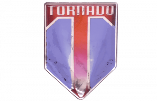
Tornado Cars was a British car brand, present in the 50-60s. In this time, the manufacturer built a number of compact cars, typical for this nation at the time. These cars were considered high-performance models, in general. The emblem resembled a shield. Much of it was blue, but there was also a big red ‘T’ that occupied the entire top space and stretched down the center to the bottom of the emblem. The word ‘Tornado’ was written along the top rim, in smooth silver letters.
Trabant
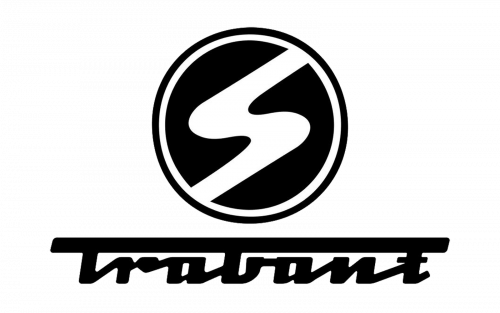
The name Trabant refers to a series of compact people cars, produced on the East German factory in Zwickau. The production lasted throughout the lifespan of GDR, and ended with it. The cars were primarily small, affordable sedans, built in very large numbers. The brand’s logo is its name. The word ‘Trabant’ is written in cursive black letters, except the top bar of the first letter is much bolder and extends the entire length of the word. There was also an emblem that looked like a letter ‘S’, jammed inside the circle. It was supposed to resemble the road, basically.
Trackson
Trackson Company was an American vehicle manufacturer. Their primarily built utility vehicles, meant for construction or agriculture, including tractors, excavators and more. A lot of these were built in the 1930s and 1940s. The company used no long-term emblems. On the few marketing brochures they released, the name was written somewhere below. Usually, the font was a bold sans-serif with yellow or black colors.
Tracta
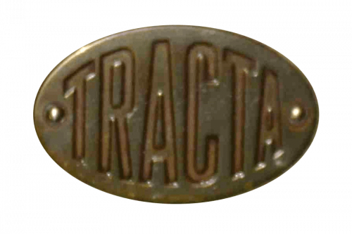
Tracta was a pre-WW2 French car brand. They manufactured several racing car models, although later some road variations were also offered. These cars are famous for being among the first FWD models to exist. Their logo only depicts an oval shape with the company name written inside. The font uses sans-serif letters, stretched thinly upright. They also varied in size, because each was designed to fit the most room possible, but this number was different for all of them.
Tramontana
 Tramontana is a Spanish racing car model, produced since 2007. It’s designed partially as a formula car, but with a few quirks. The wheel are only partly closed, there are two seats in the car (one behind the other), and there’s no top. Their logo depicts a horizontal streak of flame with two tongues. It’s supposed to mean the trail of fire that a car leaves at a great velocity. The color is usually a metal grey.
Trekka
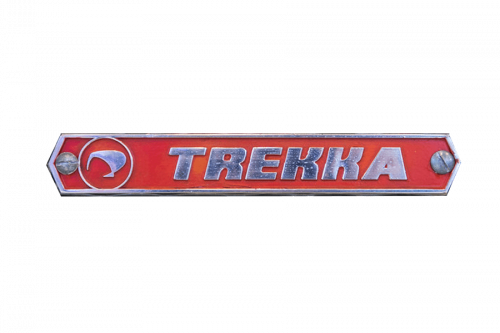
Trekka is what they call a small 2-door SUV from New Zealand. It was produced in the late 60s to early 70s, and it looked like a blocky sort of jeep people would use for safari. Not many of these were built, but the car has historical value for New Zealand. The Trekka badge is a little strip of red or black with the brand’s name on it. The letters were a bold sans-serif type with a slight tilt. They normally shifted these two the right a bit to accommodate a little image of a kiwi bird (the symbol of NZ) on the left.
TREKOL
TREKOL is a Russian manufacturer that builds all-terrain vehicles. There are several models and variations of these cars, but they are typically big and good on cross-country. The vehicles are said to be effective in swamps, snow, mud and other elements. The logo depicts a thick all-terrain tire with the bottom half turned white. On this white section, the word ‘TREKOL’ is written in Russian, using bold black letters. There’s also a big green leaf going up from the center of this image.
Treser
Treser is a series of cars, designed independently by the ex-Audi engineer Walt Treser in the 80s. The cars were moderate to heavy modifications of the original models, which were largely Audis and Volkswagens. In common, they had generally small sizes and high performance. These cars even had their own emblems. That includes a wordmark that said ‘Treser’ in thin sans-serif letters, except the top bar on ‘T’ extended above the entire word. Depending on the model, there could be other elements on the logo.
Trevethan
Trevethan was an early automobile, built by the Australians in 1902-03. It looked like a typical carriage-like auto of the time. It’s regarded as one of the first cars to ever be built in Australia. These cars didn’t wear badges, and the company had no logo. When it was mentioned, the name would usually be written as ‘T. Treventhan’ in big black letters. The full name was ‘T. Treventhan Toowoomba Coach Works’.
Trident Cars Ltd
Trident was a UK car manufacturer in the 60s and 70s. Their focus was on small sports car, of which 3 main models (Trident, Venturer & Clipper) were produced. The production volume was small and the cars are regarded as rarity nowadays. They had an emblem – a black circle with three narrow triangles. They were mostly red with white outlines and arranged so that one of them faced the other two. On the car badges, they used to have name wordmarks, as well. These were white cursive writings with abrupt shapes.
Triking
Triking is a modern cyclecar model with 3-wheels. It’s basically a small sports car with two open wheels and the third one in the back. These were produced in the 70s as a replica of a similar, older car, except with the superior parts. The emblems of these cars depicted a wide downward triangle. They normally colored it dark green and fitted with the company name. The latter was written in thin, linear letters, some of which were connected with one another. Notably, the size varied for all of these characters.
Triumph Motor Company
Triumph is a brand of compact sports cars, produced in Britain since 1880s. Historically, the brand always consisted of such vehicles, but there were also some basic passenger models and luxury cars. The marque is currently owned by BMW, but there hasn’t been a new Triumph for some time. The current logo looks like the word ‘Triumph’, placed in the middle of a ring of laurel wreaths. The font is normally a bold sans-serif. The coloring, for is part, is typically just black.
Trojan
Trojan was a UK-based vehicle brand, discontinued in the 60s. The bulk of their production consisted of small passenger cars. That included even some minicars, but there were also van, scooter and truck models. The logo depicted a disc with two long wings on its either side. The color could change, it was mainly purple. In its center, the brand’s name was placed in big white (typically) letters.
Troll
Troll was a sports car project, produced in Norway in the 50s. In terms of composition, it was a small high-performance car with 2 seats. They didn’t produce a lot of these, but the brand has historical significance for the Norwegians. Their primary emblem depicted a smooth, capital ‘T’. Normally, they’d color it red and put on the front of the car, between the three radiators. It was a typical letter, except the top bar was a bit skewed counter-clockwise.
Troller
Troller was a Brazilian car brand, owned by Ford. It was a brand of off-road cars and pickup trucks, with two main car models. The production has been discontinued in 2021, ending Ford’s presence in this country. The company’s logo displayed a vaguely square badge, colored mostly red. In its middle, there was a slightly tilted letter ‘T’, colored white. It was sliced vertically, and one of the resulting halves was lowered, making the image look like a combination of two distinct components.
Tucker
Tucker Corporation was an American carmaker that existed between 1946 and 1951. They specialized in the production of compact cars. They’re known for manufacturing of qualitative and affordable cars for working class. One of these cars was Tucker 48 – a two-door car with a streamlined body and a peculiar design. It was one of the groundbreaking cars of 40s-50s, popular for its simplicity and affordance. The Tucker Corporation logotype was a white ‘T’ letter in a red square, below which was the name in a red angular sans-serif typeface.
Turcat-Mery
Turcat-Mery was a company from France that operated from 1899 until being merged with Lorraine-Dietrich in 1928. They specialized in the making of high-performance compact cars and racing vehicles, as well as parts for them. They’re known for winning several top French rallies, such as Monte Carlo Rally. Their logotype was a circle drawn in different shades of blue. Inside it, there was a monogram ‘TM’. It was also blue, and it had a sharp sans-serif typeface.
Tourner Sports Cars
Tourner was a British engineering company that operated in 50s-60s. They designed, developed and produced sports cars. The company also produced single components of these cars: chassis, engines, etc. The brand logotype depicted a circle, colored 50/50 in black and white. On it, there were images of two winged animals: one red, one white. Between them, there were two red images of a horseshoe and an anvil. The whole circle was drawn on a blue background.
Tuchek & Spigel Supercars GmbH
Tushek & Spigel is an Austrian/Slovenian automotive startup, which appeared in 2012. The company focuses on the production of street-legal, high performance sports cars for private race trucks. The company’s focus is to produce not only extra fast, but also incredibly light supercars. The Tushek & Spigel logotype depicts a gray metallic triangle with a ‘T’ letter on it. Below it, we can see the name, written in a white futuristic typeface with wide letters. Some of these have shortened tips, as well.
TVR
TVR is a British automotive company, founded in 1946. For much of their history, they offered top-level convertibles, coupes and supercars. Their cars are often equipped with powerful engines. Most of their cars themselves are extra-light, which allows them to accelerate faster and reach higher velocities. The company logotype is its name, written in a bold sans-serif typeface. It’s executed in striped black and white lines.
Twombly
Twombly was a line of American cyclecars, designed, produced and manufactured by Driggs-Seabury Company in 1913-1915. These were the luxury cars, produced in very limited quantities. The cars had water-cooled, four cylinder engines, two seats, and elongated bodies. These particular models were put into motion with the help of bicycle-like pedals. The Driggs-Seabury Company was an engineering company. They concerned not only with motor cars, but also artillery for the Military.
Conclusion
In the vibrant tapestry of the global automotive industry, brands that begin with the letter “T” represent a fascinating spectrum of innovation, heritage, and engineering excellence. These brands, nestled within the broader narrative of companies like Bentley in England and Porsche in Germany, exemplify the pinnacle of automobile manufacturing and design. From the luxury sedans crafted by Lexus to the rugged, enduring appeal of Land Rover, each automobile manufacturer contributes its unique signature to the industry’s legacy.
In regions as diverse as the Czech Republic, home to storied brands, and North America, where Chevrolet and Chrysler embody the spirit of the open road, the influence of these companies is ubiquitous. The elegance of Jaguar, the formidable presence of Bugatti, and the pioneering spirit of Honda further enrich this landscape, offering consumers an array of choices that cater to every conceivable preference and need.
The automotive sector, underpinned by giants such as General Motors in North America and the Volkswagen Group in Europe, is a testament to human ingenuity and the relentless pursuit of perfection. Brands like Subaru and Hyundai, along with luxury marques like Mercedes-Benz and Rolls-Royce, push the boundaries of what is possible, blending performance, luxury, and technology in ways that were once unimaginable.
Emerging brands like Genesis, alongside established names such as Cadillac and Alfa Romeo, continue to innovate, ensuring that the automobile remains a central figure in our technological and cultural evolution. From the sleek, sophisticated offerings of Acura and Infiniti to the robust, dependable vehicles produced by GMC and Ram, the diversity of the automotive world is its greatest strength.
In this dynamic landscape, brands that start with “T” stand shoulder to shoulder with industry luminaries like Lincoln, Kia, and Volvo, each contributing to a global narrative of progress and excellence. Whether it’s the elegance of a luxury sedan from Lexus or the rugged charm of a Land Rover, the automobile continues to be a symbol of freedom, innovation, and the endless possibilities that lie on the road ahead.


