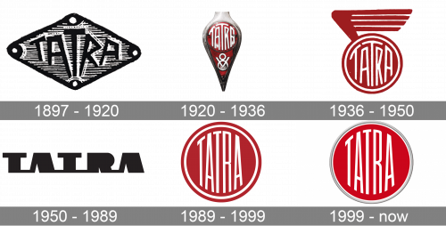
Tatra is the name of a Czech automaker, which was established in 1850 and is considered to be one of the oldest in the world’s car manufacturing industry. At the beginning of its history, the business was oriented on the production of wagons and changed its direction at the end of the 1890s.
Meaning and history
1897 – 1920
The original Tatra logo was a sort of metallic rhombic plaque with the company name put onto its central plane. The letters were all over the place and really looked carved into rather than made with some sort of typographic tool. It was very artistic.
1920 – 1936
In 1920, they produced the first version of what later became their iconic emblem. It was a red circle with white letters depicted haphazardly on it. This emblem was then put onto a metallic badge shaped like a vial. There was a big red space in its center, and the emblem was in its top.
1936 – 1950
The 1936 emblem is a 2D edition of the same round symbol, except with an additional white outline. There was also a sort of illustrative minimalistic wing sprouting from its top left corner and colored the same shade of red.
1950 – 1989

For a few decades, Tatra tried using a new design – this one. It’s a black wordmark of the brand’s name, although it didn’t use standard letters. Rather, it was a collection of round blots shapes and lines fused together by a few more lines to make an impression of something mechanical.
1989 – 1999
The initial Tatra badge was created in 1897 and is still kept as the basis for the company’s visual identity. It was a flat dark red circular badge in a thick double outline of white and red, and a vertically stretched sans-serif logotype in white, with both it is top and bottom contours arched to fit the circular framing of the emblem.
1999 – Today
The visual identity of the Czech automaker has been changed several times throughout its history, but he always been text-based. The latest version of the Tatra logo is a modified emblem from the 1990s, which looks bright and contemporary.
The emblem is composed of a scarlet red circle in a delicate silver outline, where the custom sans-serif lettering is enclosed. The wordmark in white features its letters capitalized and arched both on their top and bottom parts in order to repeat the circular shape of the badge.
In the printed materials and official document, the Tatra logo had its silver outline replaced by a double red and white, which makes it look stricter and more professional.
The red and white color palette of the brand’s visual identity is a perfect reflection of power and passion, along with the company’s energy in moving forward and implementing new technologies and principles in its manufacturing process. The silver outline of the badge adds style and a sense of modernity and makes the emblem look balanced and cool when placed on the car.


