Triumph is the brand of one of the most popular motorcycles in the world. It was created at the end of the nineteenth century in the U.K. The company’s creator, Siegfried Bettmann, was first focused on the distribution of sewing machines and bicycles.
Meaning and history
The brand was named by its founder, Siegfried Bettman, who spoke three languages and the word “Triumph” had the same meaning in all three of them. It was a loud and memorable name.
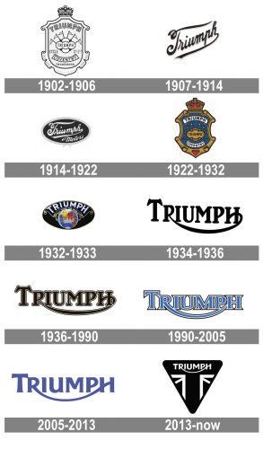
Triumph is synonymous with classical moto style, which is accompanied by the highest quality. The brand had 12 major versions of its logo during history, but all of them were elegant and memorable.
1902 – 1906
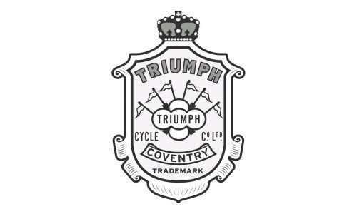
The first known Triumph logo was designed in 1902 and depicted a crest shape with a crown on top and a bold ornate wordmark. The central part of the logo was given to six flags, representing continents.
1907 – 1914
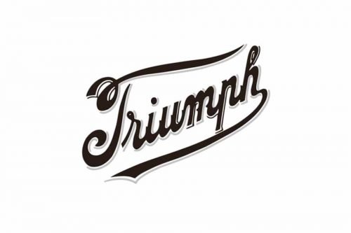
In 1907 the script logo was created. Executed in black cursive lettering with white outline and strict all-caps “Motorcycles” tagline, it looked elegant and confident. The wordmark was placed diagonally and the elongated lower tail of the letter “h” underlined the whole name.
1914 – 1922
In 1914 the wordmark was enclosed in an oval frame and the tagline was changed to “Motors”, executed in a bold cursive font. The color scheme became more gray and white, which was softer than the previous logo.
1922 – 1932
A bright blue crest was designed in 1922. It was a modification of the first Triumph logo, with the addition of colors and slightly refined shape of the framing. The logo featured colors of the British flag and the word “Coventry” was added to the bottom part.
1932 – 1933
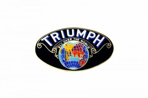
In the 1930s the brand experiments with symbols. For one year the Triumph logo featured an oval-shaped emblem with the image of the globe and a large arched wordmark.
The globe was accompanied by the new brand’s motto “Triumph All Over The World”.
1934 – 1936
The Triumph visual identity was dramatically changed in 1934. That’s when the base for today’s logo was created. There no frames and ornaments on the logo now. It is composed of a simple yet strong wordmark in all-caps, where the first “T” is enlarged and the tail of the letter “R” merges into the middle of the “H”.
The logo looks stylish and sophisticated in the monochrome palette, showing the brand’s timelessness and strength.
1936 – 1990
The wordmark remains, but the typeface is slightly changed. The lines became bolder and shorter, the logo now looks more balanced and bright, due to the contour of the letters. this logo stays with the brand until 1990.
1990 – 2005
The new birth of the brand was celebrated by the new logo. It was still a wordmark, but with straightened and strengthen lines and a new color palette. The “Triumph” lettering was executed in a calm blue with the white contour. The logo is more solid and confident now, it boasts symmetry and balanced lines.
In 2002 the 100-years anniversary logo was designed. It was an ornate emblem with two flags — the U.K. on the left and the race checkered flag on the right. It was a very colorful and eye-catching design.
2005 – 2013
The Triumph wordmark was refined in 2005. The lines became bolder and cleaner, the blue color now is deeper and the countering was removed. It looks modern and stylish with its sleek rounded lines.
The elongated tail of “R” now resembles a smile. The logo is simplified yet modernized and reflects the uniqueness of the brand.
2013 – Today
The new Triumph logo was designed in 2013 and features a monochrome palette, a refined wordmark, and a new triangular emblem.
The wordmark is executed in a custom sans-serif typeface with smooth clean lines. The letter-spacing is more symmetrical now and the first “T” is the same size as other letters.
The triangle standing on its top features rounded angles and a British Flag pattern. It is a celebration of the brand’s heritage and energy.


