Talbot was the name of a British car brand, which was established in 1903 and discontinued in 1994. Talbot had a pretty intense history, which includes participation in Formula 1 and sponsorship of football clubs.
Meaning and history
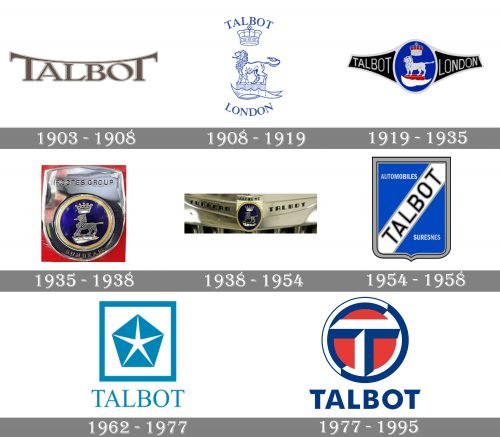
1903 – 1908
The very first Talbot emblem was fully text-based. The badge was composed of a fancy custom lettering with the two letters “T” enlarged and their horizontal bars connected, arching from the center above the wordmark, creating a “roof”. The inscription was set in a calm and sophisticated brown shade and featured a thin double outline in brown and white.
1908 – 1919
The redesign of 1908 switched the concept of the Talbot visual identity and the new badge was drawn in a blue and white color palette, placing the lettering from the top and bottom of the contoured heraldic image with the lion and a crown. The “Talbot” in the uppercase of a classy serif font was arched above the lion, while the “London” in the same style and size — under it.
1919 – 1935
In 1919 the Talbot badge was redesigned again. The lion with the crown was redrawn in thick silver lines and placed on a solid blue oval with a thick silver outline. Two black fragments were coming out of the oval to the sides and outlined in the same silver. The “Talbot London” inscription was set on the black background in a smooth rounded sans-serif typeface, in light gray color.
1935 – 1938
In 1935 the visual identity of the British automaker was refined. The two black banners were removed and now the blue circular medallion was set on a silver crest with a rounded bottom line. The inscription was set right on the silver background, from the top and bottom of the graphical element.
1938 – 1954
The blue medallion changed its color palette to a darker and a more intense one and got placed on a horizontally stretched wing-like emblem in silver. The lettering was redesigned and now executed in an ExtraBold custom sans-serif, with thick black lines of the uppercase letters.
1954 – 1958
The Talbot logo was simplified in 1954. The new concept was built around a simple blue crest with a thick diagonal white banner coming through it. The black uppercase “Talbot” lettering in a gray outline was placed on a white banner and complemented by a thick black and gray framing of the crest.
1962 – 1977
The logo created for the brand in 1962 featured a light blue Pentastar with white sharp lines in the middle. The symbol was set on a white background and enclosed into a thick square frame in the same shade of blue. The wordmark, also in blue, was written in an elegant serif font under the square emblem.
1977 – 1995
As for the latest version of the Talbot visual identity, it was very stylish and modern. A bold geometric letter “T” in a circular frame was complemented by the “Talbot” wordmark under it. The lettering in all capitals was executed in a custom sans-serif typeface with thick staring lines and diagonal cuts of the “T” horizontal bar.
The logo was drawn in white, dark blue and red, and usually exposed on a light blue background. When placed on the company’s cars, the badge was executed in silver and looked professional and strict, yet due to the thickness of the lines and their volume, it was a very solid and stylish badge.
What is Talbot?
Talbot is the name of a British historical car brand, which was established at the beginning of the 20th century and stayed at the top of the brand list for almost six decades. The company ceased all operations in the middle of the 1970s.


