The team based in Boise, Idaho, now has the status of the farm team for the Colorado Rockies. While the franchise was officially established in 1987, in fact, it had spent several years in other locations playing under different names.
Meaning and history
The Minor League Baseball team the Boise Hawks has been pretty consistent in its brand identity over the last decade. Since 2007, they’ve introduced only one subtle update to the logo.
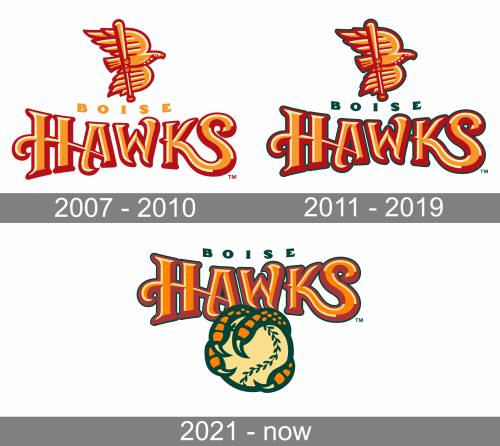
2007 — 2010
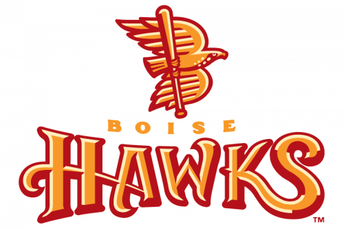
The Minor League Baseball team the Boise Hawks has been pretty consistent in its brand identity over the last decade. Since 2007, they’ve introduced only one subtle update to the logo. The first logotype showed an eagle keeping a baseball bat in its claws. Below it, we can see the word ‘Boise’, written in an uppercase sans-serif typeface with larger gaps between letters. In the bottom of the logo, the huge word ‘Hawks’ showed off, having custom handwritten typeface. The whole logotype was colored caramel orange-and-red, with several beige areas.
2011 — 2019
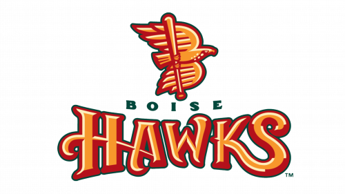
While the shape of the elements has remained the same, there has been a noticeable shift in the color palette. The overall impression is now a bit darker. The orange-and-red color palette used in the logo was a bit darkened, and the ‘Hawks’ word was now drawn in a more circular position. The ‘Boise’ word became dark green, with no other changes. Also, all of the logotype elements were enlarged.
2021 – Today
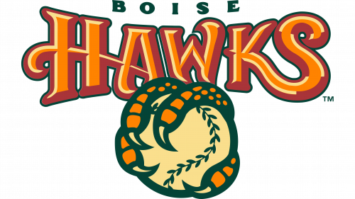
The 2021 version of the brand logotype shows the same familiar brand elements, but this time they’re drawn with paler shades. The ‘Boise’ word is now located in the upper part of the logo. The emblem also depicts green-with-orange claws now, in which a baseball is kept. The latter is depicted in the forefront, at the bottom of the logo.
Colors
The lettering “Boise” is green, while the word “Hawks” and the bird itself has acquired a green outline.


